VELORA
- Year
- 2026
- Type
- Self-initiated concept
- Services
- Branding & Visual Identity, UI/UX & Product Design, Web Development
- Type
- Self-initiated concept
- Year
- 2026
- Scope
- Brand identity, visual system, UI/UX, website development
- Deliverables
- Monogram & wordmark, colour & type system, stationery, project book, signage, social, responsive website
02Introduction
An interior studio whose website feels as considered as its rooms.
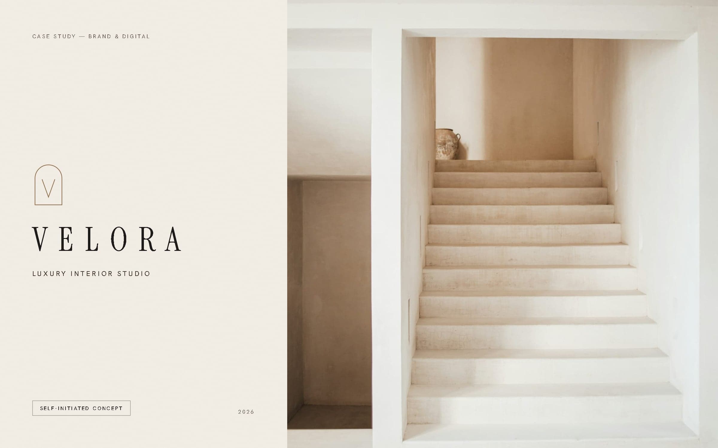
VELORA is a self-initiated WEXILAR concept: an imagined interior architecture studio, built to show how a quiet-luxury brand can carry from a monogram to a printed project book to a working website. It is not a real business, and the four projects it presents are fictional studies — not client commissions.
The brief we set ourselves: an identity with almost nothing in it, and a website that lets photography, proportion and material do the selling — without falling back on a template.
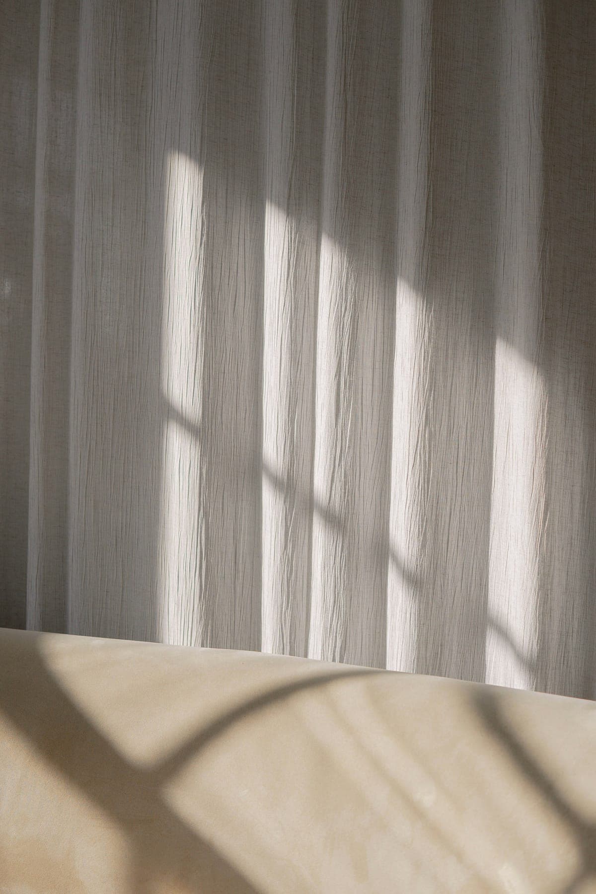
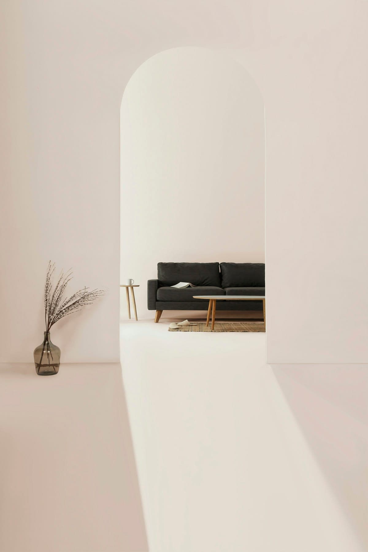
Reference photography — daylight on linen, and a limestone threshold.
03Brand concept
Light, material and intention.
Three words hold the brand together. Light — rooms are drawn around where the sun falls before anything else. Material — a short palette of stone, oak, linen and bronze, chosen at full size. Intention — fewer, larger gestures, and nothing added for its own sake. The identity borrows the same restraint: few elements, generous space, one warm metal.
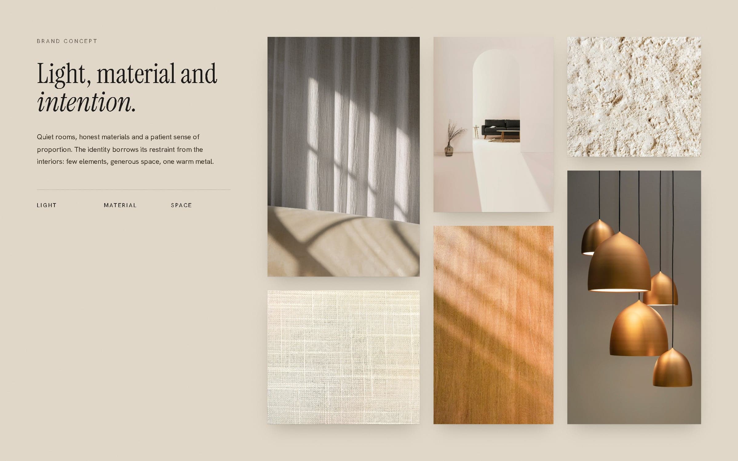
Moodboard: plaster, limestone, linen, oiled oak and brushed bronze.
Rooms that are generous about doing very little.
04Logo & visual identity
A threshold, and the light that falls through it.
The monogram is an arched opening with a V drawn inside it — a doorway, and the wedge of light that crosses its floor. It is built on a 48 × 64 grid from a single 20-unit radius. The wordmark is Instrument Serif in wide capitals, tracked open so it reads as calm rather than loud, and the two lock up horizontally or stacked.
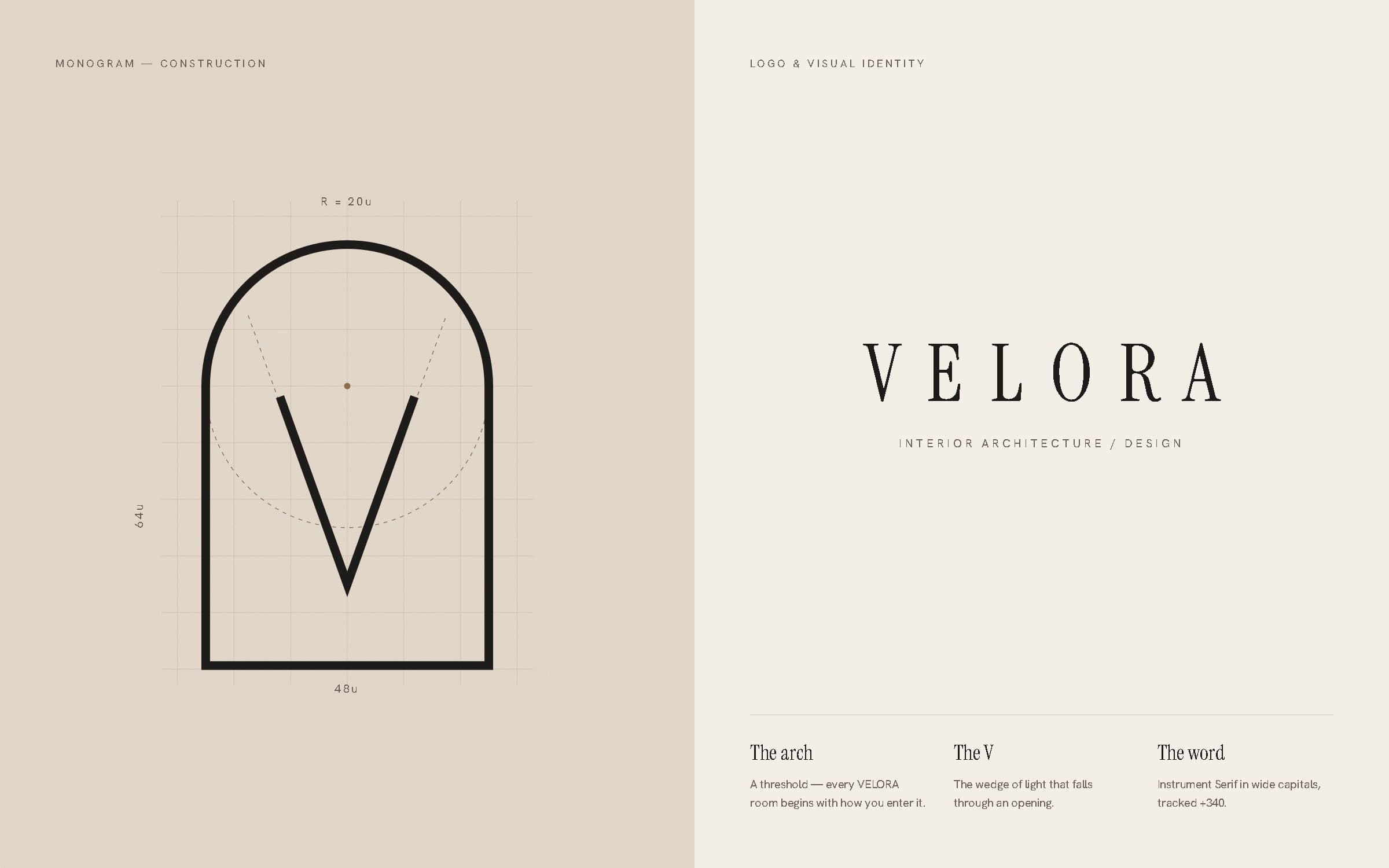
Monogram construction and primary wordmark.
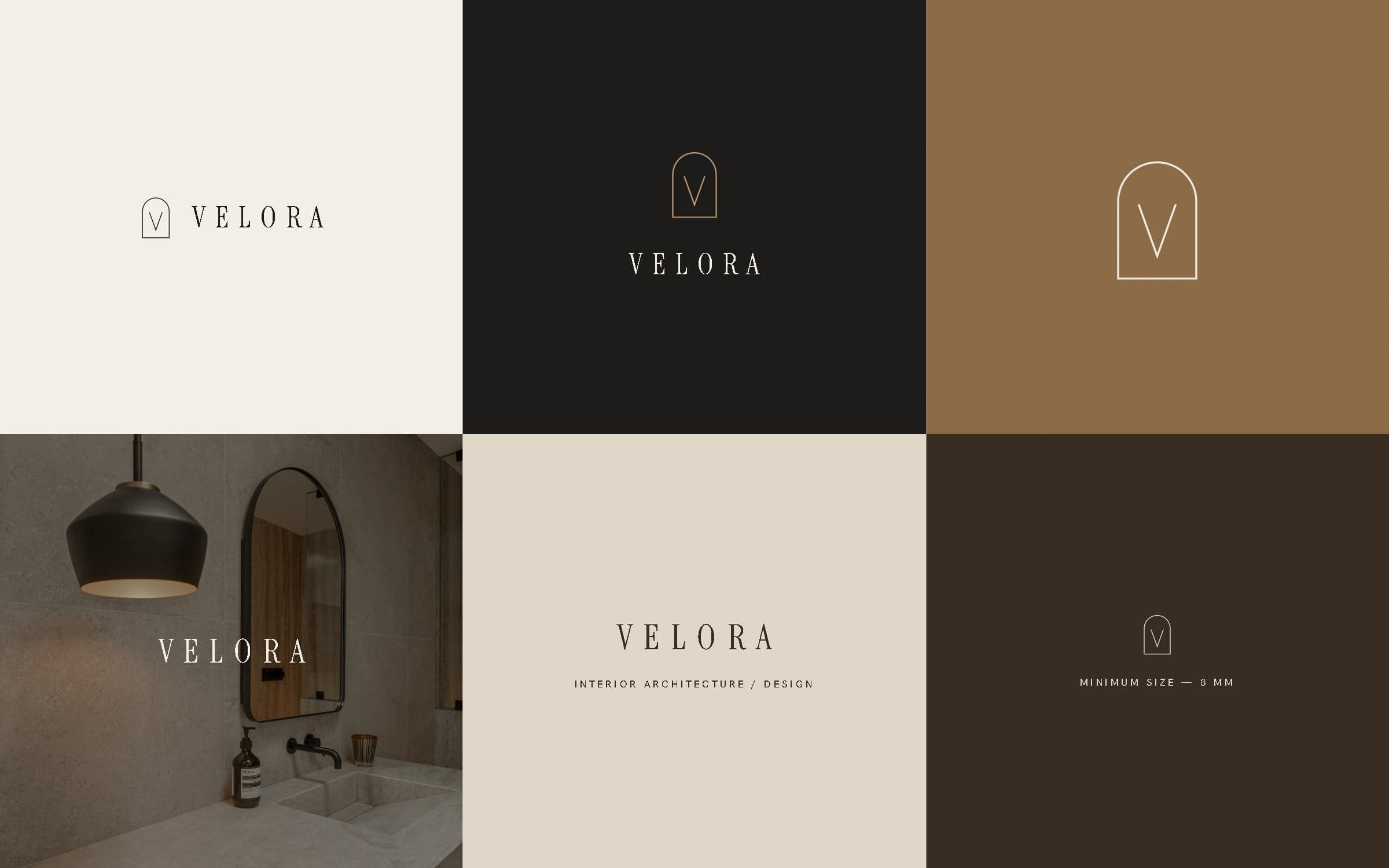
Lockups on ivory, charcoal, bronze, photography, limestone and umber.
05Colour system
Ivory, stone and charcoal — with bronze held back.
The palette is taken from the materials themselves: the ivory of lime plaster, the grey-beige of honed limestone, the deep brown of oiled walnut. Bronze is the only accent and is used sparingly — the monogram, a signage plate, a single rule — so it keeps its warmth.
- Ivory#F3EEE6Paper & primary ground
- Limestone#E3DACBSurfaces & cards
- Taupe#A69886Secondary text & rules
- Bronze#8E6D48Accent — sparingly
- Umber#3A2D24Deep brown, print
- Charcoal#1E1C1AType & dark ground
Bronze is reserved for the monogram and small details — never large areas or body text.
06Typography
An editorial serif, and a sans that stays out of the way.
Instrument Serif carries the voice — headlines, project names, the wordmark — with its italic kept for a single word of emphasis. Hanken Grotesk does the quiet work: navigation, captions, labels and body text, often in small spaced capitals.
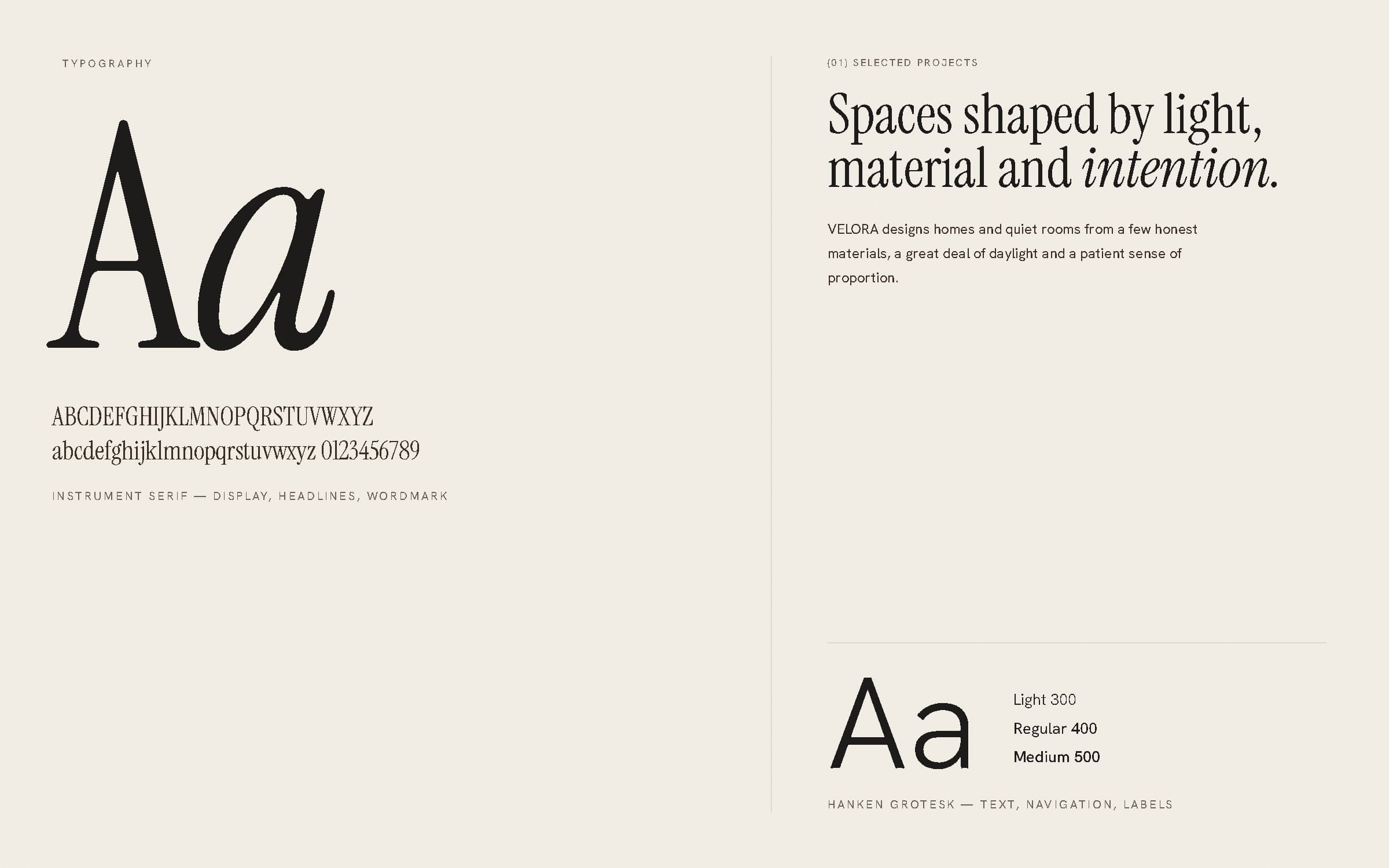
Type specimen and hierarchy.
07Brand applications
Objects a client actually holds.
Business cards in umber and ivory, a letterhead and DL envelope, a presentation folder with a blind-debossed monogram, a project book, a brushed-bronze studio plate, and a library of material cards that travel with every sample box. Each piece uses one or two colours and lets paper and finish do the rest.
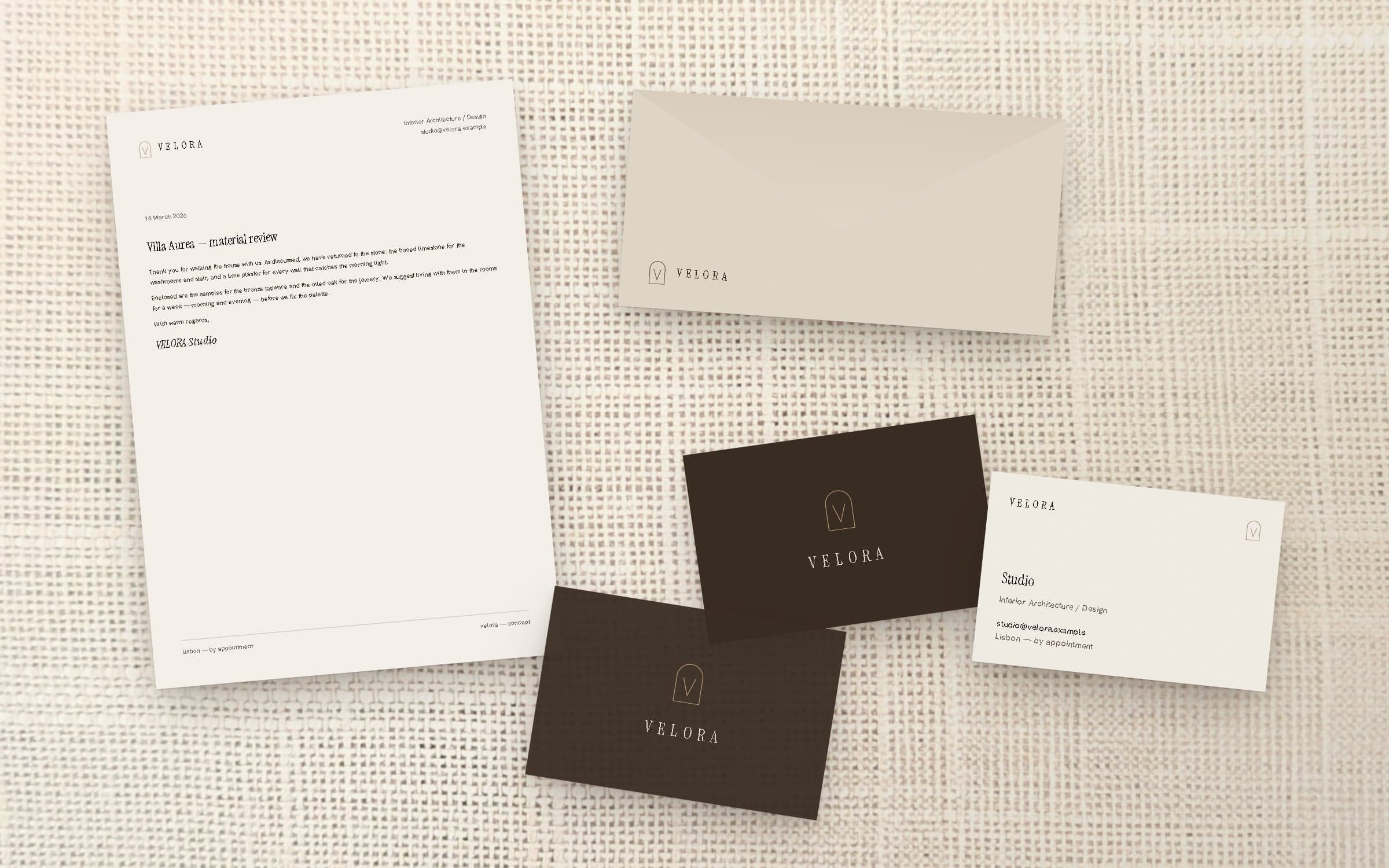
Stationery — letterhead, envelope and business cards.
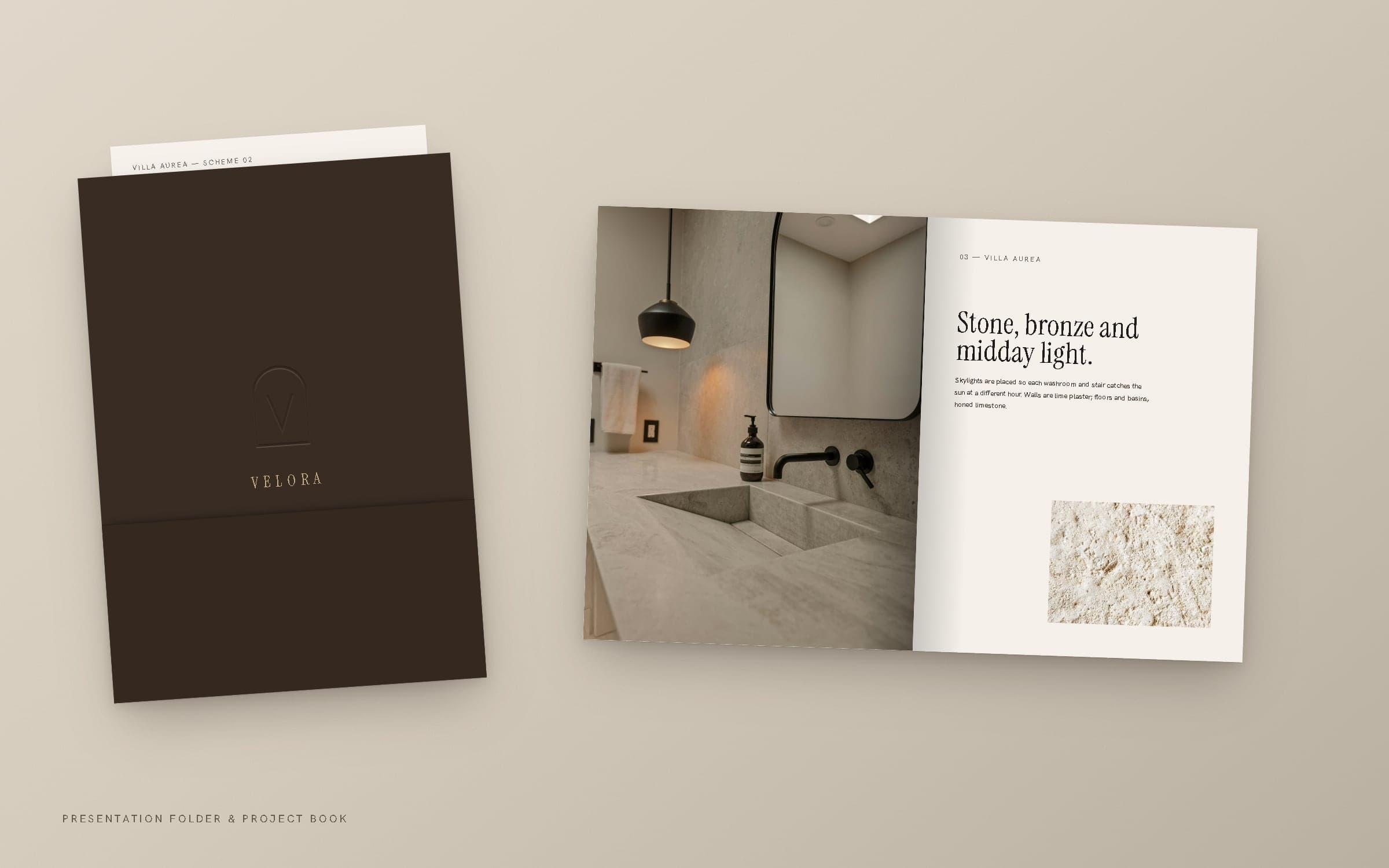
Presentation folder and project book.
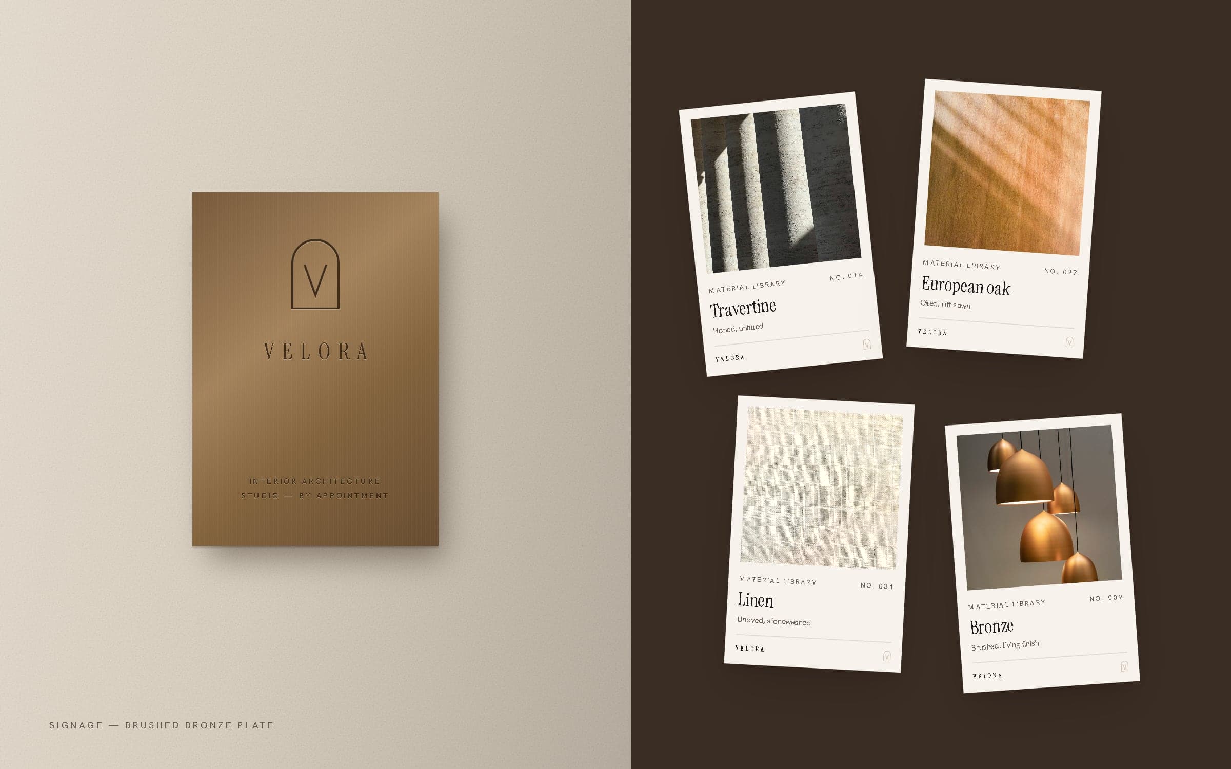
Studio signage and material library cards.
08Social media
A feed that reads like a monograph.
Eight repeatable templates — a new project, a statement, an architectural detail, a material close-up, a palette — so the feed stays calm and consistent, and every post looks like a page from the same book.
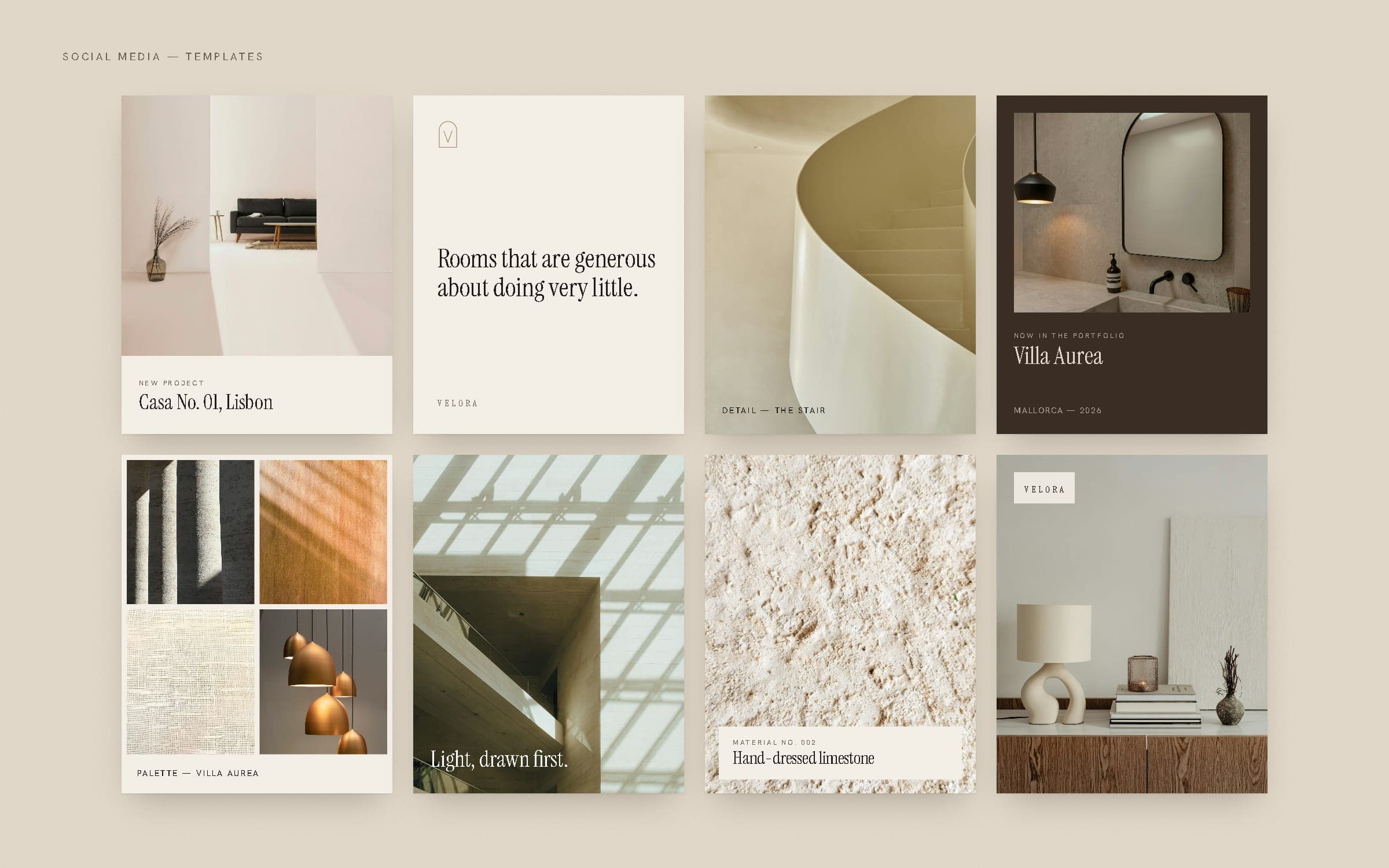
Project announcements, architectural details and material posts.
09Digital experience
A working website, paced like a walk through a house.
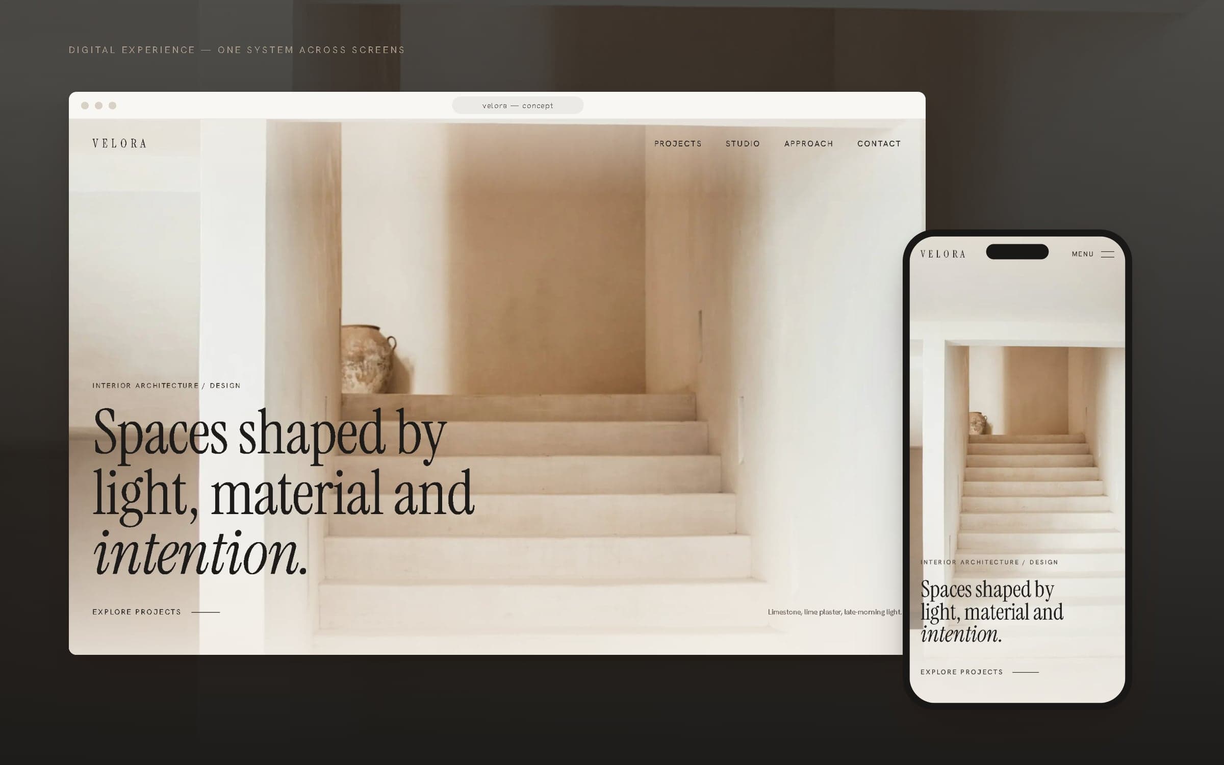
The VELORA site is built, not mocked up — a responsive Next.js page with real navigation, art-directed imagery and a contact form, live as a prototype at wexilar.com/concepts/velora. It moves from a single photograph and headline, through selected projects, the studio, its approach, a material library and one project in depth, to a quiet contact form. Every screen in this case study is a screenshot of that build.
10Desktop website
Large photography, small type, a lot of room.
A twelve-column grid set loose: project images offset against one another, captions kept small and quiet, and a single dark section — the approach — to change the pace halfway down the page.
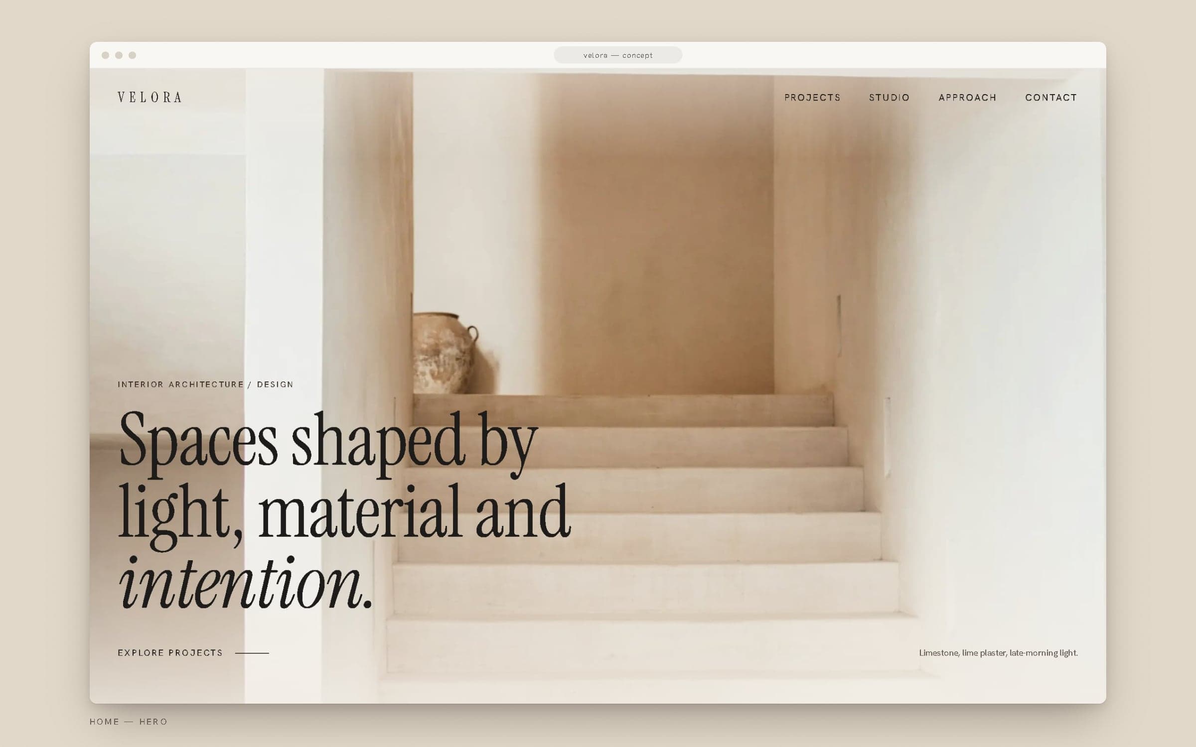
Home — hero.
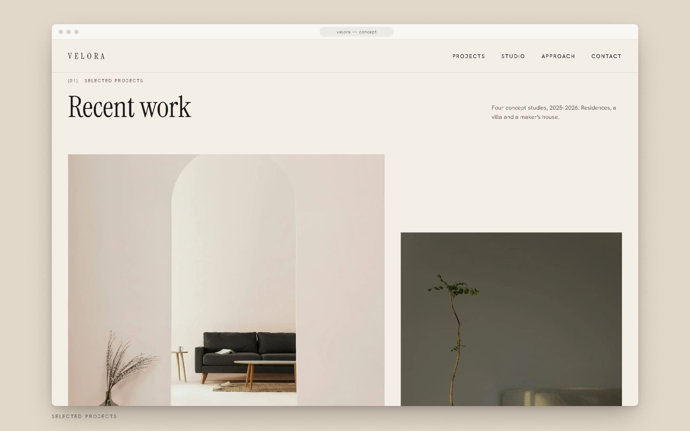
Selected projects.
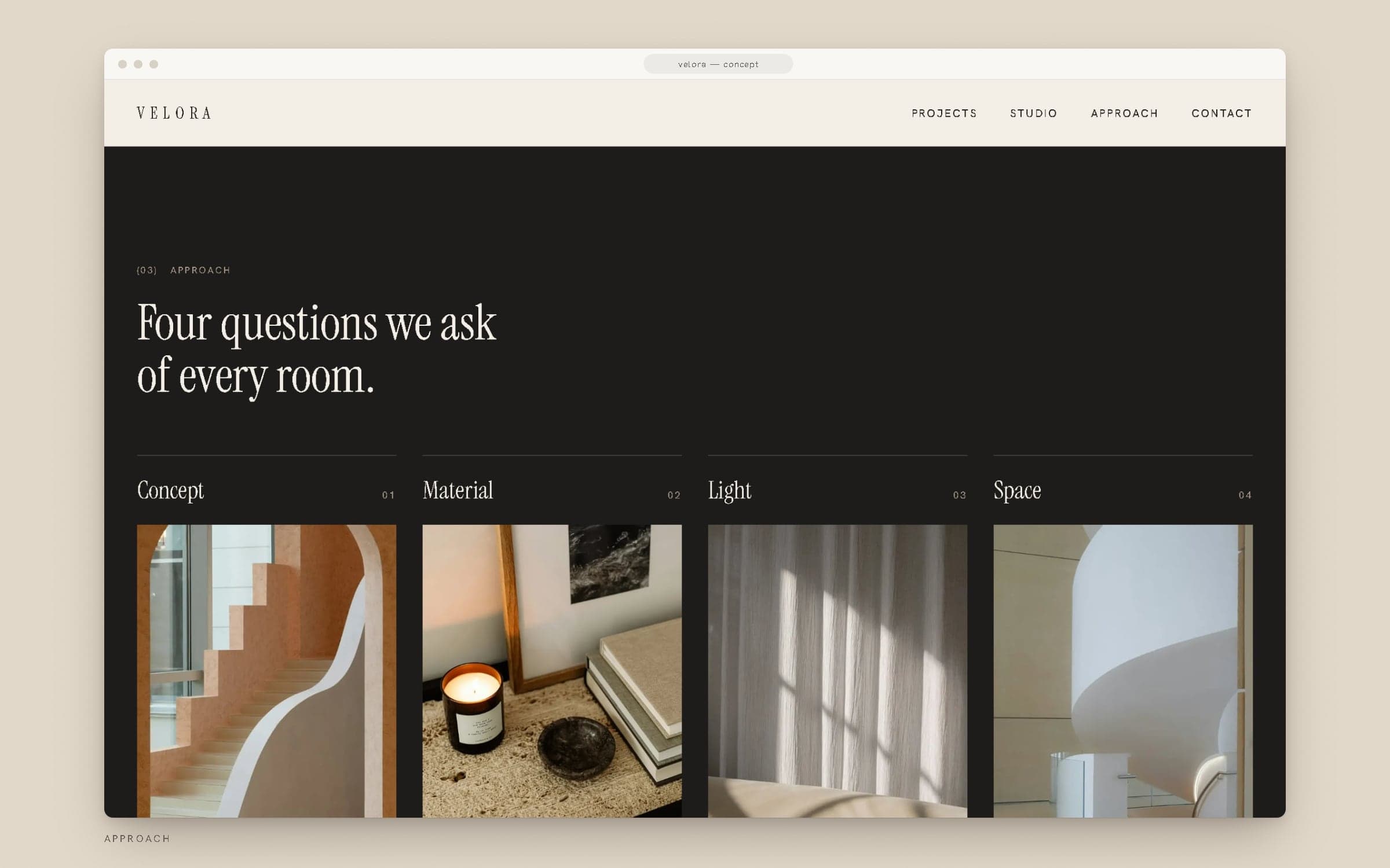
Approach — Concept, Material, Light, Space.
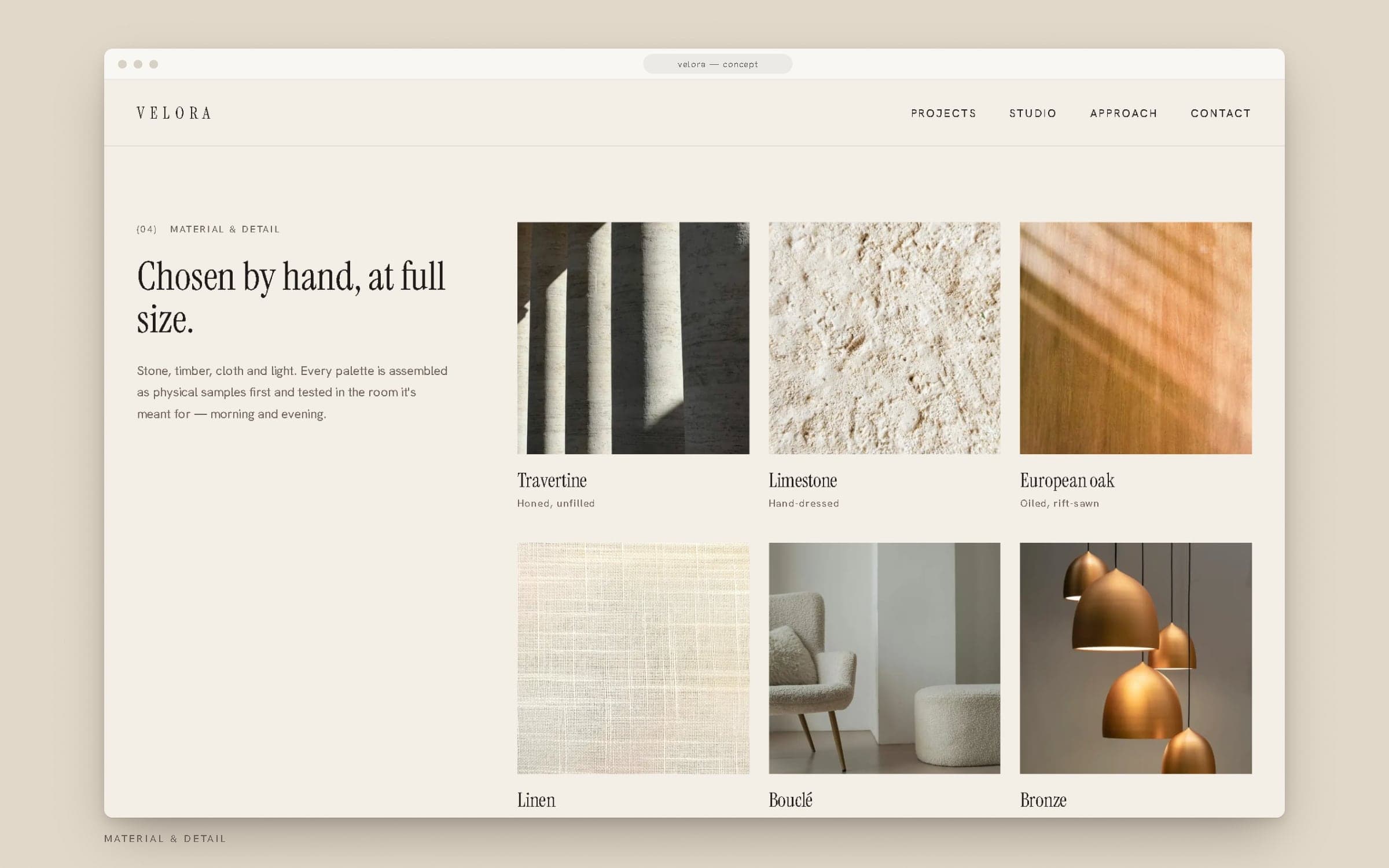
Material & detail.
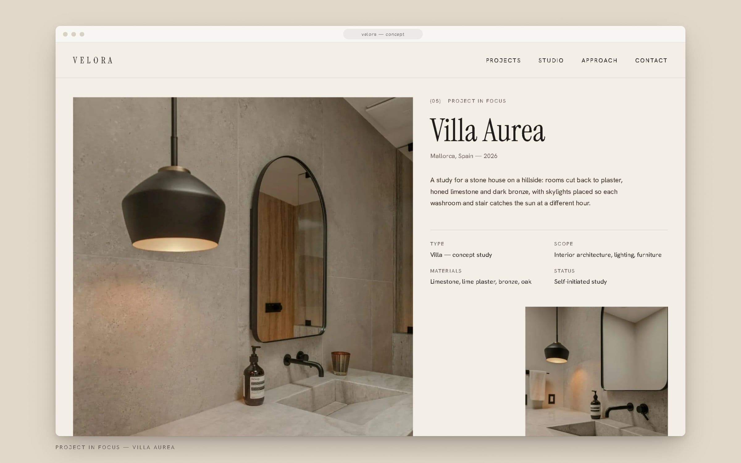
Project in focus — Villa Aurea.
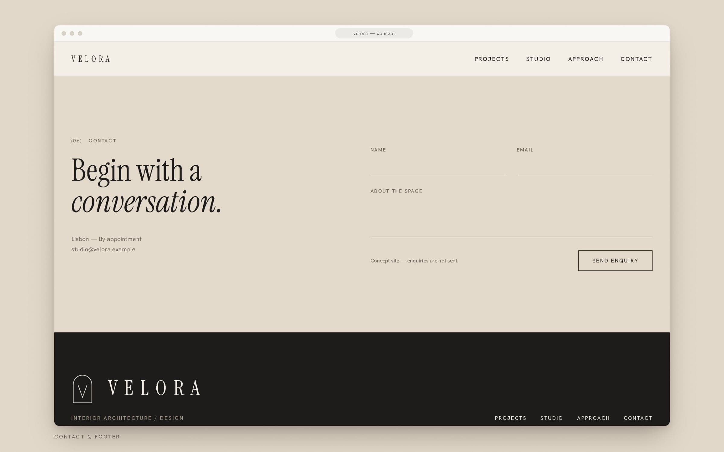
Contact and footer.
11Mobile website
The same calm, at 390 pixels.
On phones the hero switches to a portrait crop of the same photograph, the project grid becomes a single column, and navigation moves into a full-screen menu set in the serif — large enough to tap without looking twice.
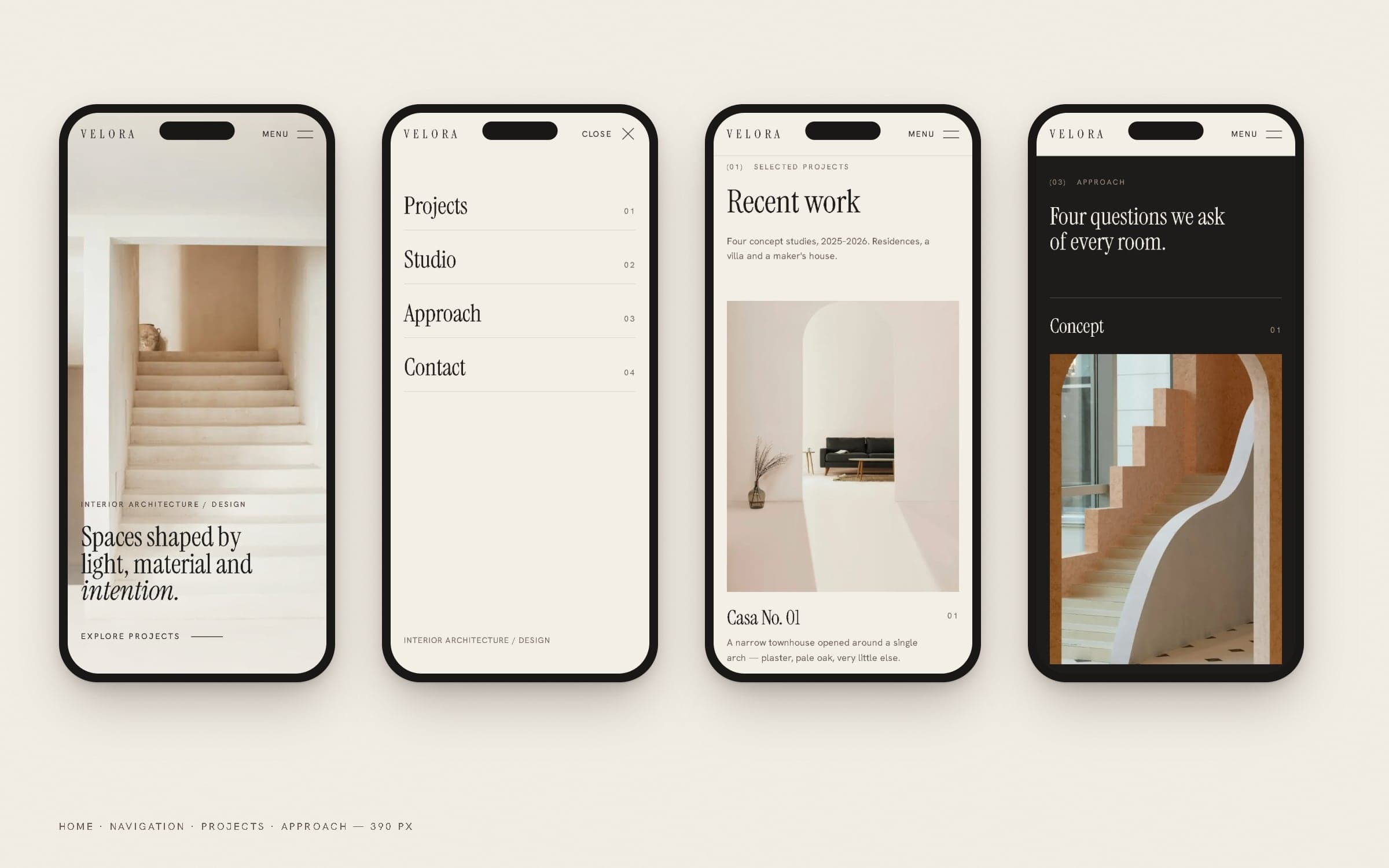
Home, navigation, projects and approach — mobile.
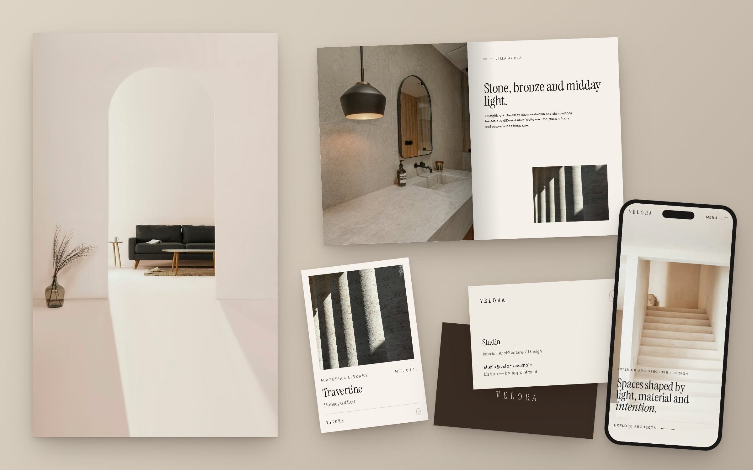
One idea — light through an opening — carried from the monogram to the material cards to the screen.
12Final showcase
Identity, interiors and interface, together.
- Strategy & identity
- WEXILAR
- Design & development
- WEXILAR
- Photography
- Unsplash (Unsplash License) — stock images, not VELORA projects
- Status
- Self-initiated concept — not a real studio or client project