ORBIT
- Year
- 2026
- Type
- Self-initiated concept
- Services
- UI/UX & Product Design, Web Applications, Branding & Visual Identity
- Type
- Self-initiated concept
- Year
- 2026
- Scope
- Brand identity, product design, UI/UX, design system, front-end development
- Deliverables
- Mark & wordmark, app icon, token system, 16-screen mobile app, 6-view web dashboard, component library, concept architecture
02Introduction
A finance product, from first mark to working prototype.
ORBIT is a self-initiated WEXILAR concept: an imagined personal-finance product, designed and built end to end to show how we approach a complex digital product — from the first mark to a working app and dashboard. It is not a real bank or app, it has no users, and it never touches real money. Every balance, merchant and person in these screens is sample data.
The idea behind it fits in a sentence: your balance at the centre, and everything else — payments, bills, plans — moving around it on a clear, predictable path.
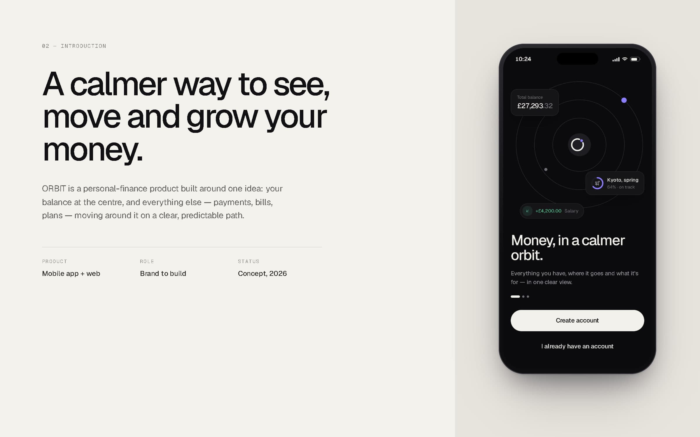
Welcome screen of the ORBIT app.
03The idea
Clarity, treated as the feature.
Most money apps show everything at once — balances, offers, charts and alerts all compete, so the one thing you opened the app for is the hardest to find. We treated clarity as the feature: fewer numbers on screen, each one explained, and an interface that only raises its voice when something needs you.
ORBIT is designed for busy people managing a salary, shared bills and a few savings goals, who want confidence in thirty seconds rather than a finance hobby. Every screen answers a single question — how much do I have, where did it go, what is it for.
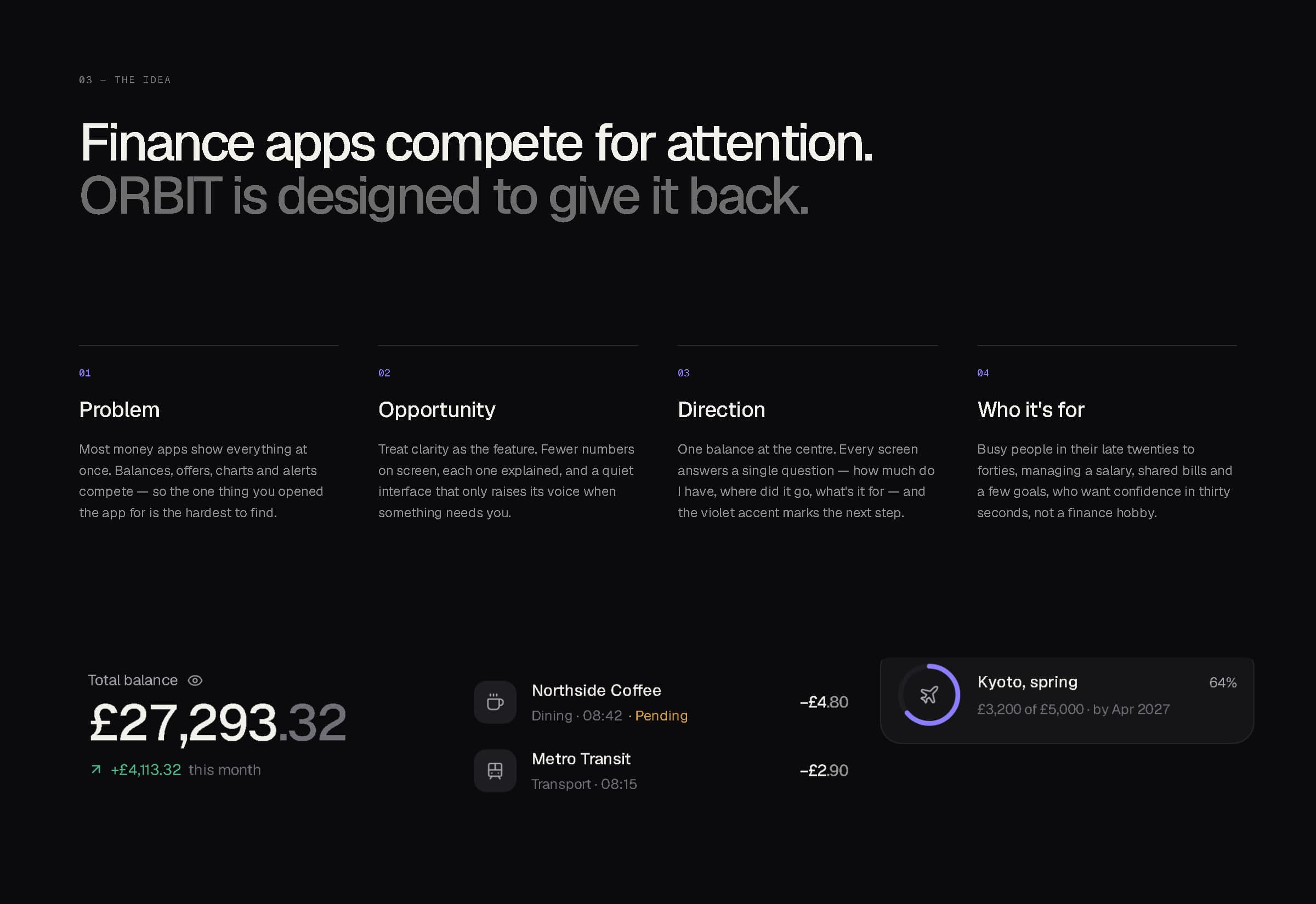
Problem, opportunity, direction and audience.
One balance at the centre. Everything else on a calm, known path around it.
04Brand identity
A ring, broken where a single point travels along it.
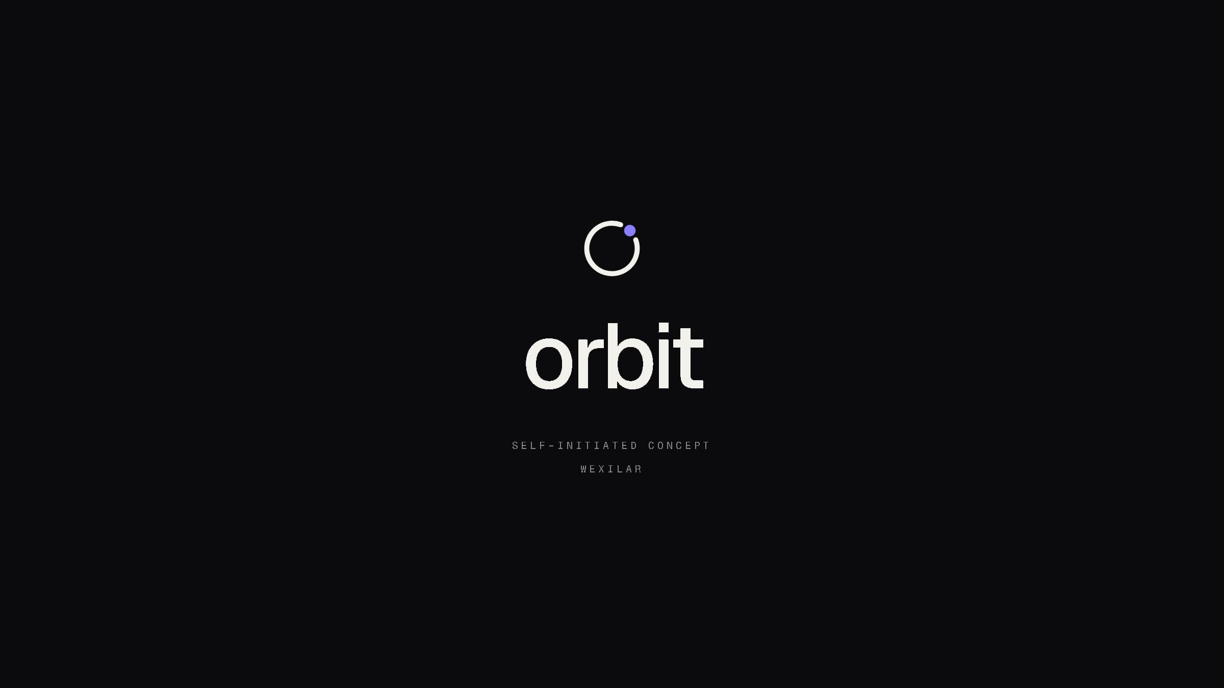
The mark is an open ring with one violet point riding its edge — the balance at the centre, and money in motion around it. It is drawn on a 32-unit grid from a single 11-unit radius and a 2.6-unit stroke, with the break set at 50° so the point reads as moving rather than resting. The lower-case wordmark is set in Geist, tightly spaced, so the two sit together as one calm lockup.
The app icon keeps the same idea at its smallest: warm white on graphite, one violet point. It reads at 32 pixels and survives on any wallpaper.
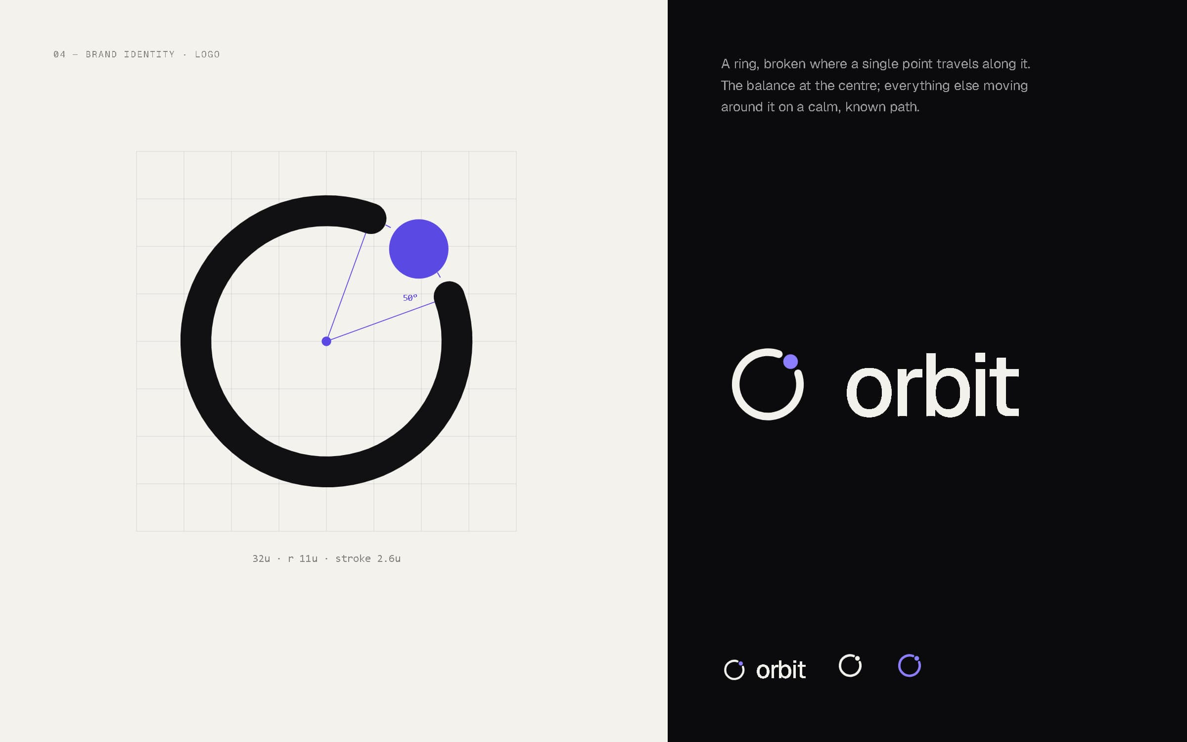
Mark construction and lockups.
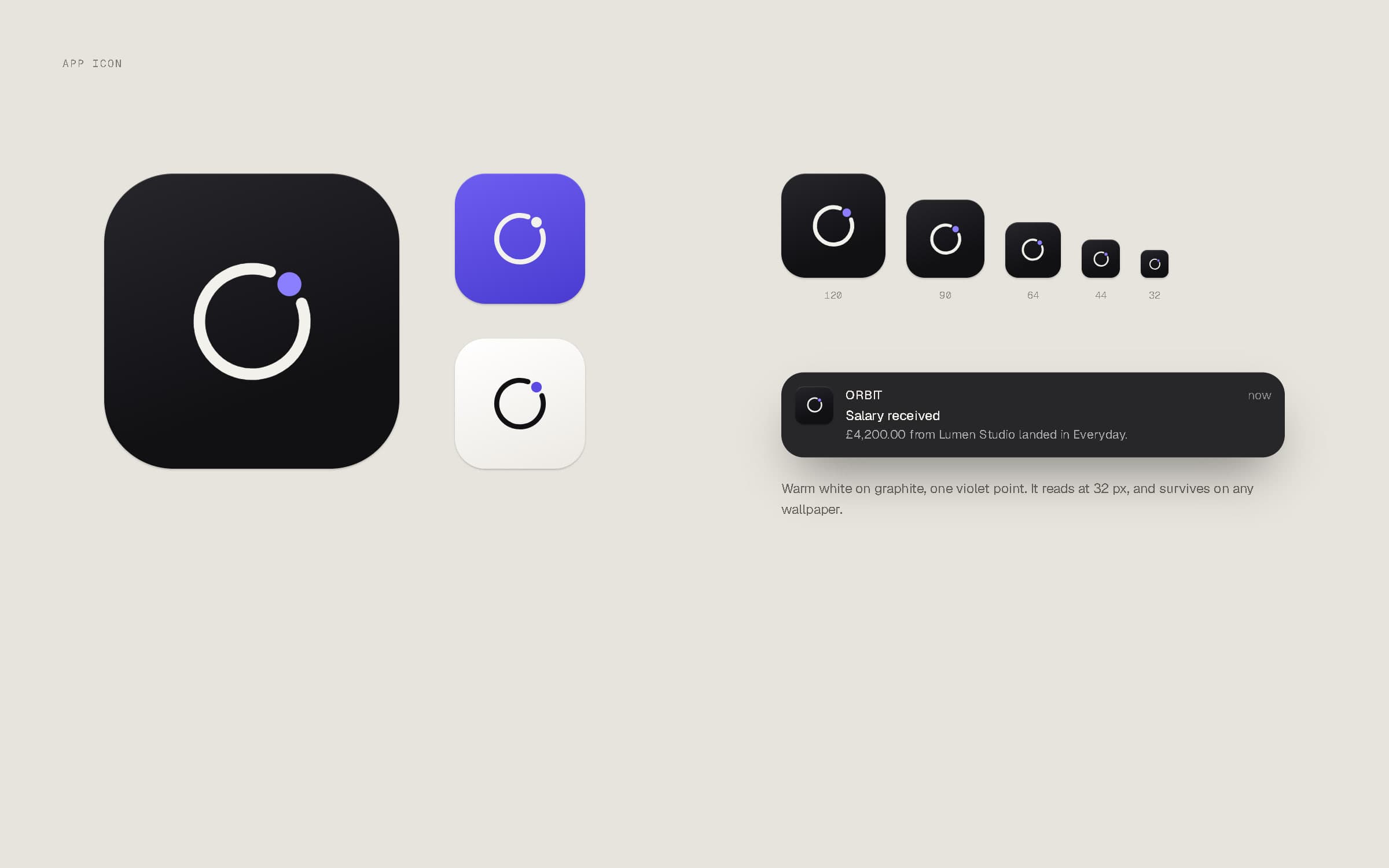
App icon in graphite, violet and light, from 120 to 32 px, and in a notification.
Colour & typography
Near-black, warm white and soft greys. Violet marks the one next step.
One set of tokens drives two themes: a dark theme for the phone, where the app lives in the hand at night as often as in the day, and a light theme for the web dashboard, where people sit down to plan. Violet is the only accent, reserved for the single action or number that matters on each screen; green and red carry money in and out, and always sit beside words, so meaning never depends on colour alone.
Geist does all the interface work in three weights. Geist Mono is kept for figures that must line up — card numbers, references, tokens — and every amount is tabular, with whole pounds leading and pence stepping back.
- Ground#0B0B0DApp background
- Surface#151518Cards & sheets
- Warm white#F3F1ECPrimary text
- Grey#A5A5ADSecondary text
- Violet#8B7FFFAccent — one per screen
- Green#52BF8CMoney in, on track
Dark theme (app) values shown; the light theme uses the same roles — #F4F2ED ground, #111114 text, #5A4AE3 accent.
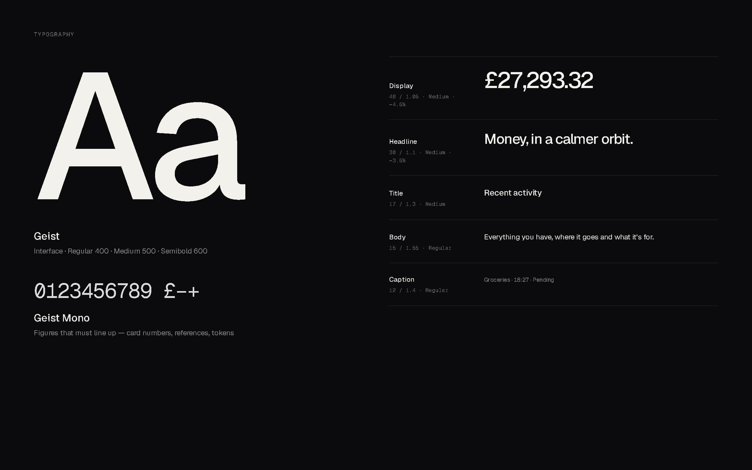
Typography — Geist and Geist Mono, five-step scale.
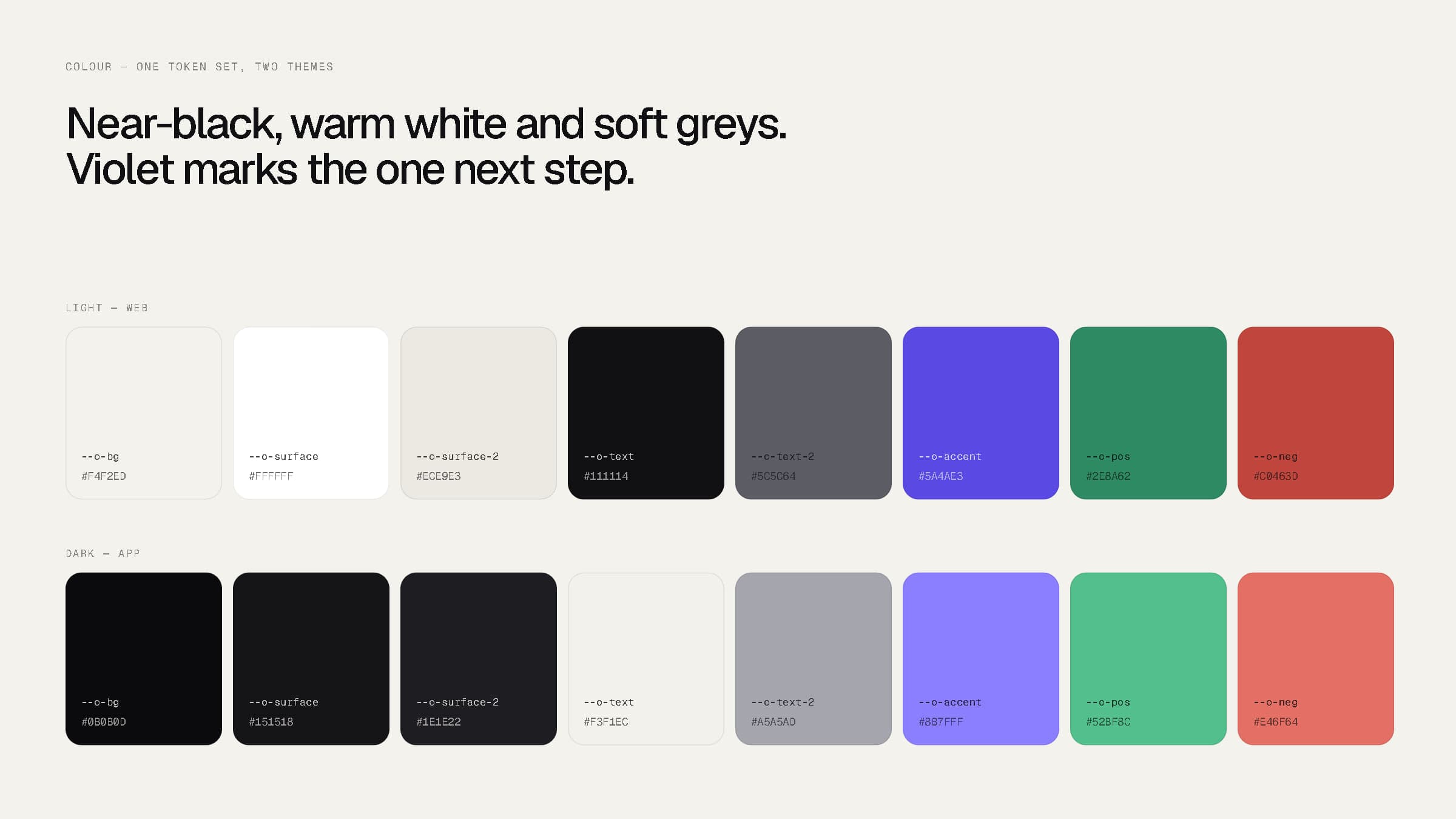
One token set, two themes.
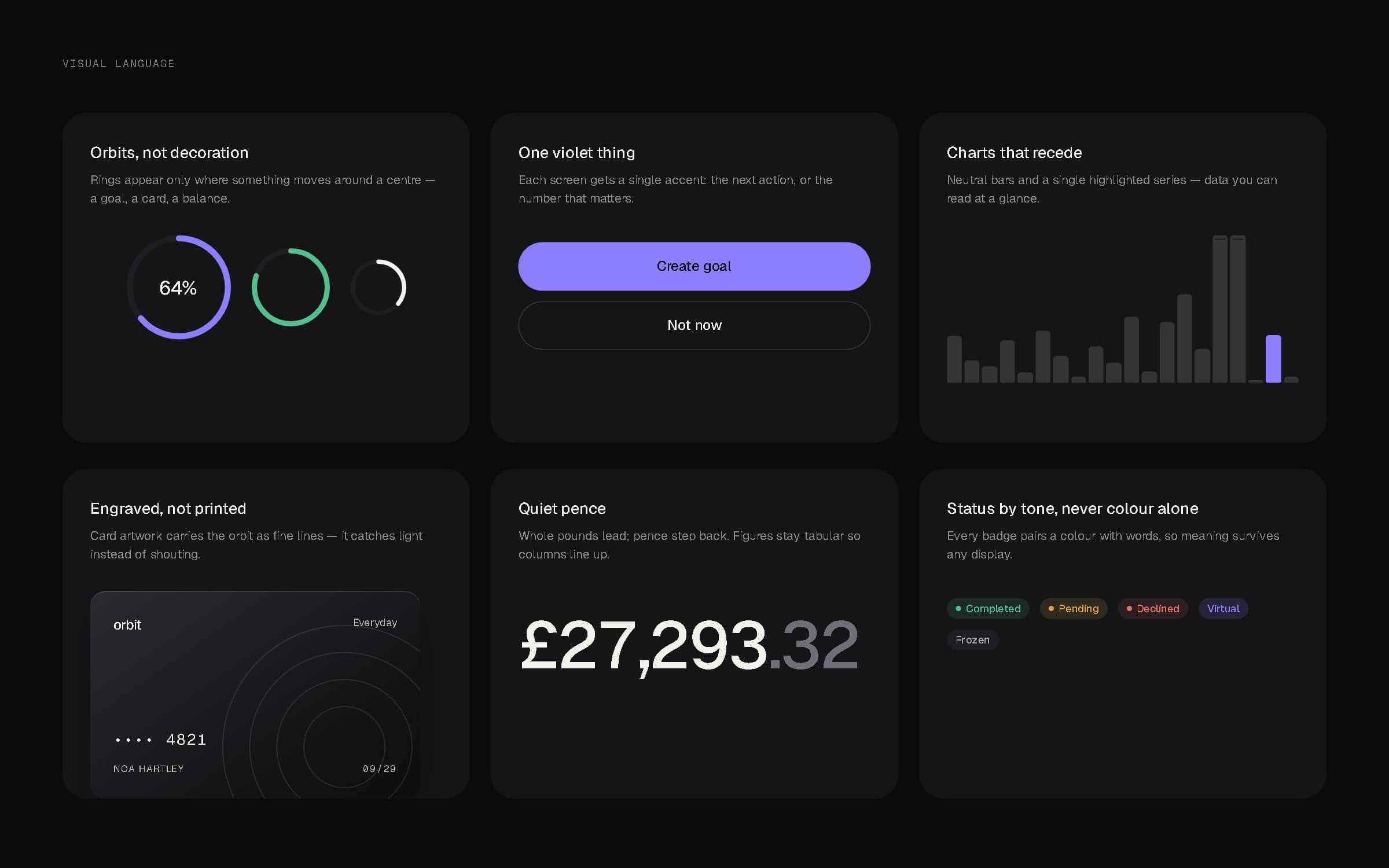
Visual language — orbits, one violet thing, charts that recede, engraved cards, quiet pence, status by tone.
05Product experience — mobile
Sixteen screens, one calm system.
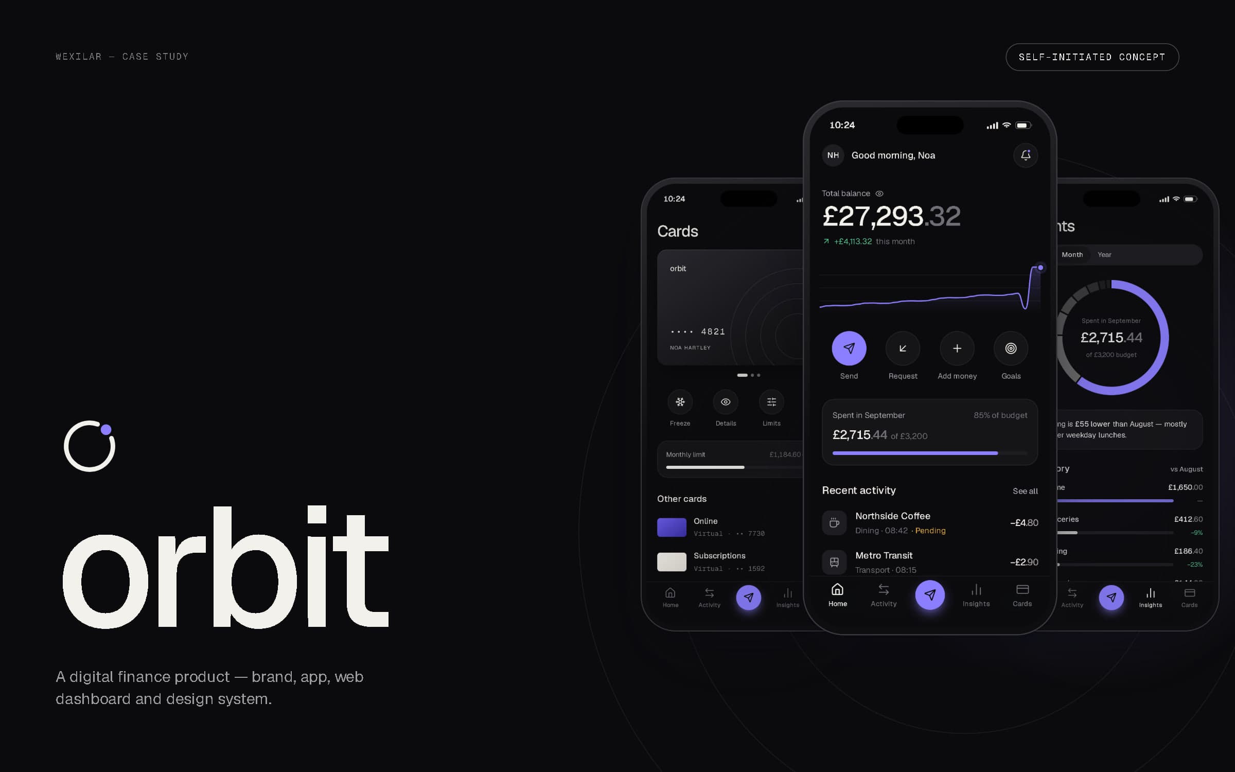
Home answers “how much do I have?” before anything else, with this month's change beneath it and the four things people do most — send, request, add money, goals — one tap away. Activity, insights and cards live in the tab bar, and sending money is the single violet action in its centre.
The app runs from onboarding and sign-in through accounts, activity, a single payment, insights, goals, cards, transfers, notifications, profile and security. Each screen is a real route in the prototype, not a flat mock-up.
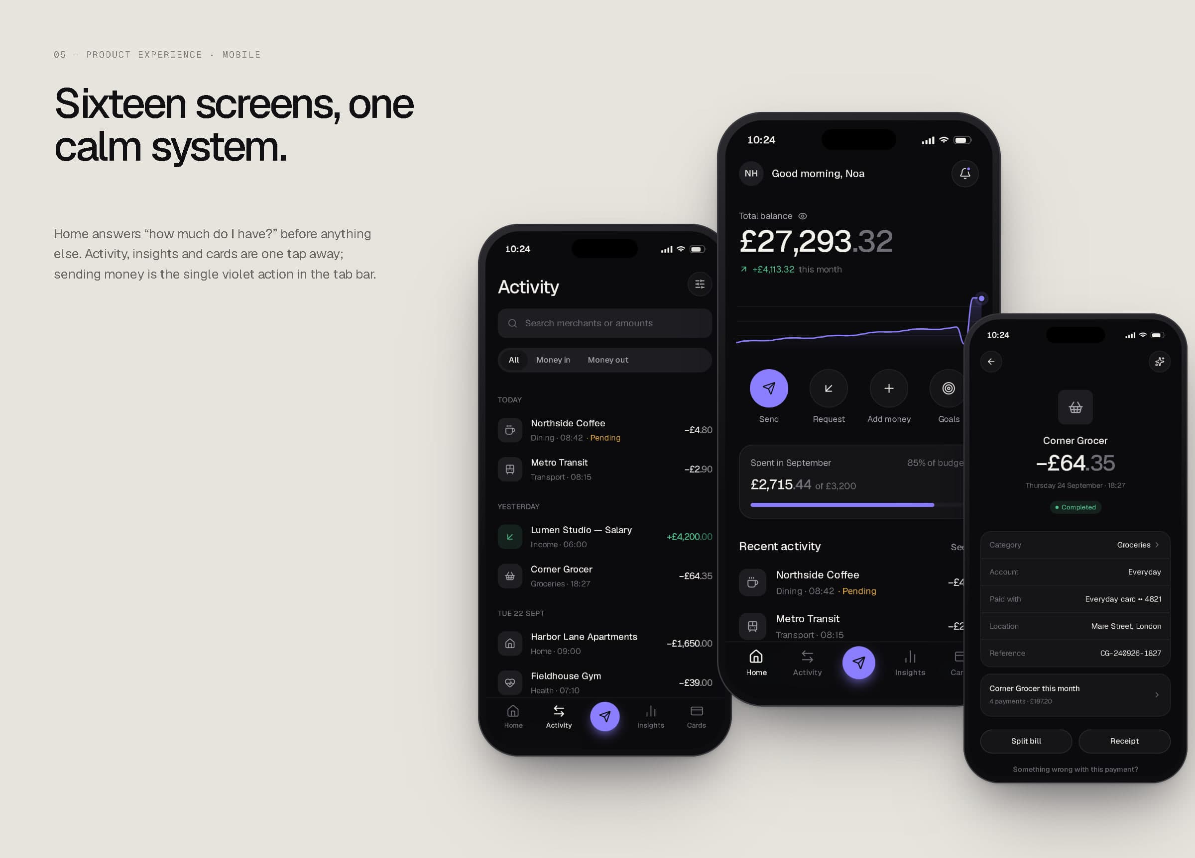
Activity, home and a payment in detail.
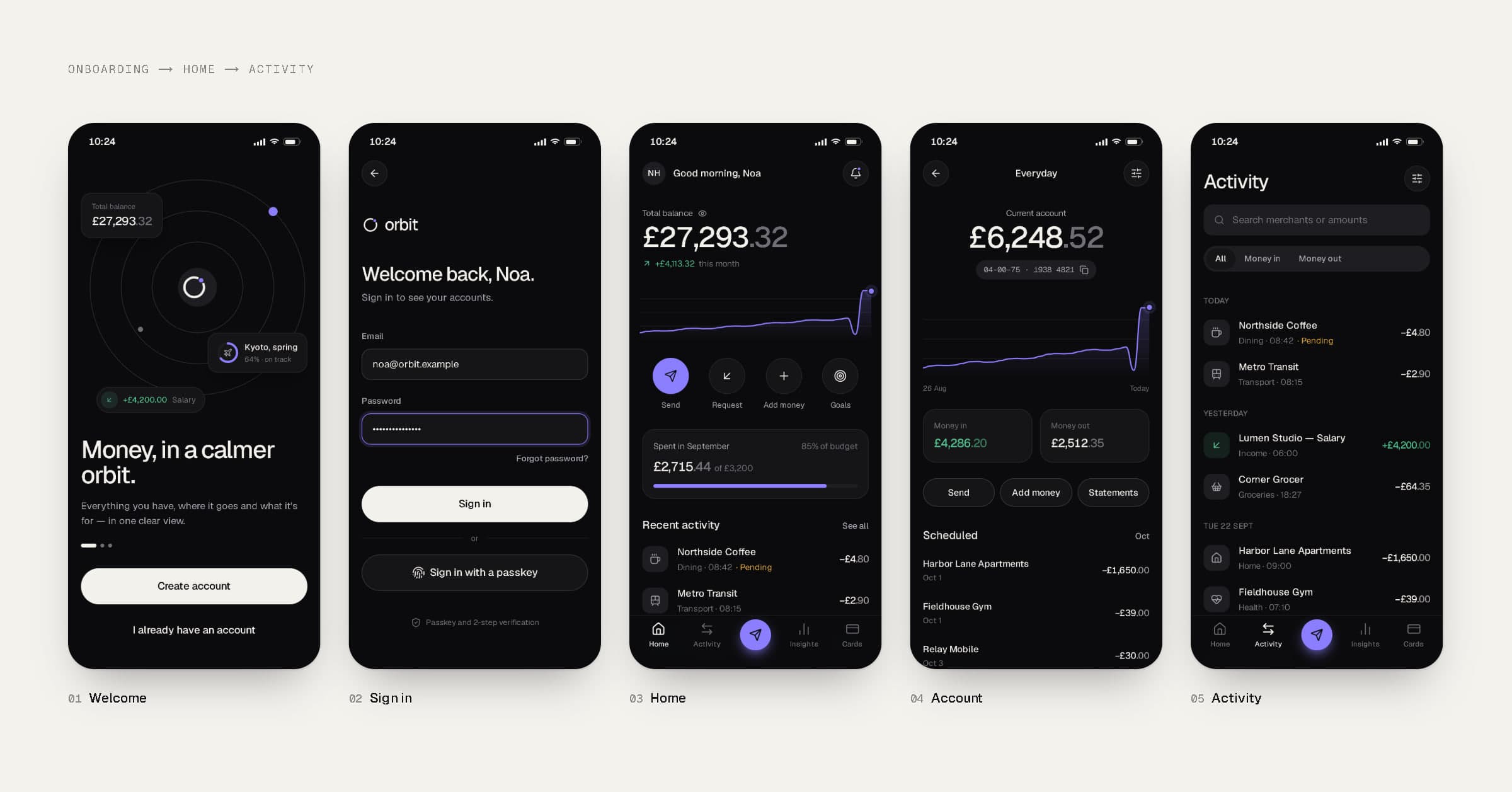
Welcome, sign in, home, account and activity.
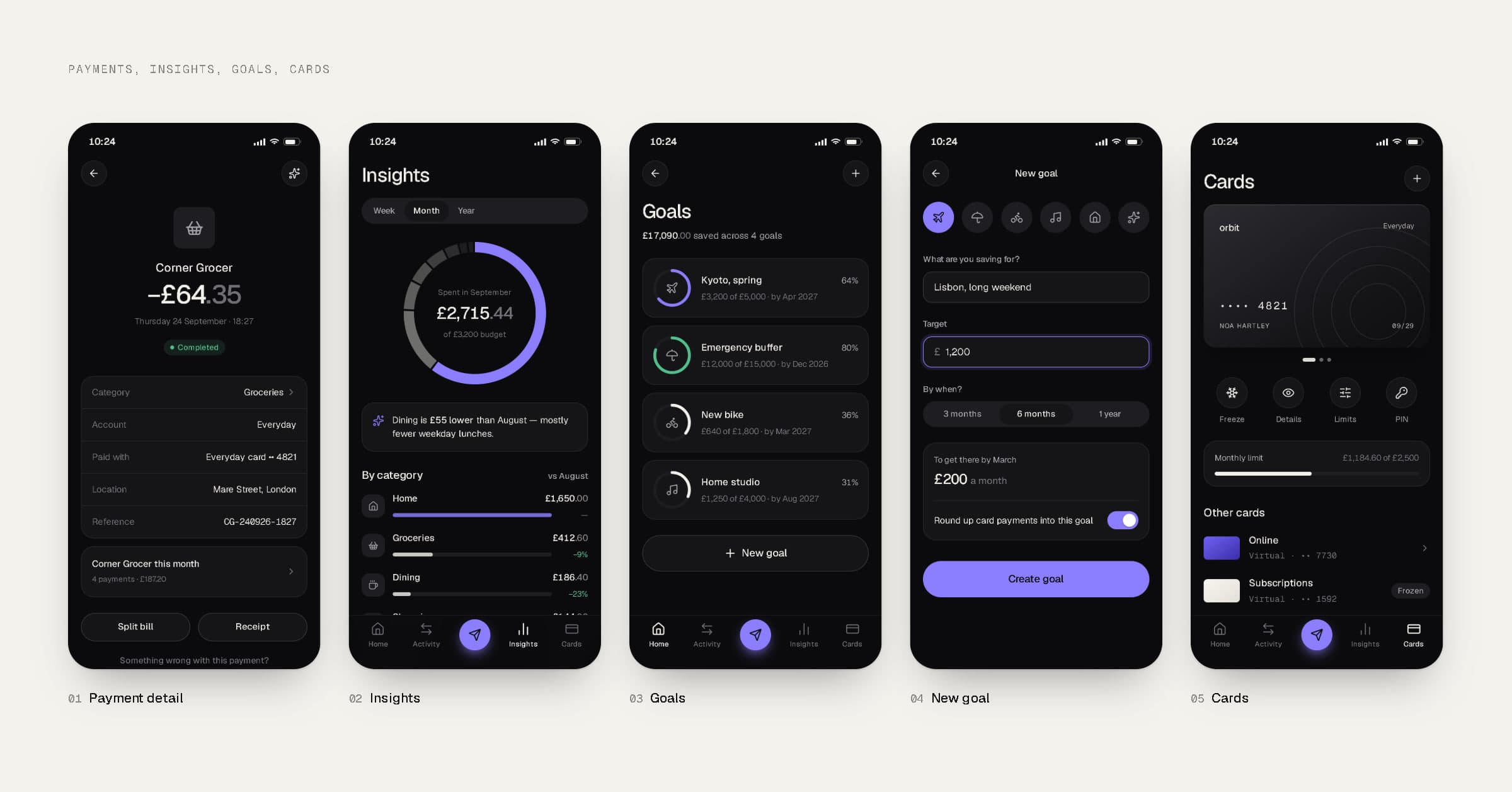
Payment detail, insights, goals, a new goal and cards.
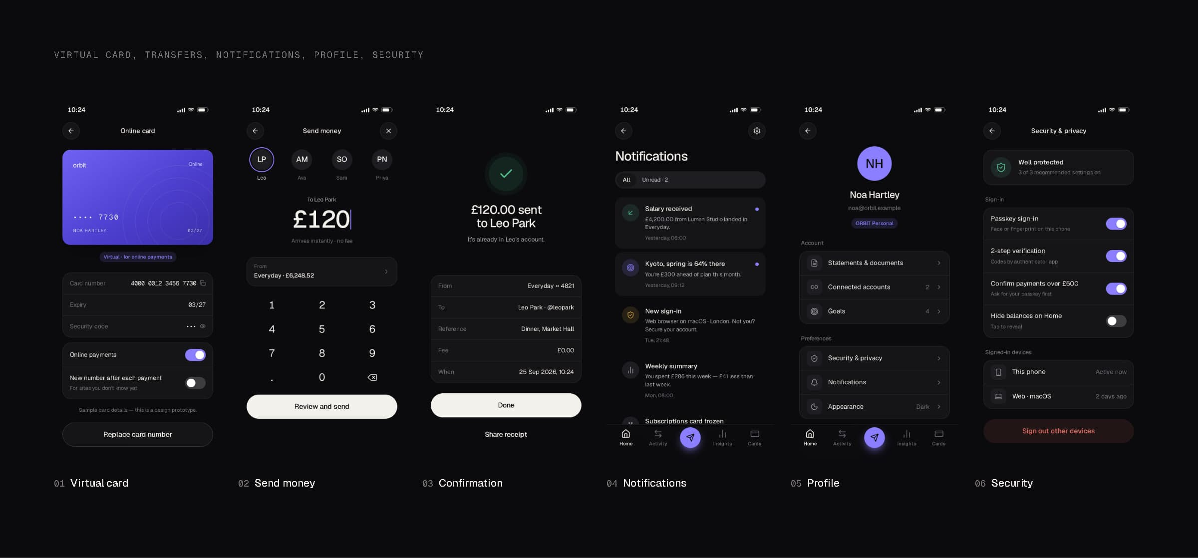
Virtual card, send money, confirmation, notifications, profile and security.
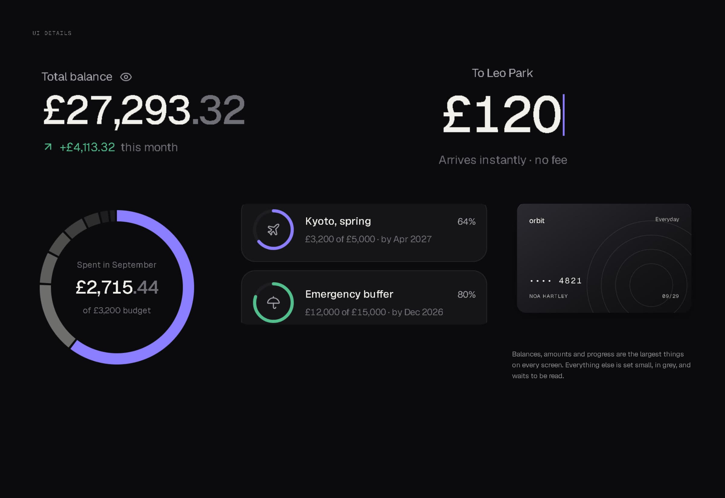
Balances, amounts and progress are the largest things on every screen; everything else waits to be read.
06Core flows
The three jobs people open a money app to do.
Checking a balance and a payment: two taps from the total to a single transaction, and every level keeps the number you started from in view. Sending money: recipient, amount and source account on one screen, then a confirmation that says what happened in plain words and gets out of the way. Planning: insights explain the month in one sentence, and a goal is three decisions — name, target, date — while ORBIT works out the monthly amount.
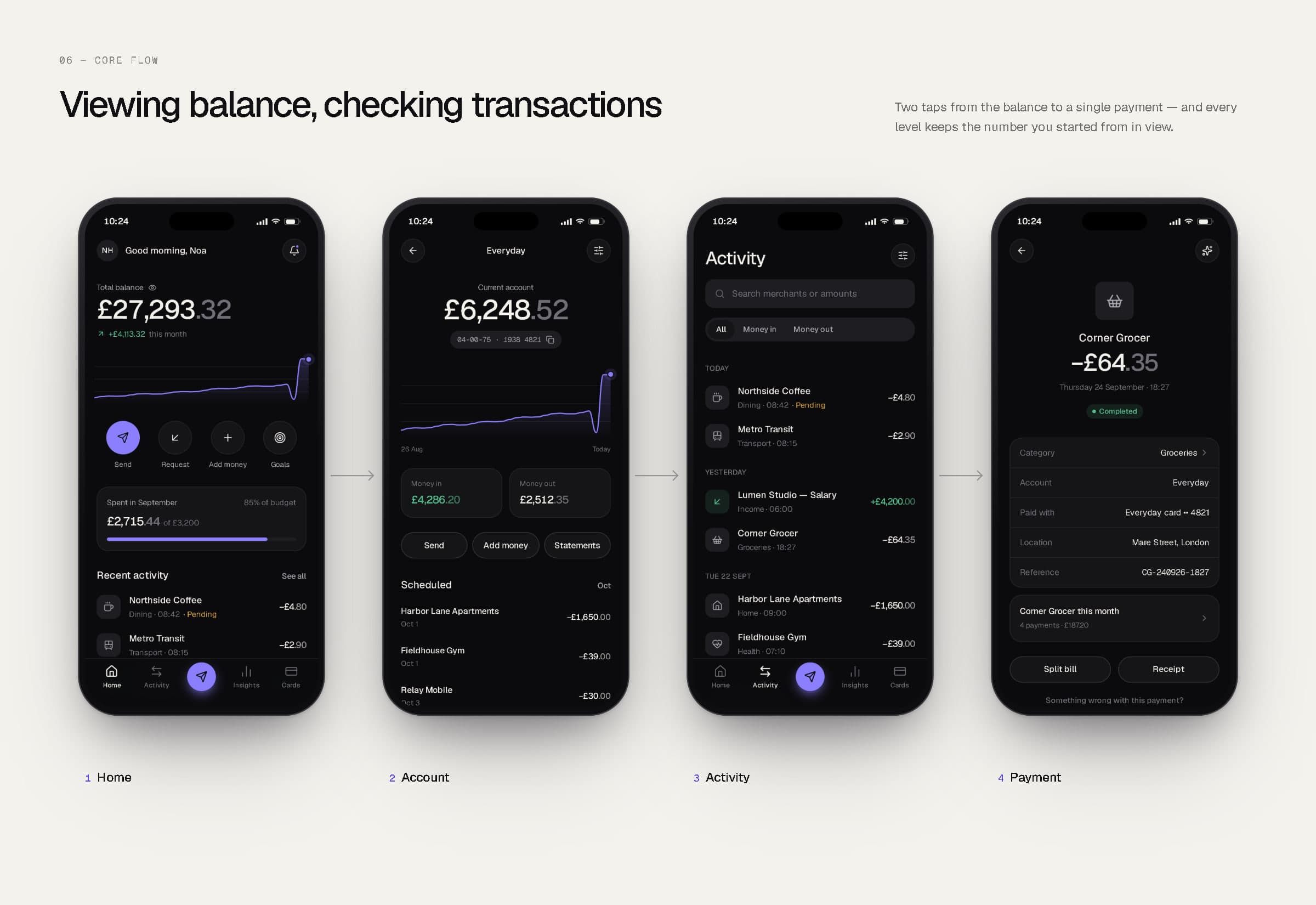
Viewing a balance and checking transactions.
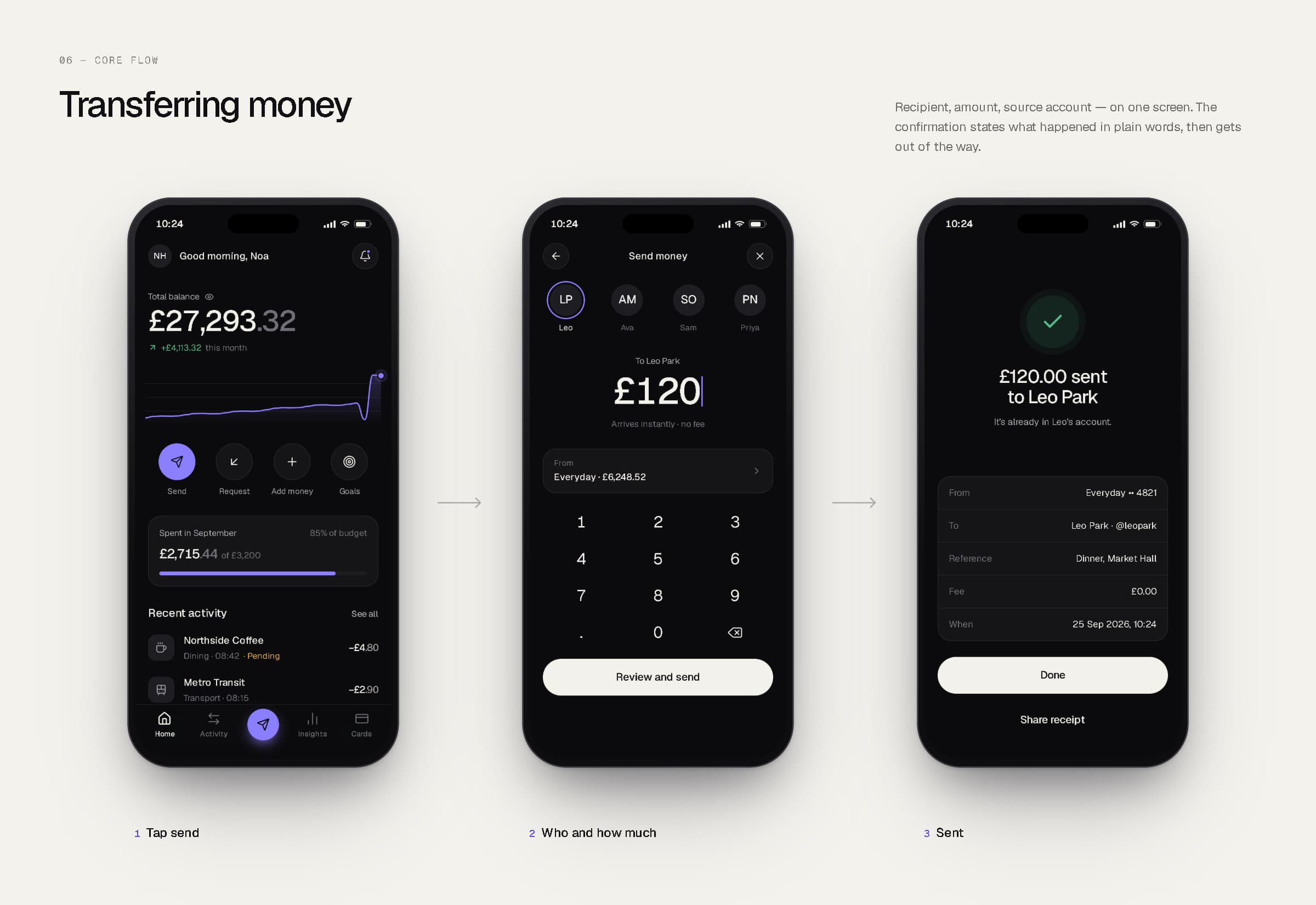
Transferring money.
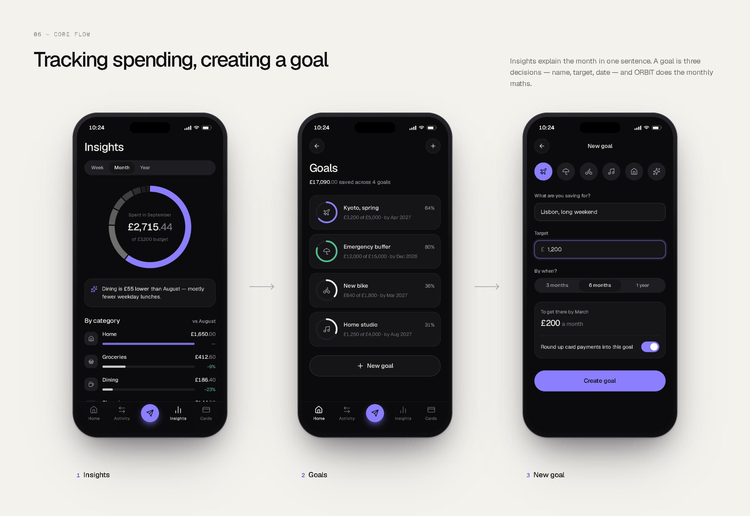
Tracking spending and creating a goal.
07Design system
Components first, screens second.
ORBIT's screens are assembled from one component library: buttons with a single accent variant, inputs with focus and error states, segmented tabs, switches, status badges, avatars, progress bars, transaction rows, payment cards, toasts and confirmation sheets — plus area, bar, donut and ring charts drawn for the product. Both boards below are rendered from those live components, not redrawn for the presentation.
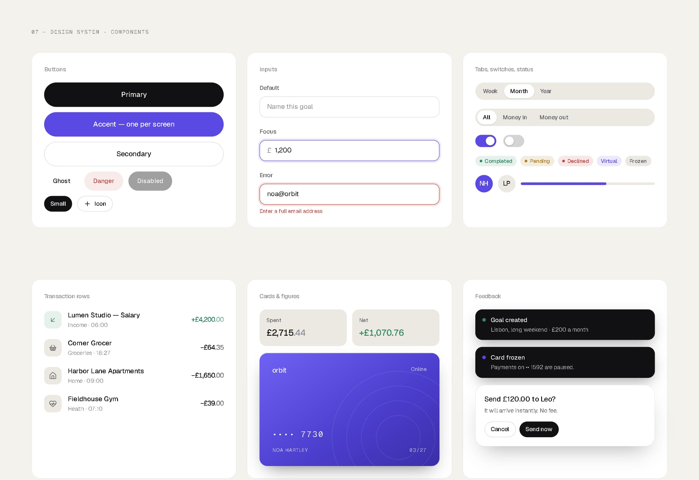
Components — light theme.
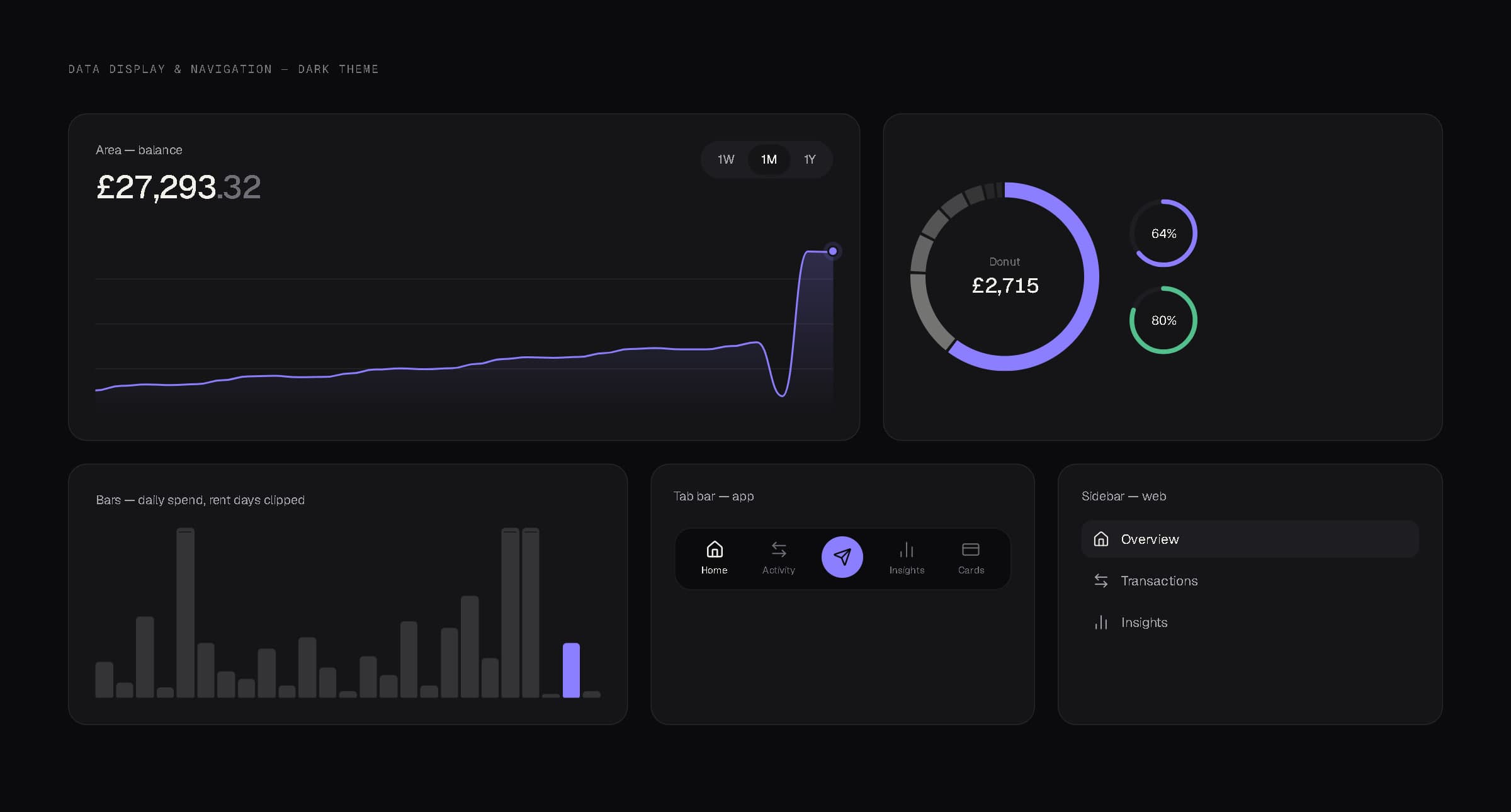
Data display and navigation — dark theme.
08Web experience
The same money, with room to plan.
The web dashboard is where people sit down with their finances rather than glance at them: an overview of balance, accounts, the month's spending, recent transactions and goals; a full transaction table with filters and a detail panel; and dedicated views for insights, cards, goals and settings. It shares the app's tokens and components, in the light theme.
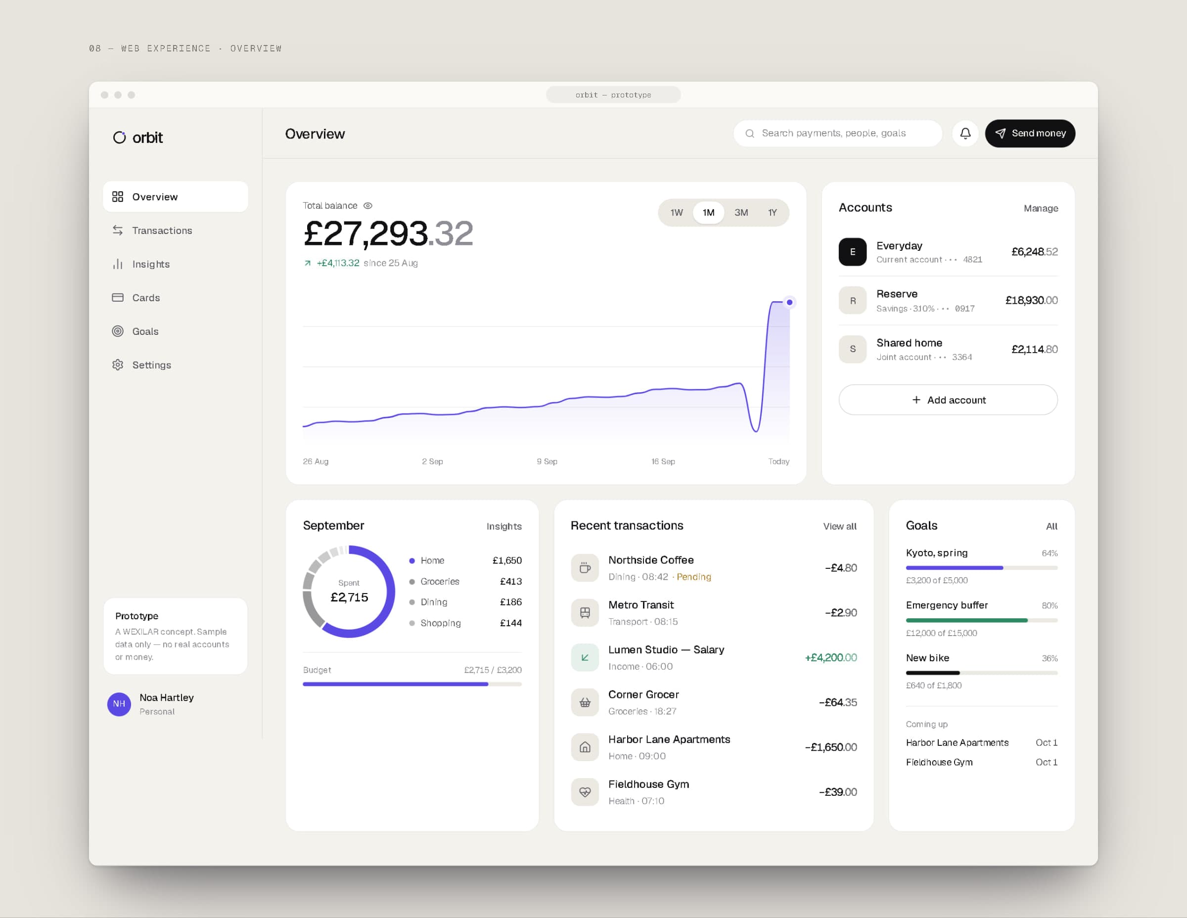
Overview.
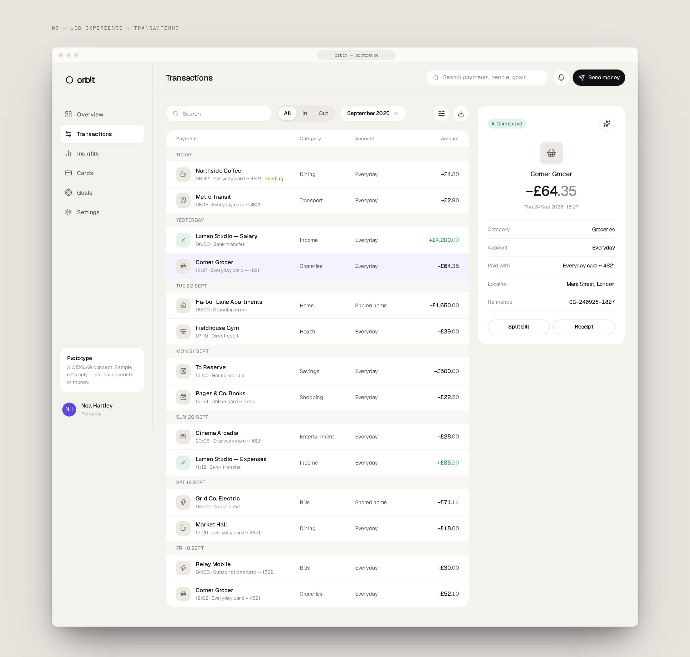
Transactions, with a payment open in the side panel.
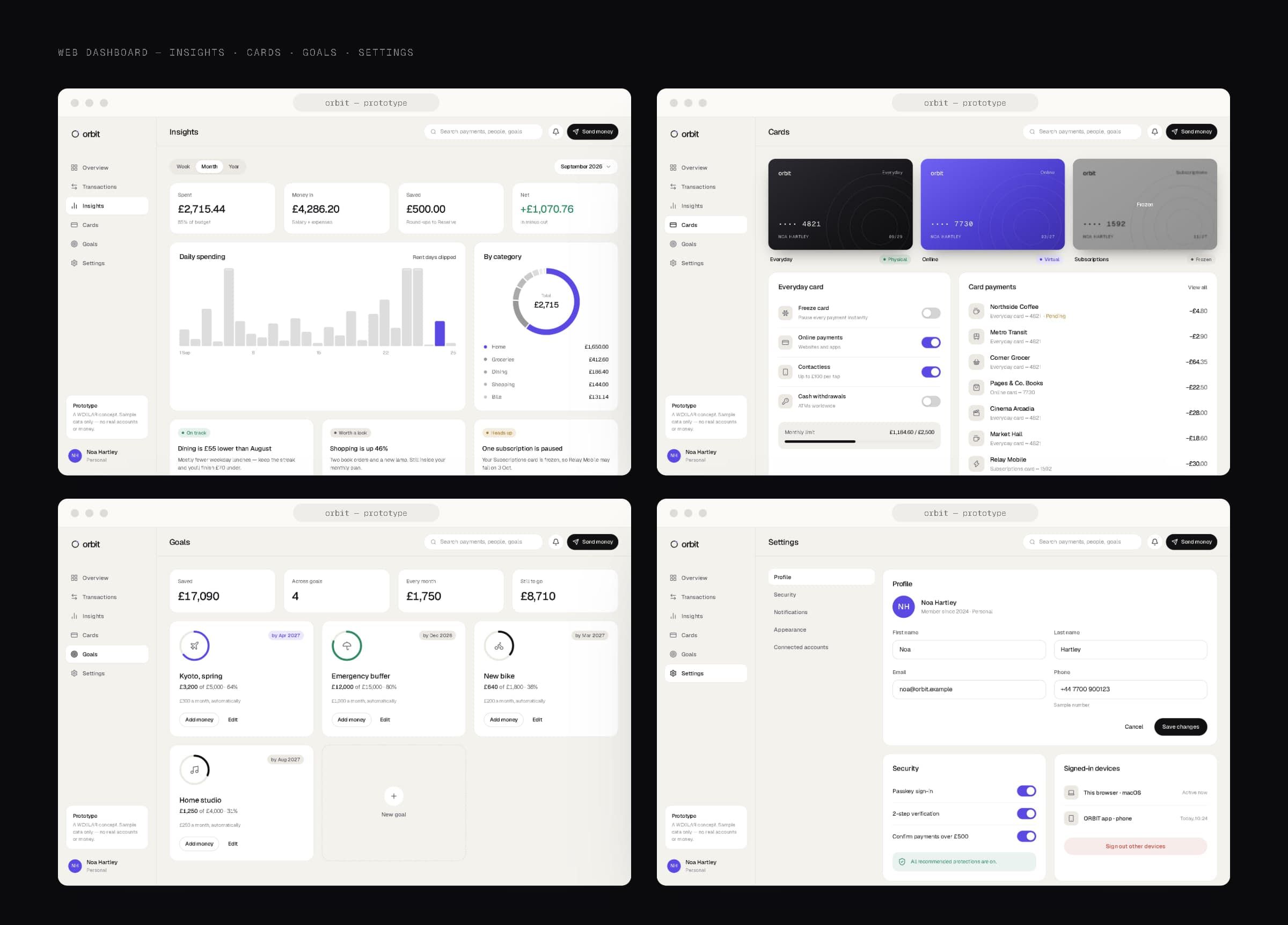
Insights, cards, goals and settings.
09Responsive
One component library, three layouts.
At 1440 pixels the dashboard has a full sidebar; at tablet width it folds into an icon rail; on a phone it becomes a tab bar with stacked cards. The tokens, data and components stay the same at every size — only the layout changes.
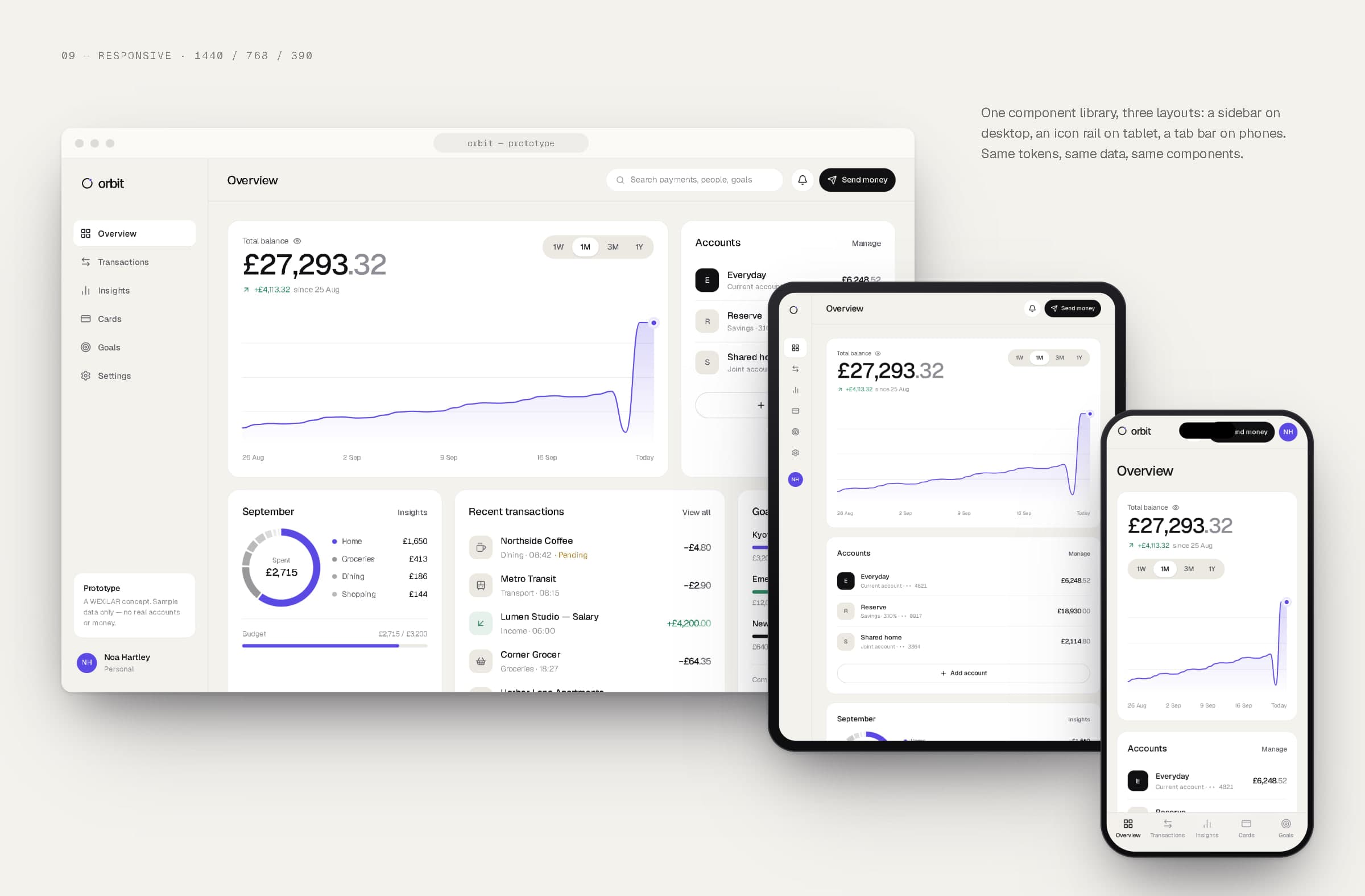
Desktop, tablet and phone.
10Technology
How the product would be built.
To design the product honestly we sketched how it would work: app and web clients behind one API contract, passkey sign-in with short-lived sessions, domain services for accounts, payments, insights, goals and notifications, and an append-only ledger feeding an event stream — so a card payment becomes a categorised transaction, an updated budget and, only when a rule you set is crossed, a notification.
This architecture is illustrative. The prototype itself is a Next.js app running on sample data: one token file drives the light and dark themes, one component library renders both the phone app and the web dashboard, and every screen in this case study is a screenshot of it. None of the services, providers or integrations shown exist in production.
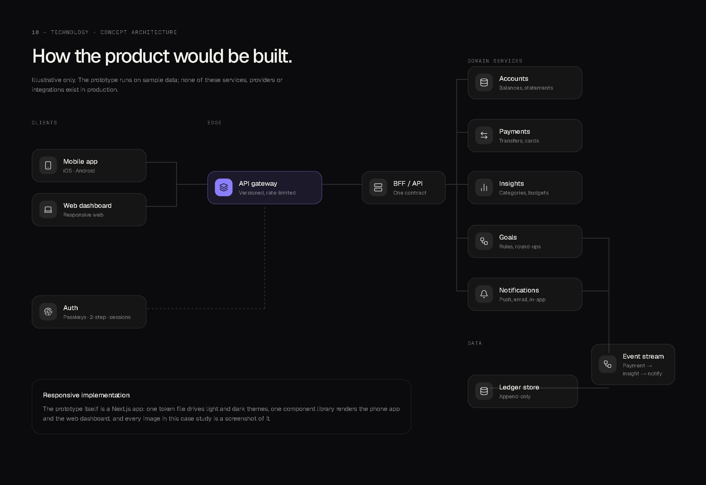
Concept architecture — illustrative only.
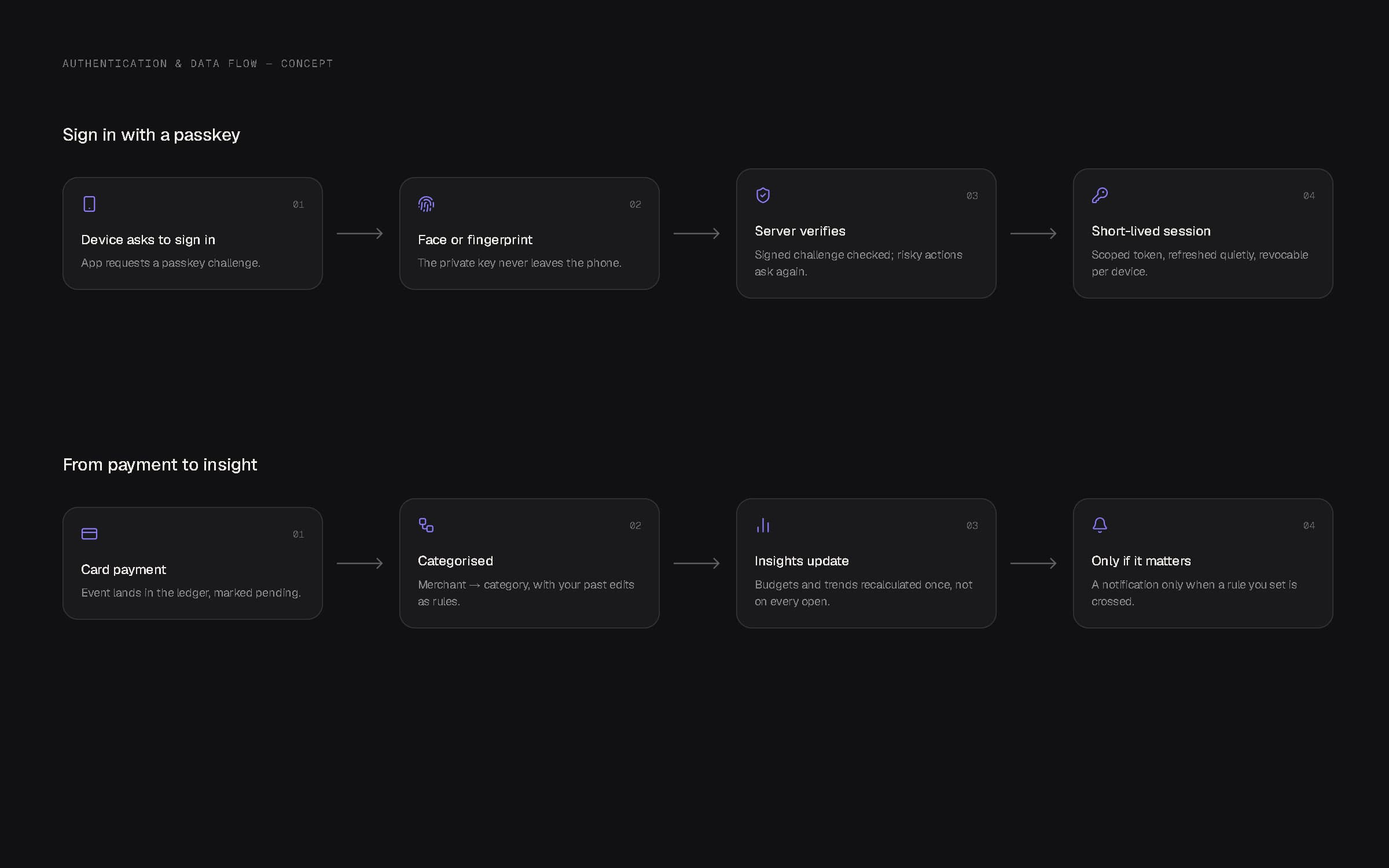
Passkey sign-in, and a payment's path to an insight.
11Applications
Beyond the screen.
A physical card in graphite or pearl with the orbit engraved as fine lines, a violet virtual card for online payments, and launch graphics built from the product itself — real screens and real components, never a promise the app can't keep.
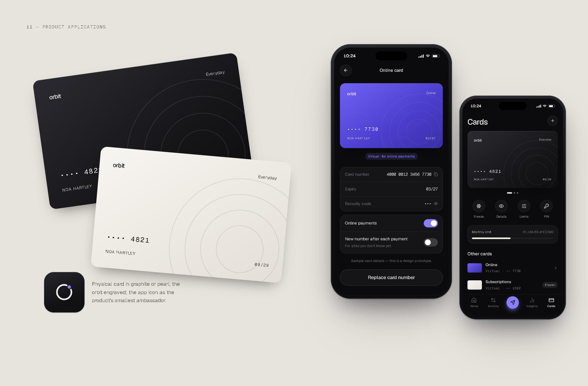
Payment cards and the cards screens.
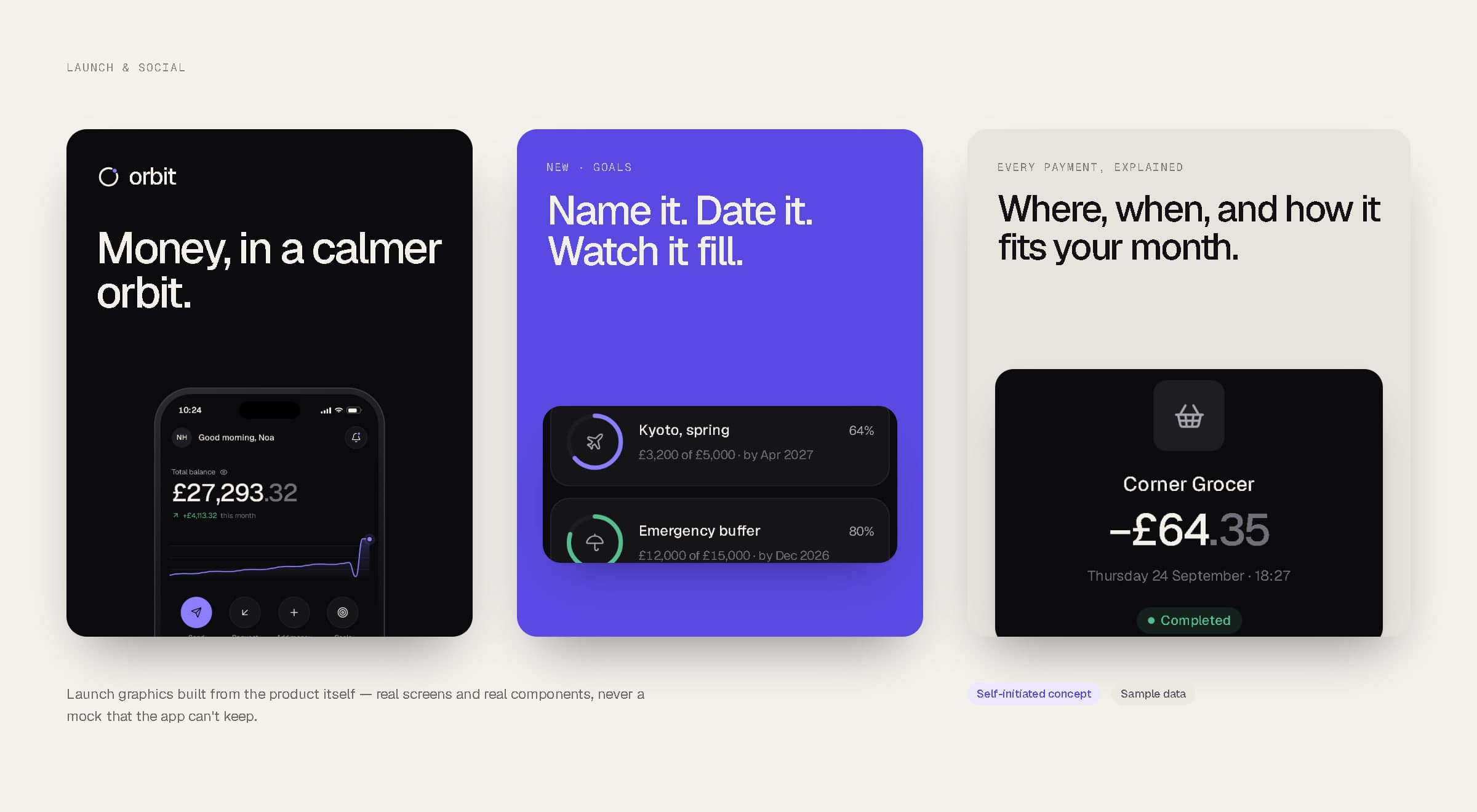
Launch and social graphics.
A complex domain can still feel immediate — if every screen answers one question well.
12Final showcase
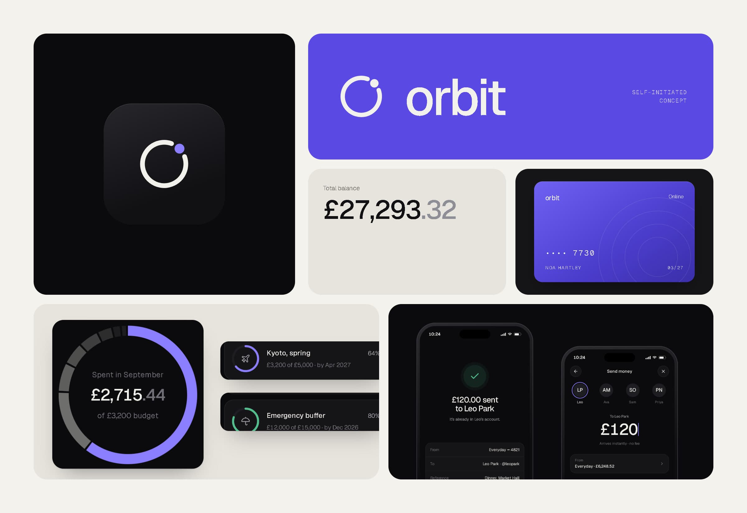
Brand, app, dashboard and system — together.
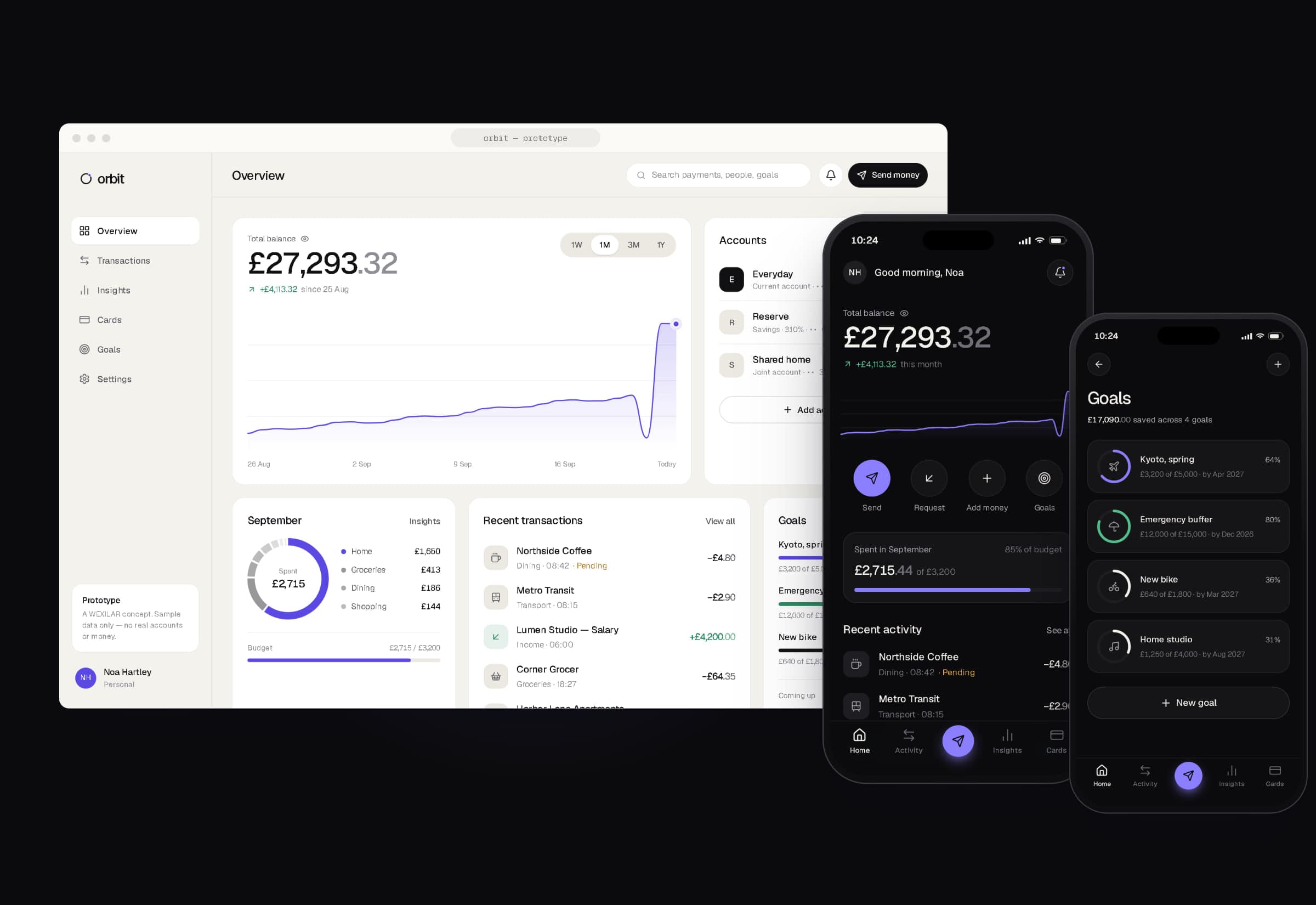
The ORBIT prototype is live at wexilar.com/concepts/orbit (web dashboard) and wexilar.com/concepts/orbit/app (mobile app, best viewed at phone width). It runs entirely on sample data.
- Strategy & identity
- WEXILAR
- Product design & development
- WEXILAR
- Data
- Sample data only — no real people, accounts, transactions or metrics
- Status
- Self-initiated concept — not a real bank, app or client project