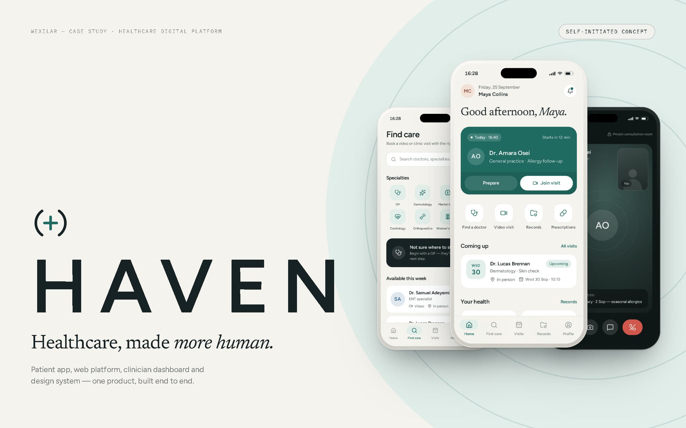
HAVEN
- Year
- 2026
- Type
- Self-initiated concept
- Services
- UI/UX & Product Design, Web Applications, Branding & Visual Identity
- Type
- Self-initiated concept
- Year
- 2026
- Scope
- Product strategy, brand identity, UI/UX, design system, mobile & web product design, front-end development
- Deliverables
- Mark & wordmark, app icon, token system, 21-screen patient app, responsive patient web platform, clinician dashboard, concept architecture
02Introduction
A healthcare product that feels like it was designed around the patient.
HAVEN is a self-initiated WEXILAR concept: an imagined healthcare platform, designed and built end to end to show how we approach a complex, sensitive digital product. It is not a real healthcare company, hospital, clinic or doctor network, it has no patients, and nothing in it is medical advice. Every doctor, patient, record and prescription in these screens is sample data.
The vision is simple to say: find the right care, see a doctor — face to face or from home — and keep every summary, result and prescription in one calm place. For clinicians, the same platform becomes a quiet workspace for the day.
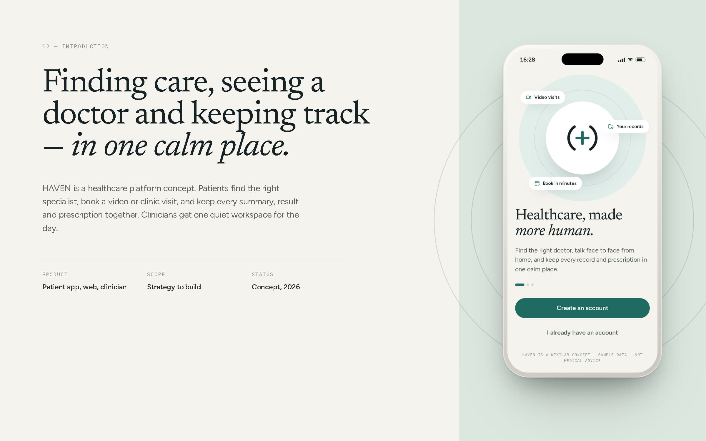
The welcome screen of the HAVEN patient app.
03The opportunity
Care is out there. Getting to it is the hard part.
A single visit to a doctor can involve a search engine, a phone queue, a portal login, a waiting room, an email and a paper letter. Specialty names rarely match how people describe what's wrong, so the first choice is often a guess. Video consultations exist, but joining one can feel like a test of your equipment. And afterwards, summaries, results and prescriptions scatter across inboxes and drawers.
None of these are clinical problems — they are experience problems. That is where design can help: fewer handoffs, plainer language, and one place that remembers.
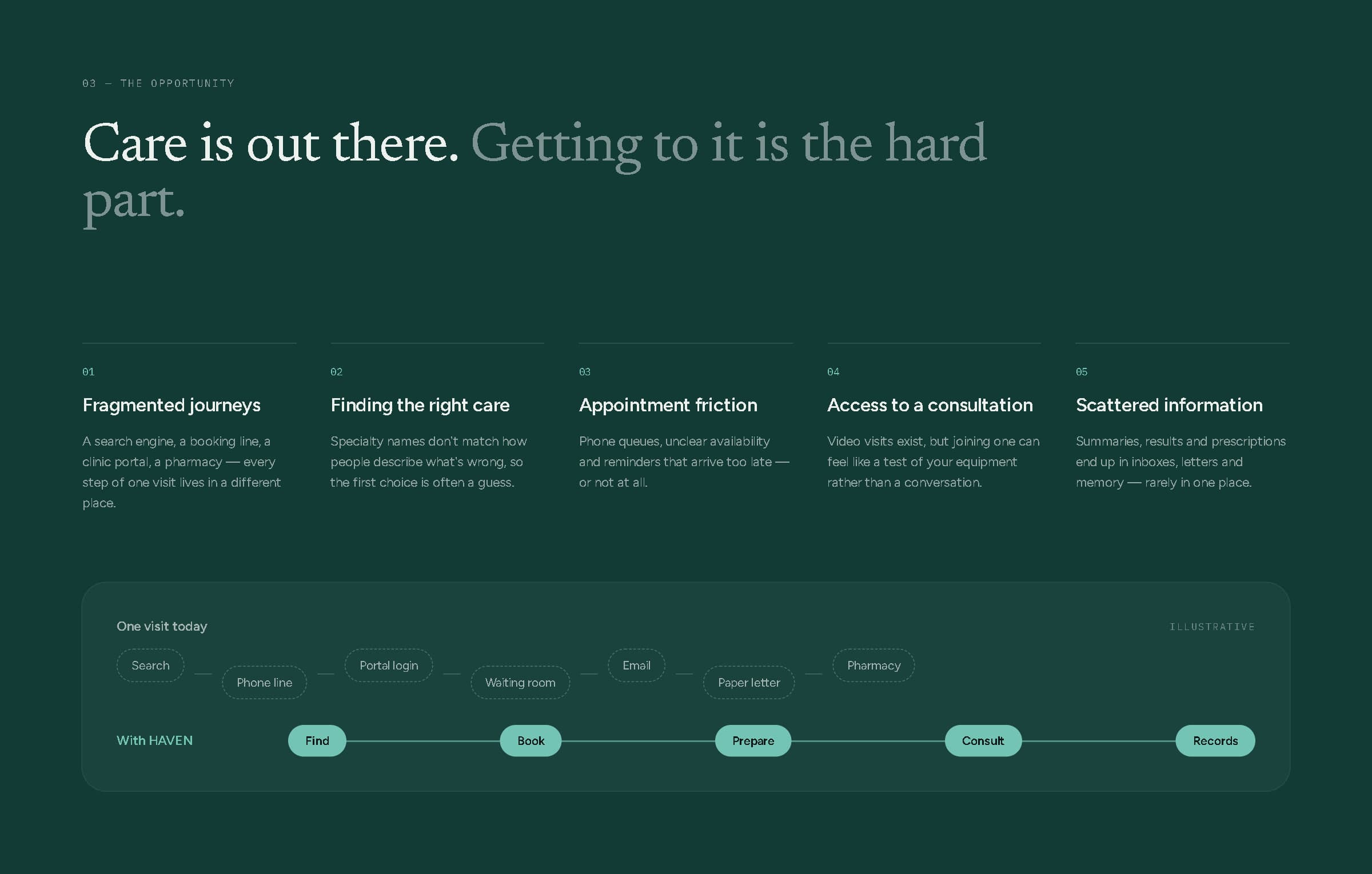
Five sources of friction, and one visit's journey today compared with HAVEN's single path (illustrative).
Find, book, prepare, consult, keep the record — one path, in plain words.
04Product direction
Two experiences, one shared record of care.
Patients discover doctors and specialties, read real profiles, book video or clinic visits, prepare, consult online, and keep their records, prescriptions and health information together — with notifications that arrive when they are useful. Clinicians see their schedule and today's appointments, open a patient's information, consult, write notes and prescribe from one dashboard.
Both sides sit on the same shared platform — scheduling, consultations, records and notifications — so what a doctor writes is what the patient sees.
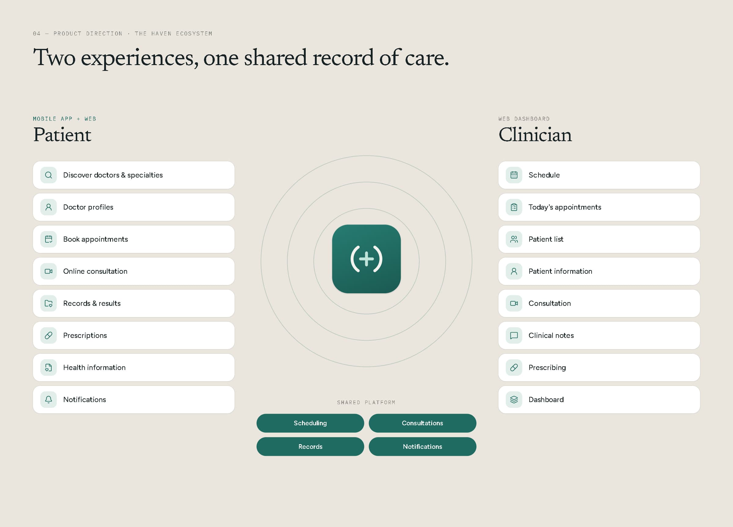
The HAVEN ecosystem: patient features, clinician features and the shared platform between them.
05Brand identity
A plus, held between two open arcs.
The HAVEN mark is a plus — care — held between two arcs, like hands around something that matters. The arcs never close: a haven shelters without shutting anyone in. It is drawn on a 32-unit grid from two 12-unit arcs of 110° and a 10-unit plus, all in one stroke weight. The wordmark is set in Figtree capitals, tracked wide so it reads calm and steady.
The app icon keeps the idea at its smallest — warm white arcs and a mint plus on deep teal — legible at 32 pixels on a crowded home screen.
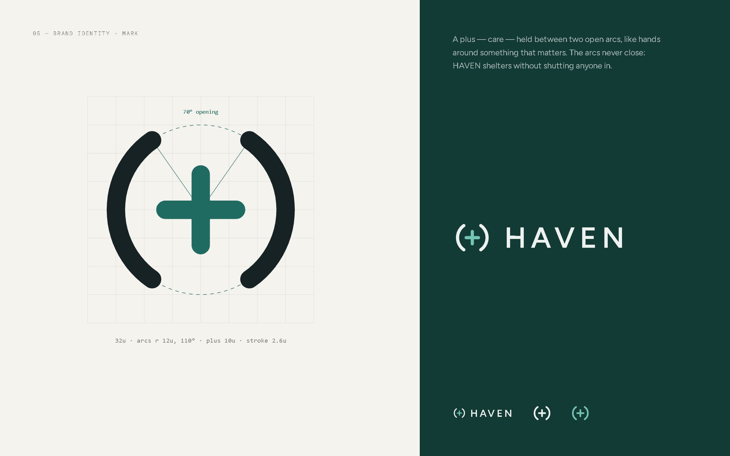
Mark construction and lockups.
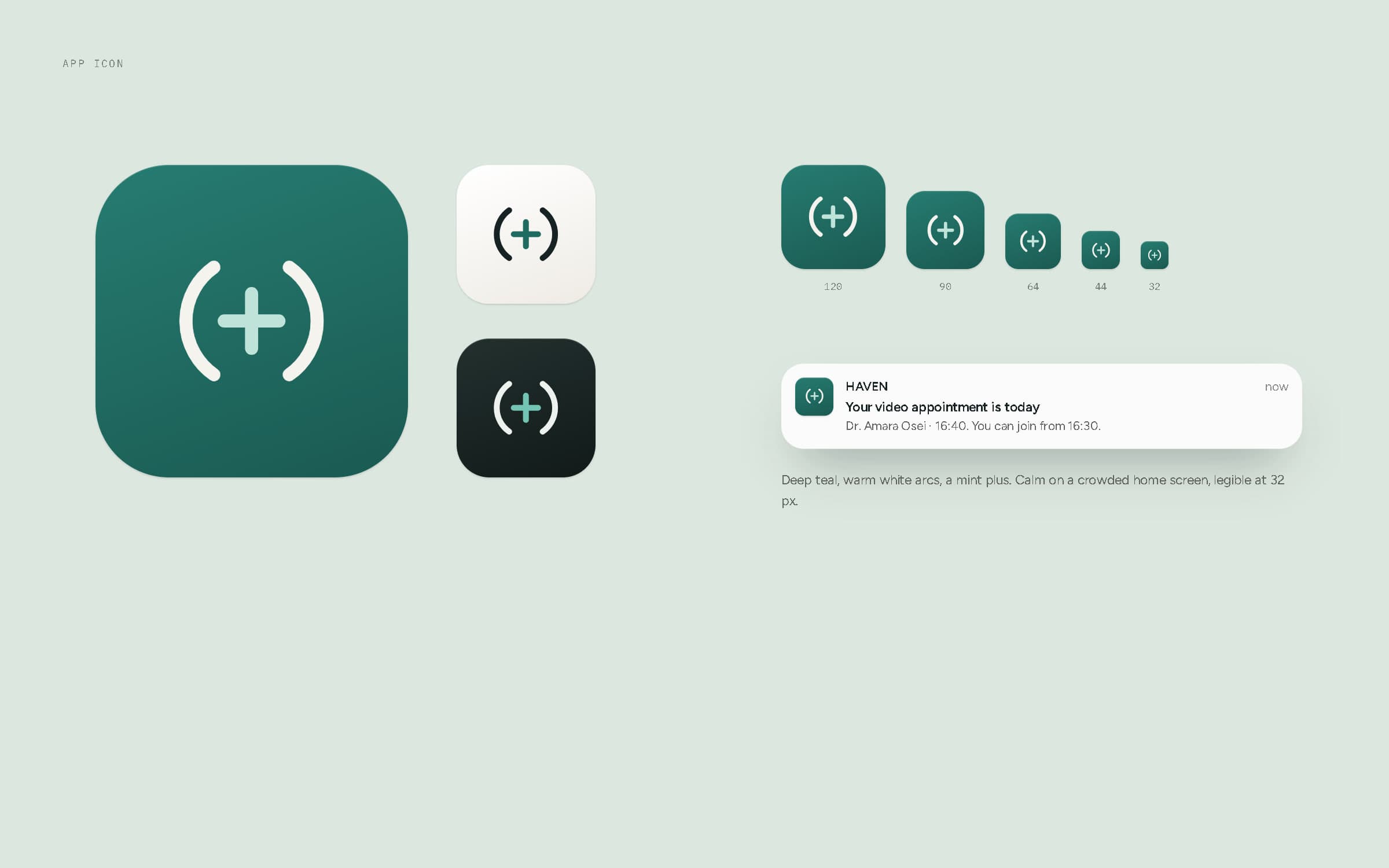
App icon in teal, light and dark, from 120 to 32 px, and in a notification.
Colour & typography
Warm neutrals and a deep, steady teal.
The palette avoids the sterile blue-and-white of many clinical products. Warm whites and linen greys make the interface feel domestic rather than institutional; a deep teal carries every primary action; charcoal carries type. Soft sage, clay, sky and sand tints identify people and categories, and four status colours — always paired with words — mark what's ready, what needs attention and what's critical.
Figtree does the interface work: open letterforms that stay clear at small sizes and for readers who need larger text. Newsreader, an editorial serif, is kept for human moments — a greeting, a confirmation, a health guide. IBM Plex Mono labels tokens and references.
- Warm white#F5F3EEGround
- Linen#EEEBE4Surfaces
- Haven teal#1F6B62Primary actions
- Deep teal#123B36Brand moments
- Charcoal#172225Type
- Mint#74C4B5Accent on dark
Teal is the single action colour on every screen; supporting tints are used for avatars and categories, never for text.
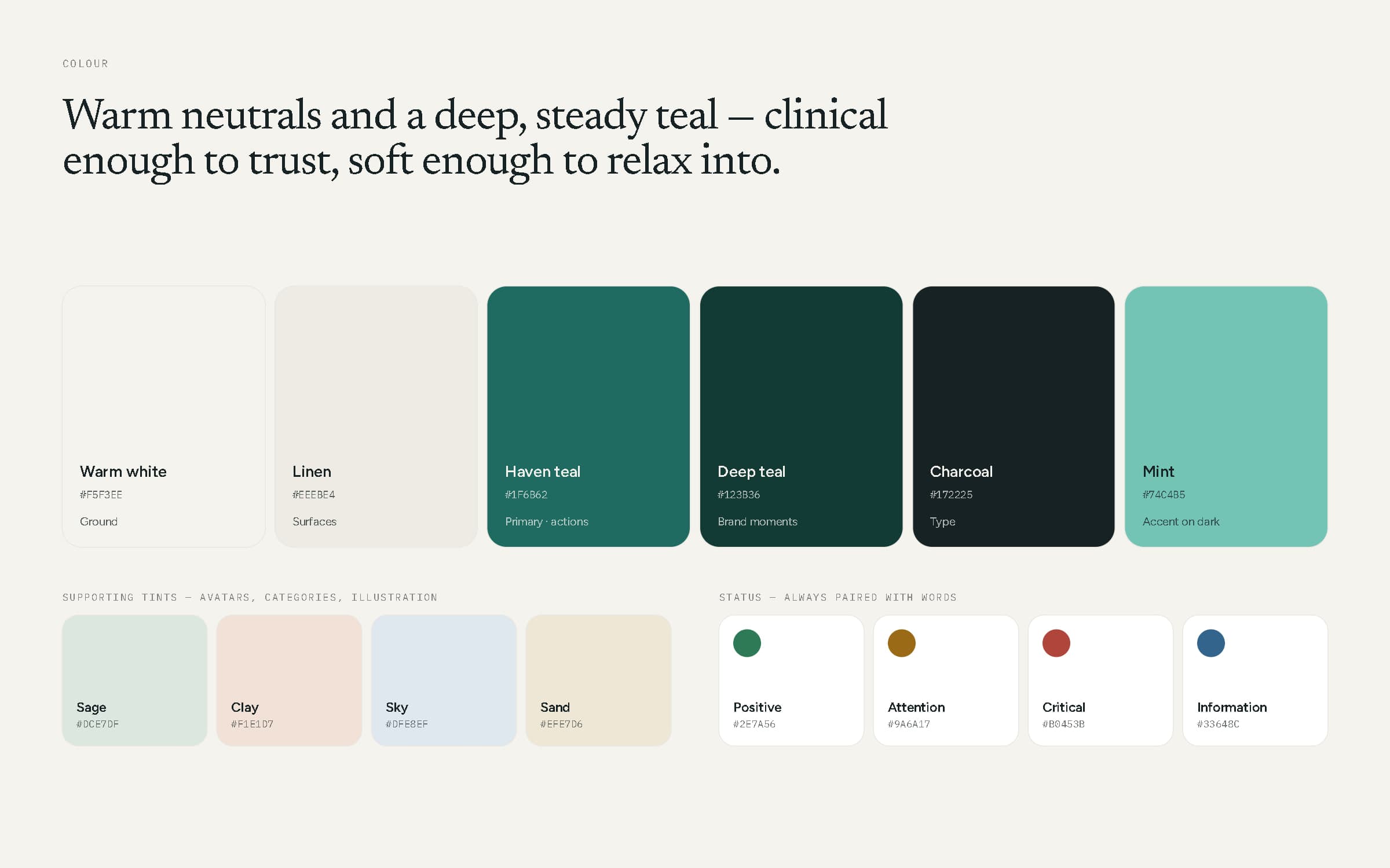
Colour system — primary, supporting tints and status.
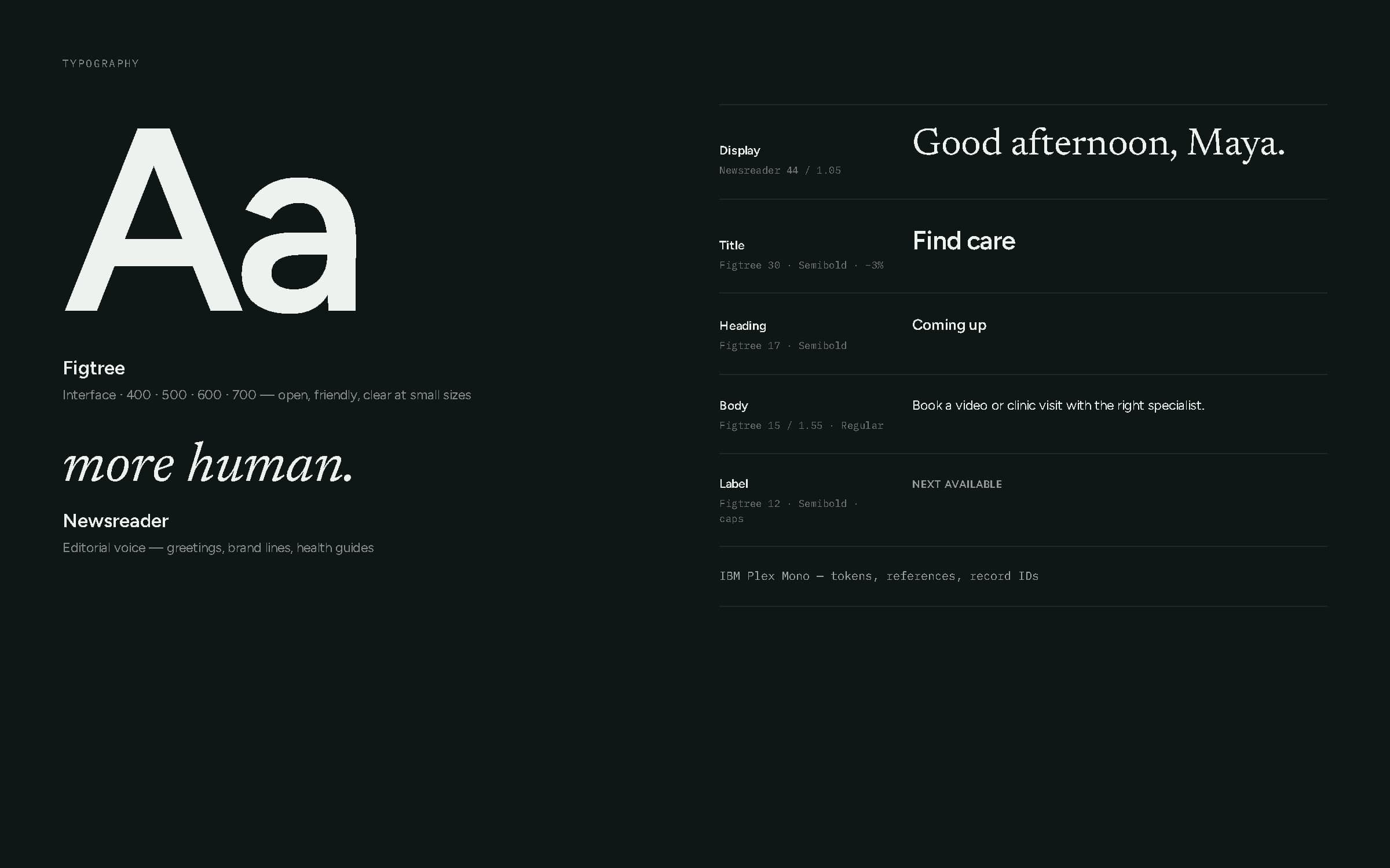
Typography — Figtree, Newsreader and a five-step scale.
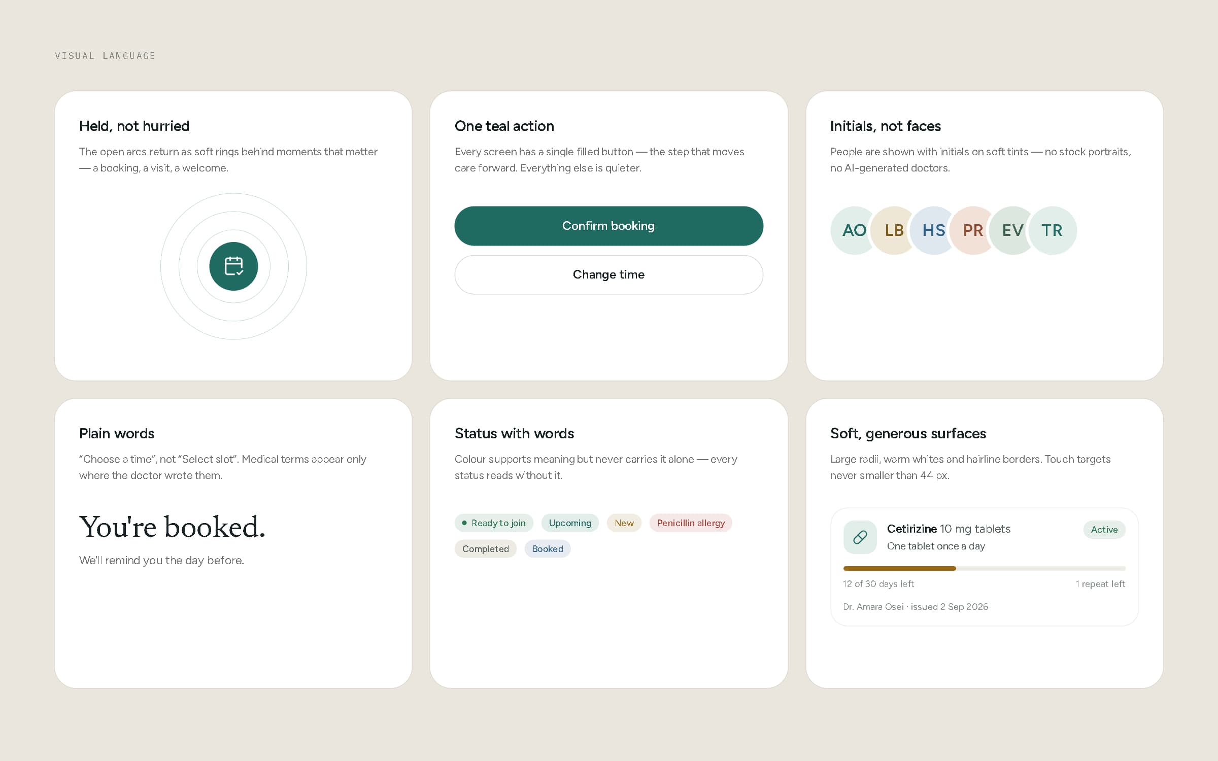
Visual language — held, not hurried; one teal action; initials, not faces; plain words; status with words; soft surfaces.
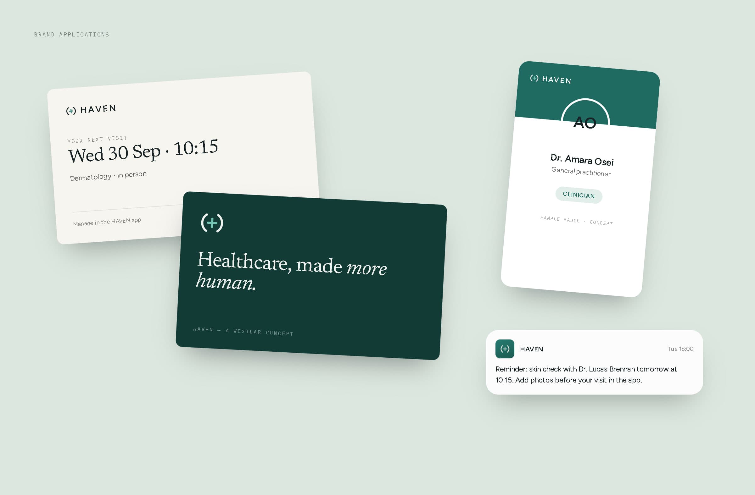
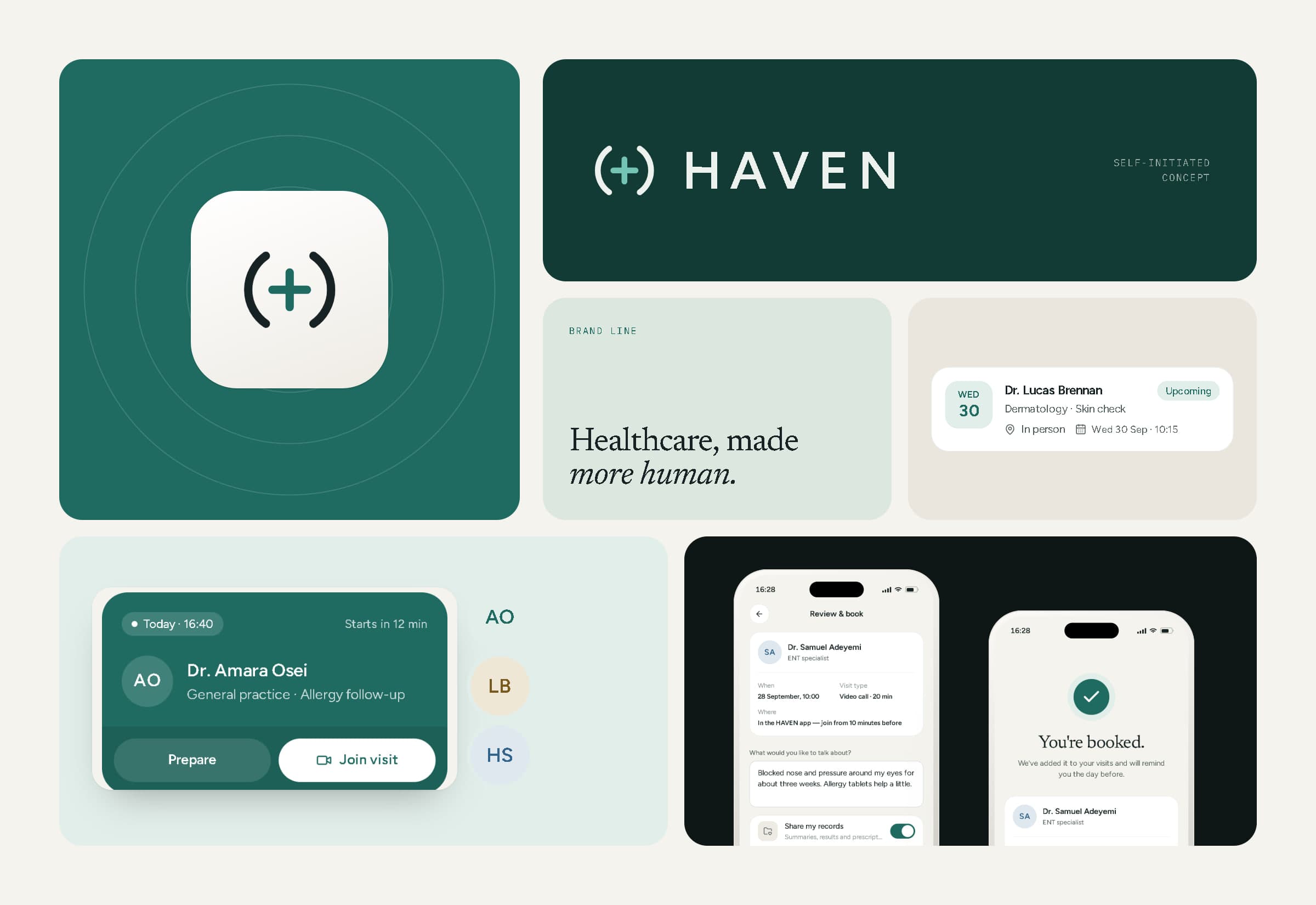
Brand applications — appointment card, brand card, clinician badge and a reminder message (all sample).
06Design system
Components built for care, not just for screens.
One token set drives two themes: the light product, and a dark consultation room where the video is the only thing that matters. On top sit the general components — buttons with one primary action per screen, inputs with focus and error states, tabs, chips, switches, navigation, modals, toasts and notifications — and a layer made for healthcare: doctor cards and rows, appointment cards, a time picker, prescription cards with supply left, record rows and health-data tiles.
Health readings are always shown as data with their source — never as a diagnosis. Every board below renders the live components from the prototype.
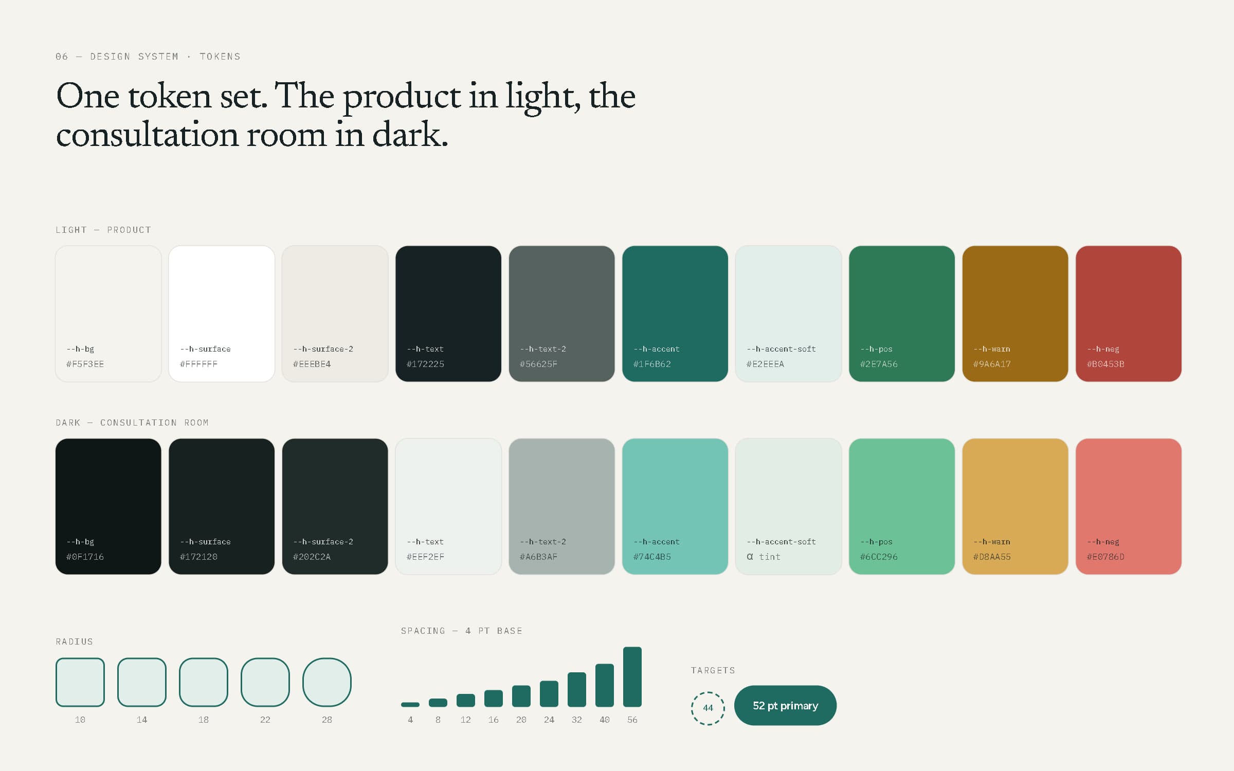
Tokens for both themes, radius, spacing and touch targets.
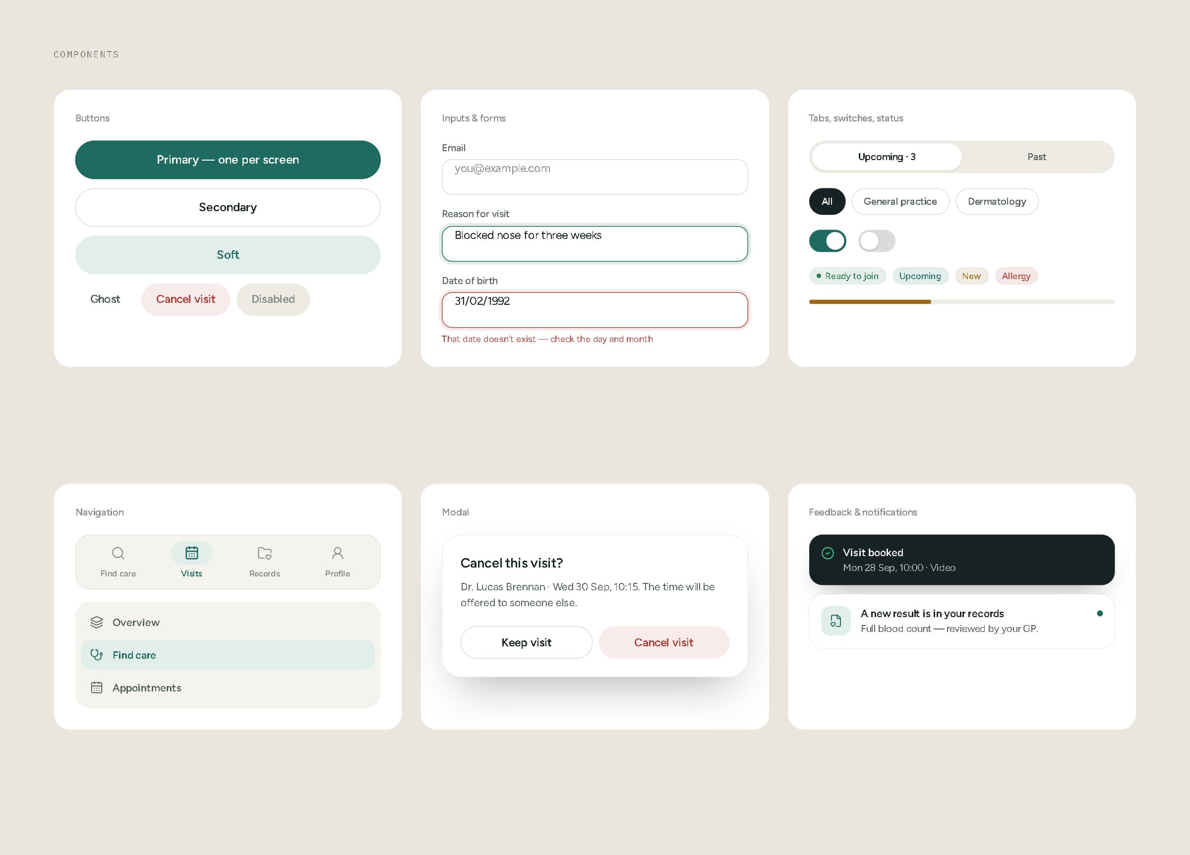
Core components — buttons, forms, tabs, status, navigation, modal, feedback.
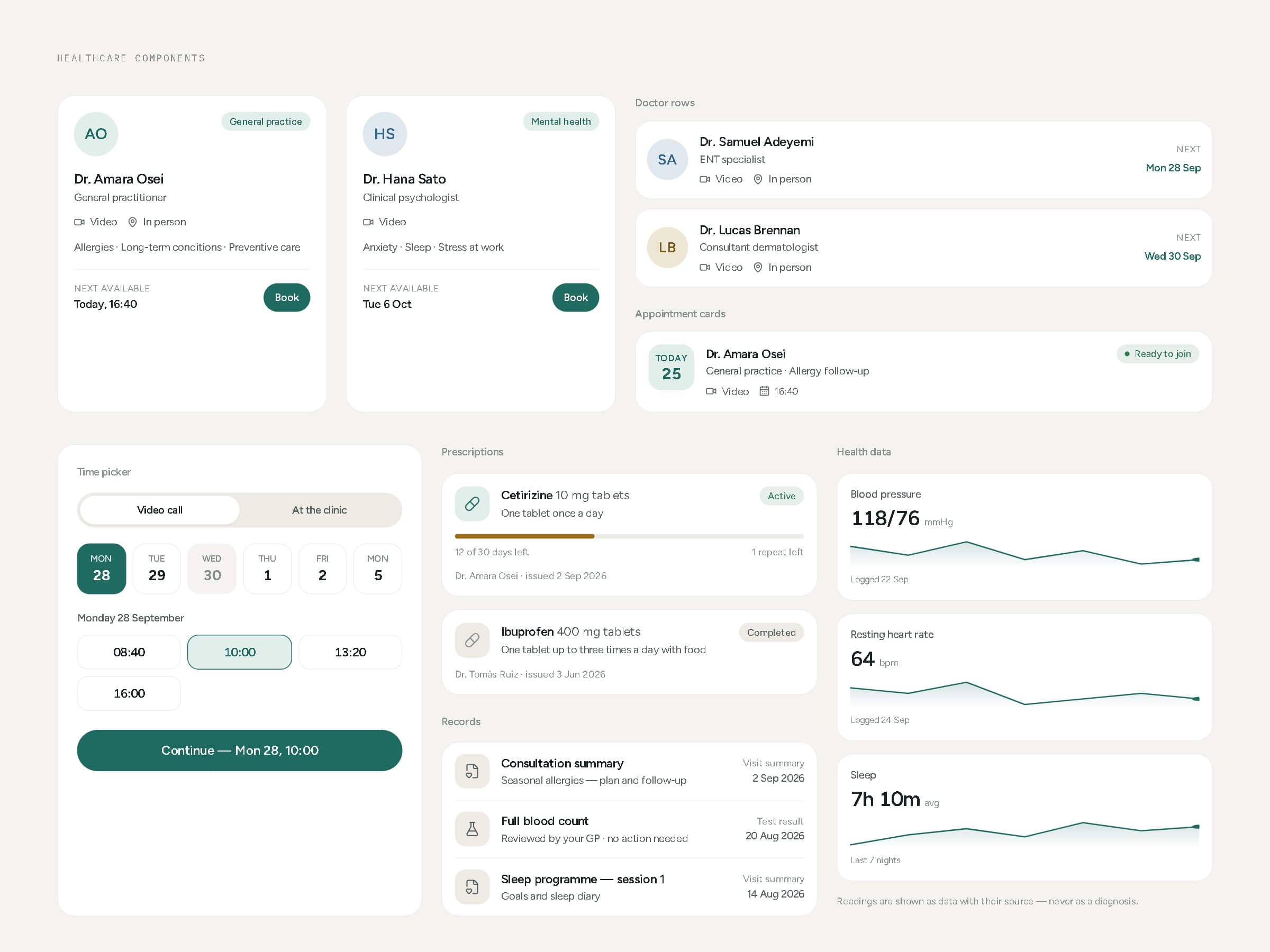
Healthcare components — doctors, appointments, time picker, prescriptions, records, health data.
07Patient experience
Twenty-one screens, one calm path.
Home opens on the one thing that matters today — the next visit — with preparation and joining a tap away. Find care starts from specialties or a search in the patient's own words; a doctor profile shows languages, focus areas and where to find them; choosing a time, reviewing and booking take three screens. Before a video visit, a short checklist removes the technical worry; after it, the next steps are spelled out and linked.
Visits, records, prescriptions, health information, notifications, profile and settings complete the app. Every screen is a real route in the prototype, and the booking flow carries the chosen doctor and time from step to step.
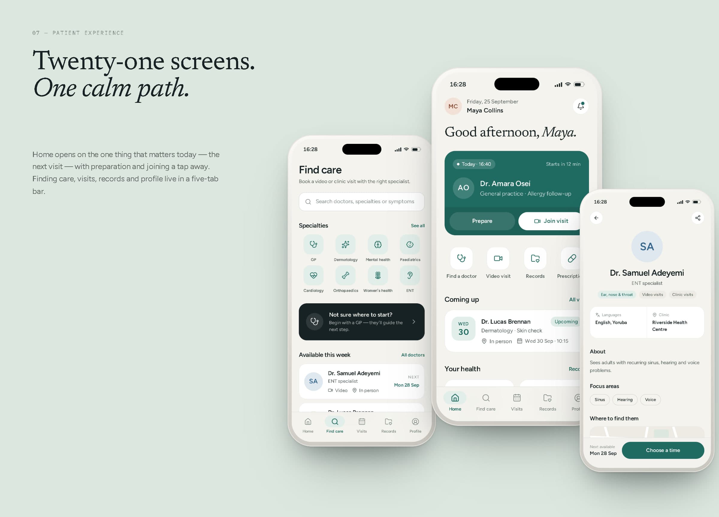
Find care, home and a doctor profile.
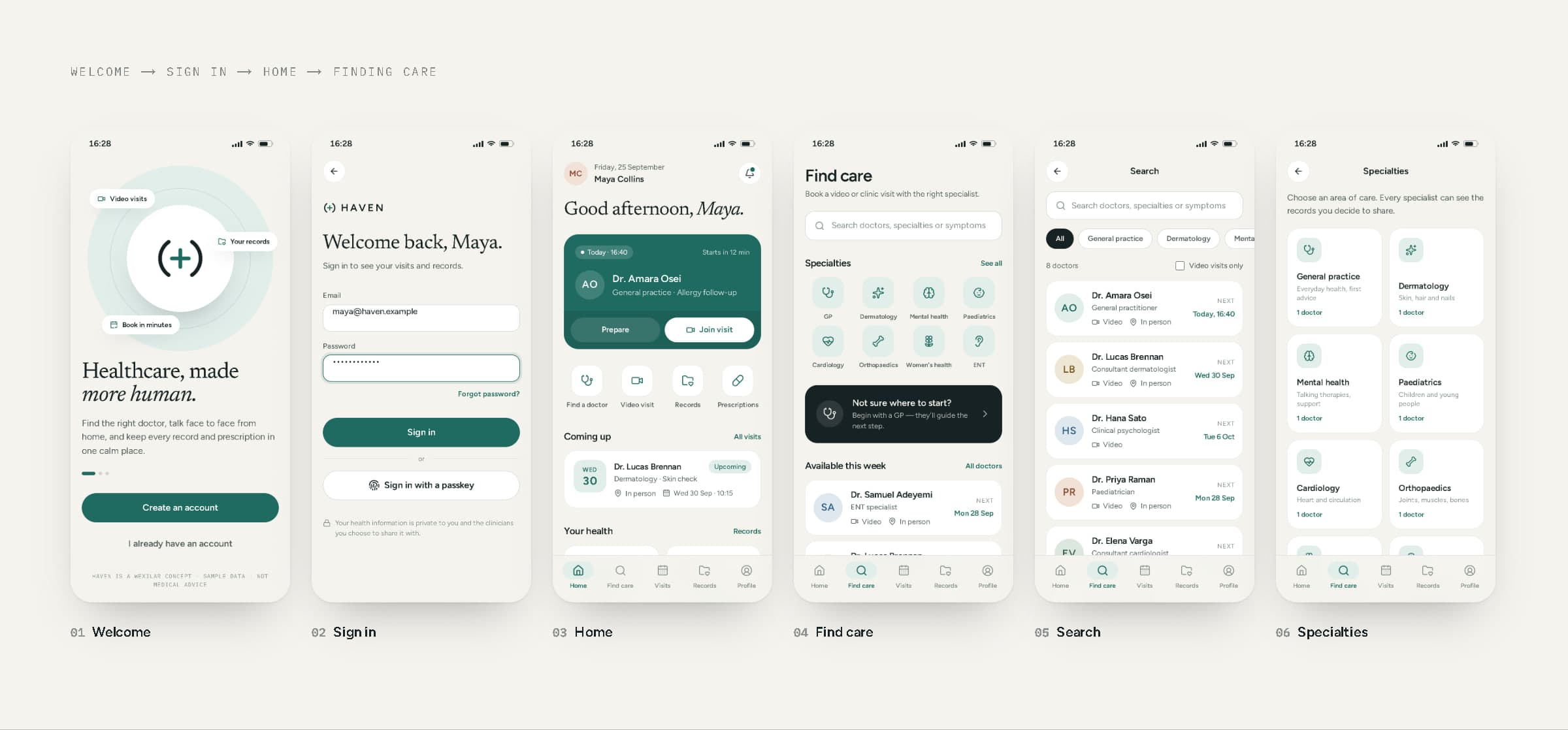
Welcome, sign in, home, find care, search and specialties.
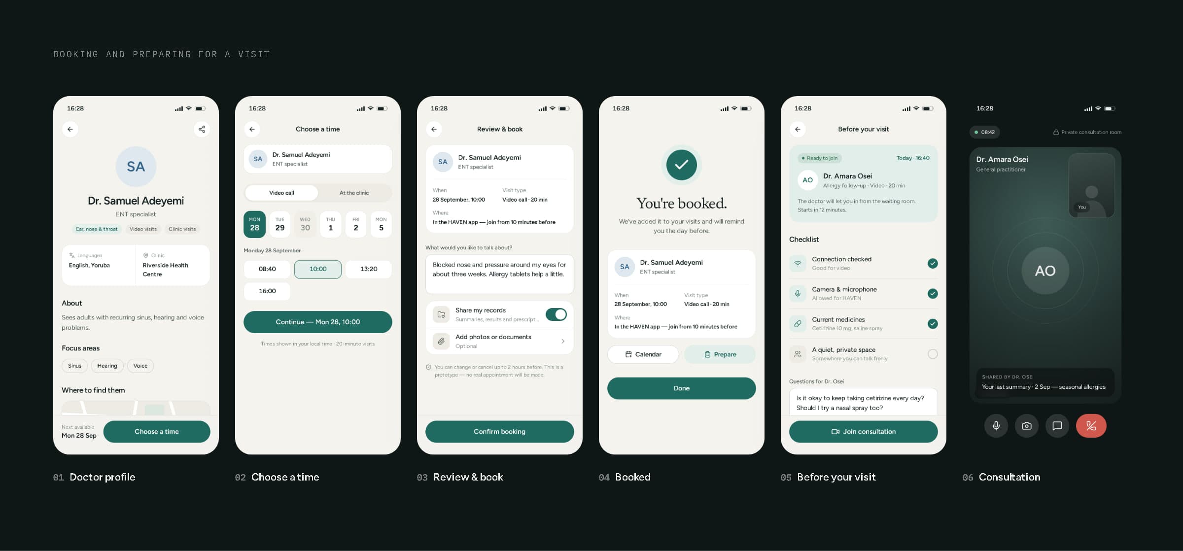
Doctor profile, choosing a time, review, confirmation, preparation and the consultation.
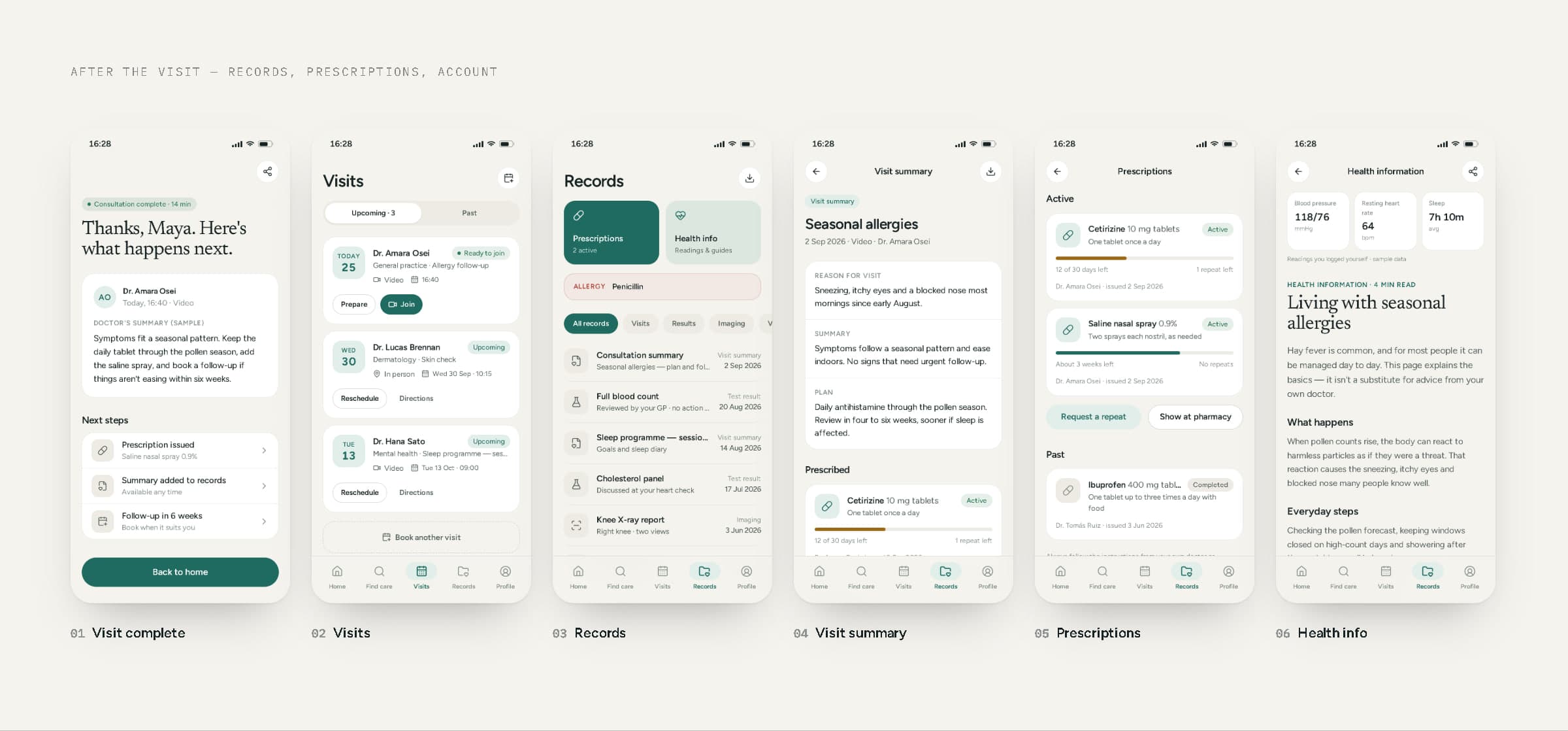
Visit complete, visits, records, a visit summary, prescriptions and health information.
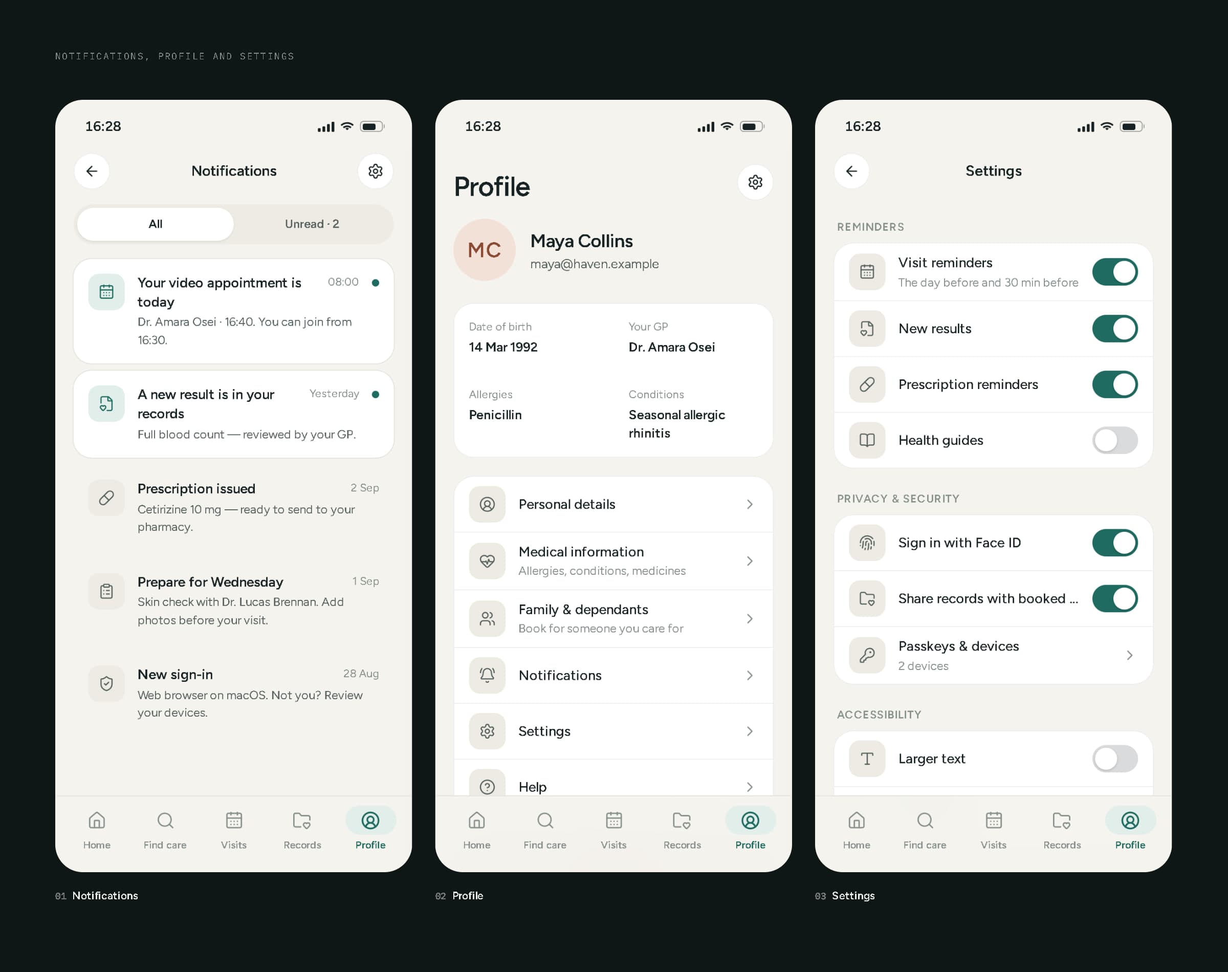
Notifications, profile and settings.
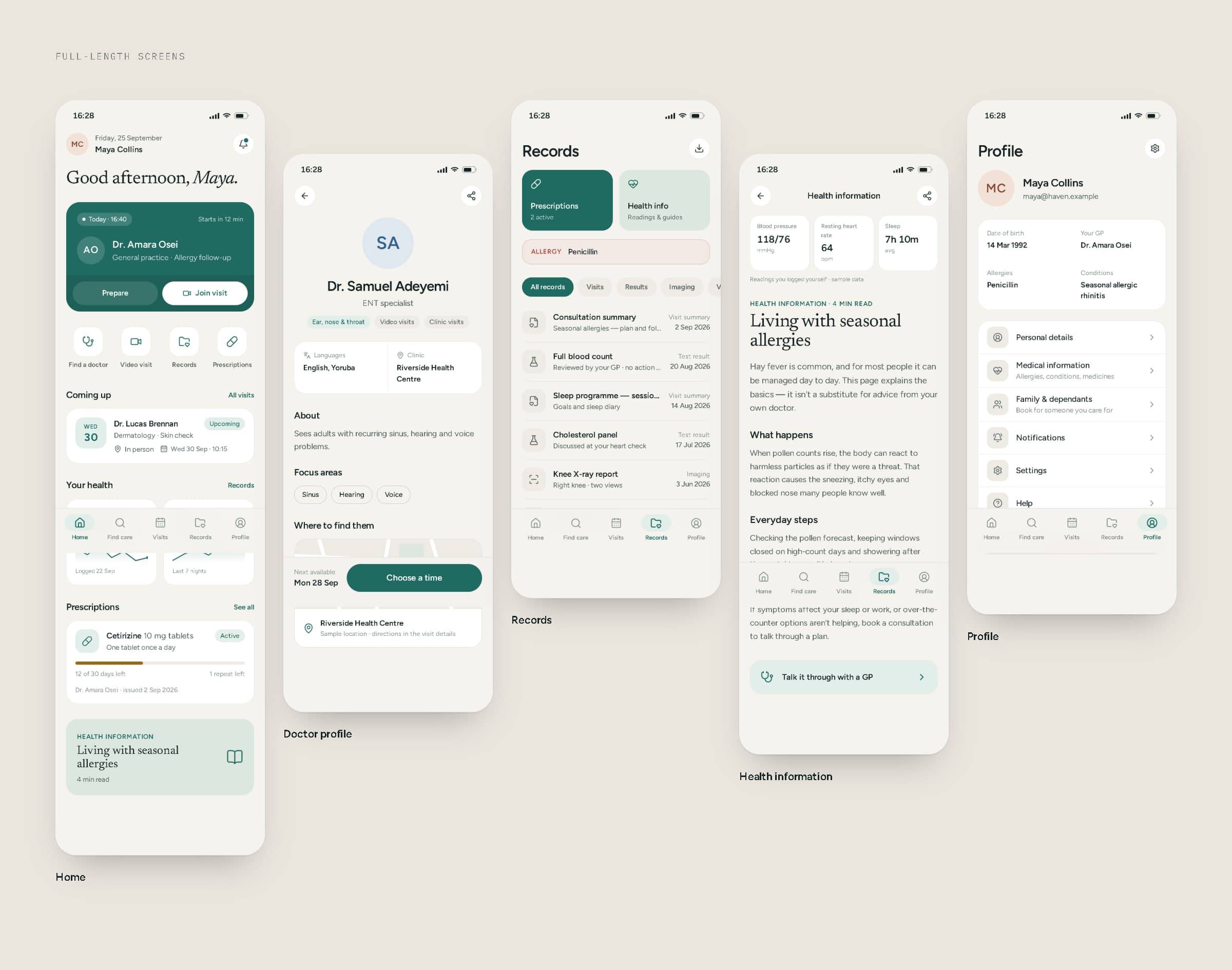
Full-length screens — home, doctor profile, records, health information and profile.
08Core user flows
The three journeys that matter most.
Finding a doctor and booking: search, profile, time, review, confirmation — nothing is committed until the last tap. Having a consultation: the upcoming visit on home, a preparation checklist, the video call, and a clear summary of what happens next. Staying on top of care: records link to what was prescribed, prescriptions show the supply left, and general health information sits one tap away — labelled as information, not advice.
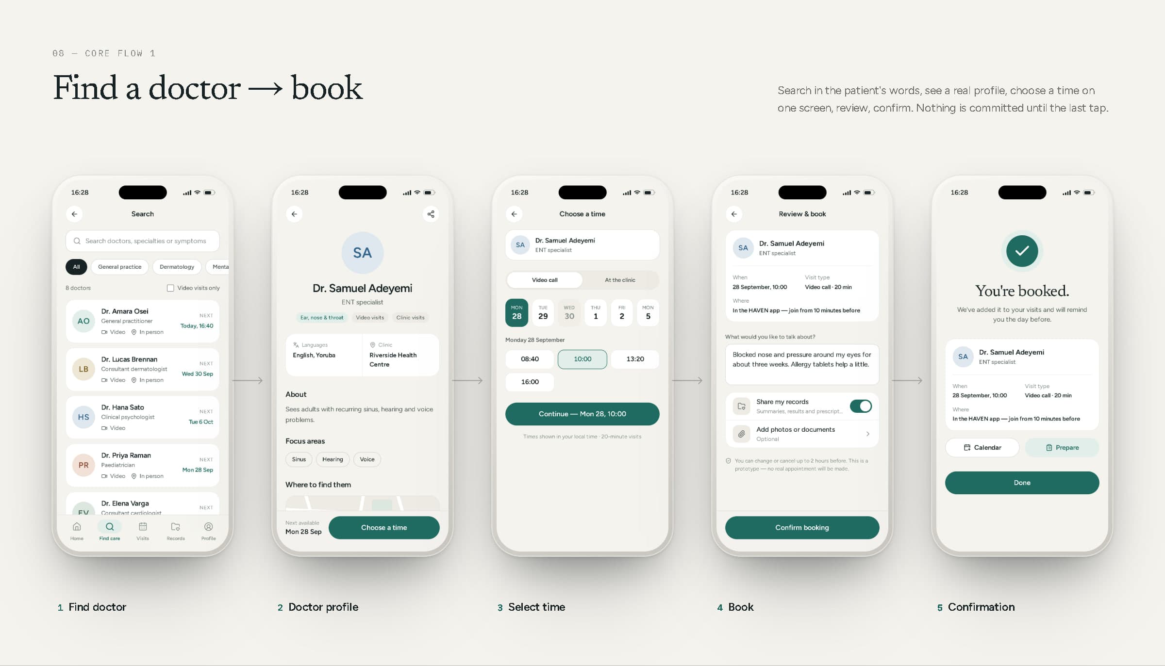
Flow 1 — Find doctor → doctor profile → select time → book → confirmation.
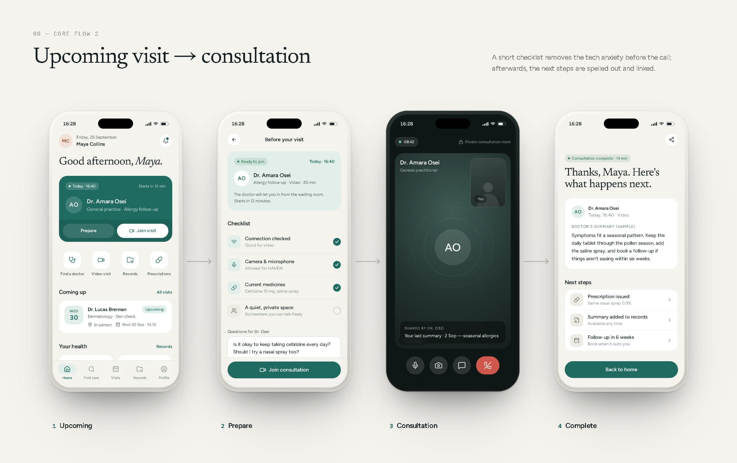
Flow 2 — Upcoming appointment → preparation → consultation → completion.
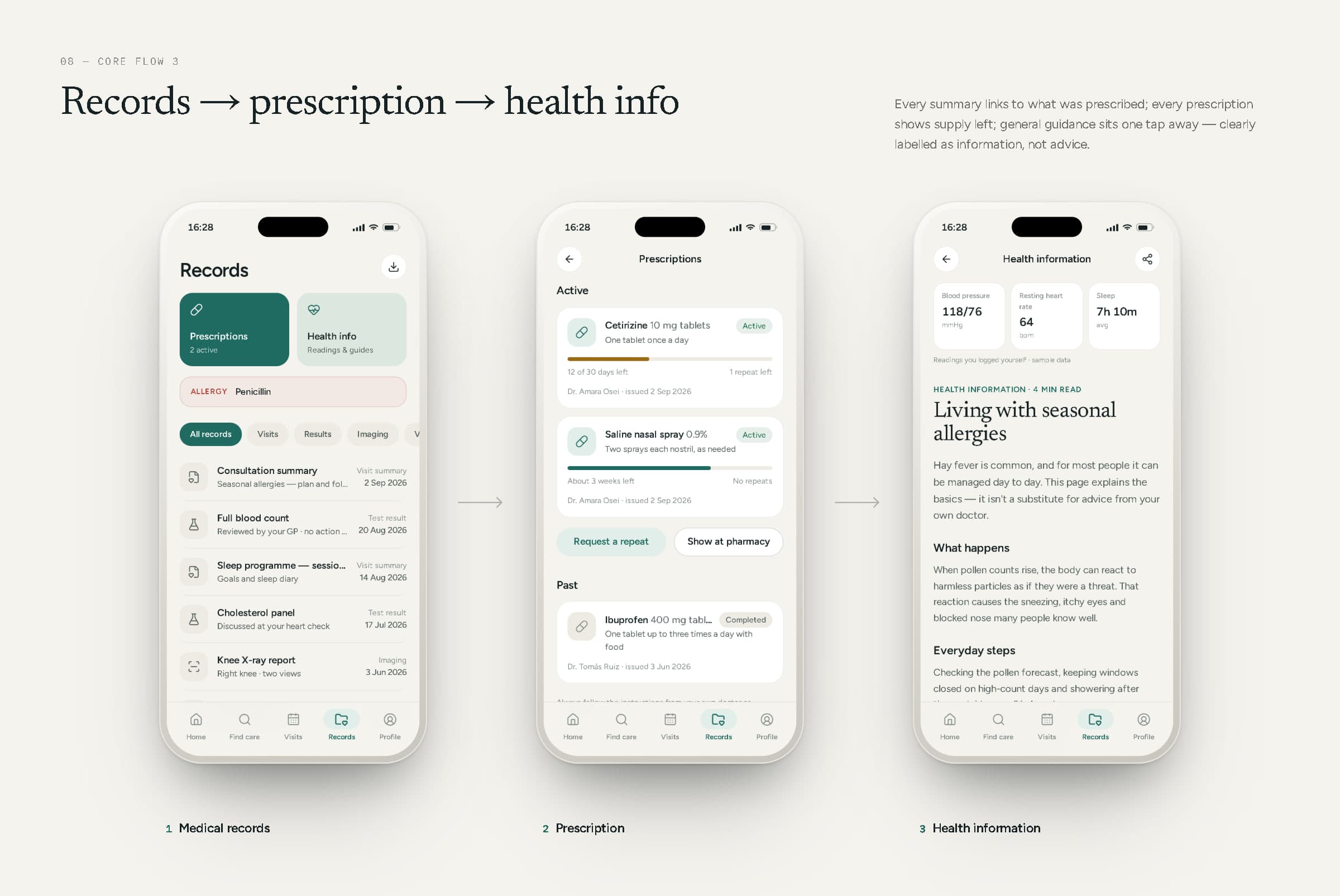
Flow 3 — Medical records → prescription → health information.
09Doctor experience
A quiet workspace for a busy day.
The clinician dashboard opens on today: the next patient waiting, with their allergy flagged before anything else; the day's appointments with their status; tasks — results to review, prescriptions to sign, notes to finish; and the week at a glance. A schedule view lays the day out on a timeline, the patient list and patient record bring notes, medicines and results together, and the consultation screen puts video, the patient's own question, a note editor and prescribing side by side.
The patients and schedules shown are sample data; the dashboard isn't connected to any clinical system.
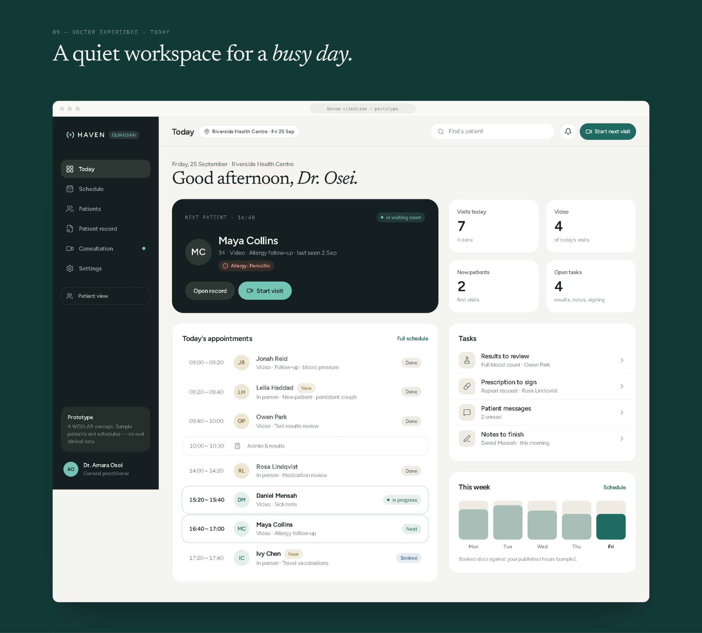
Clinician dashboard — today.
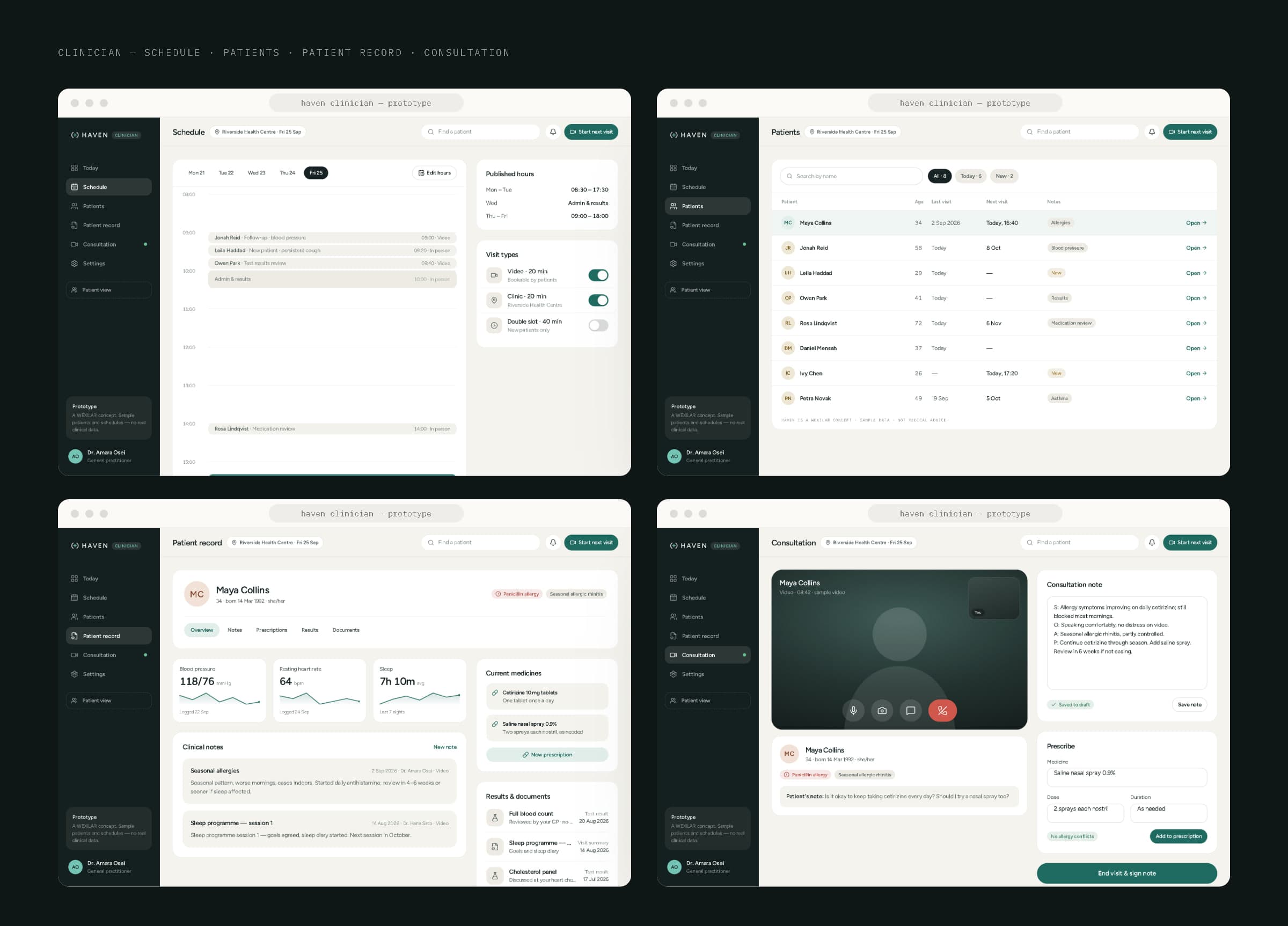
Schedule, patients, patient record and consultation.
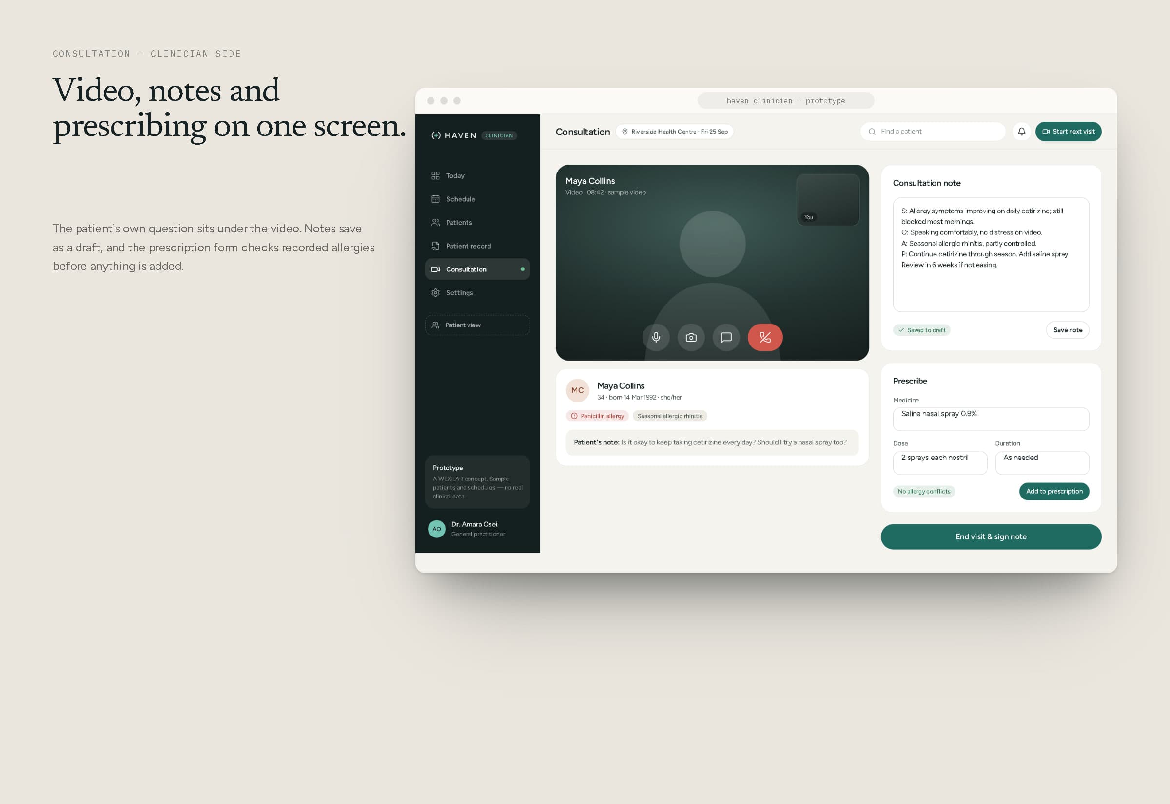
Consultation — video, notes and prescribing on one screen.
10Web platform
The same care, with room to plan.
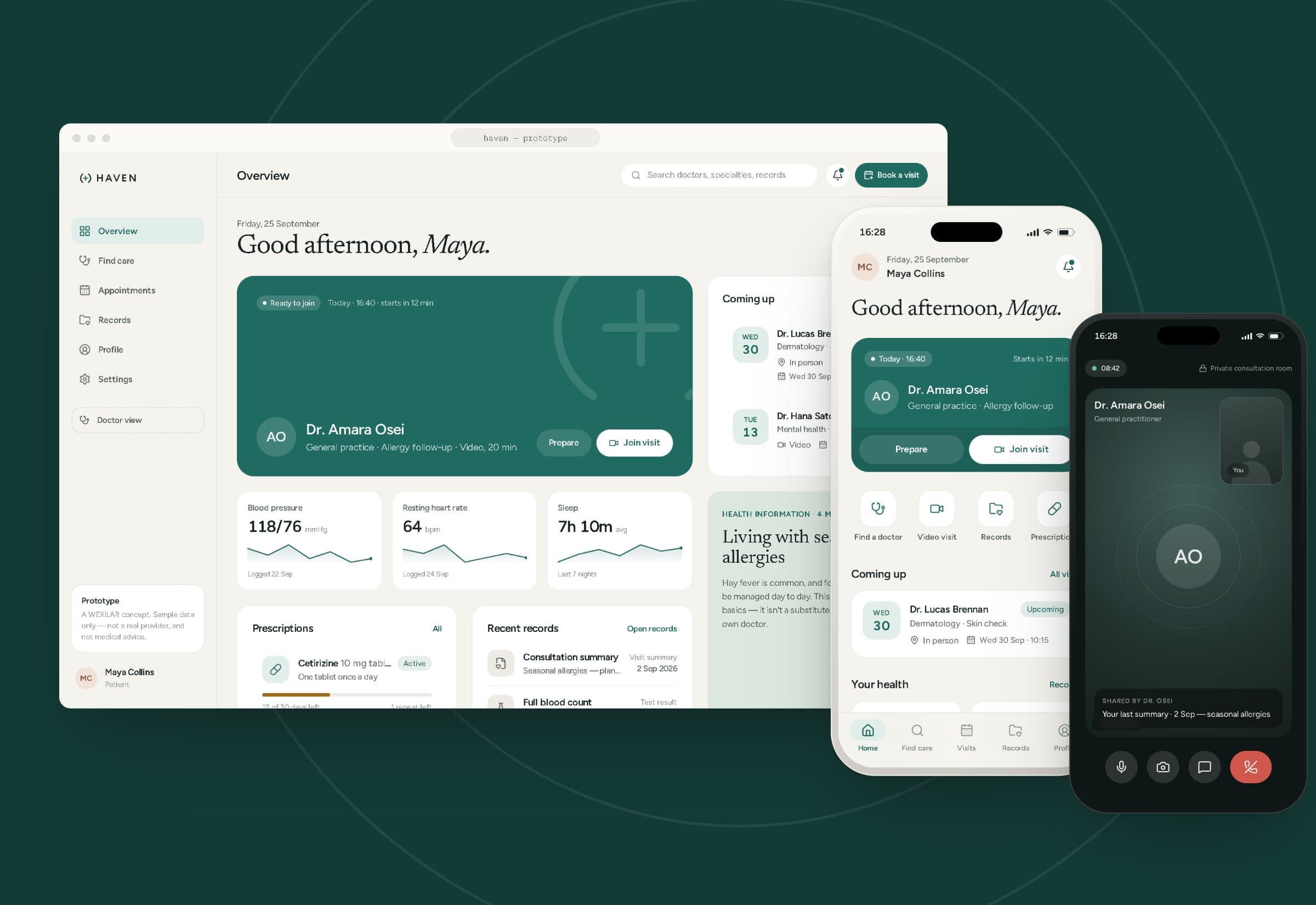
On desktop, patients get a dashboard built around the next visit, their readings, prescriptions, recent records and a health guide; doctor discovery with filters, cards and a booking panel that stays beside the results; appointments with a calendar and history; records with a full visit summary; and profile and settings. It shares the app's tokens and components — it is the same product, not a separate site.
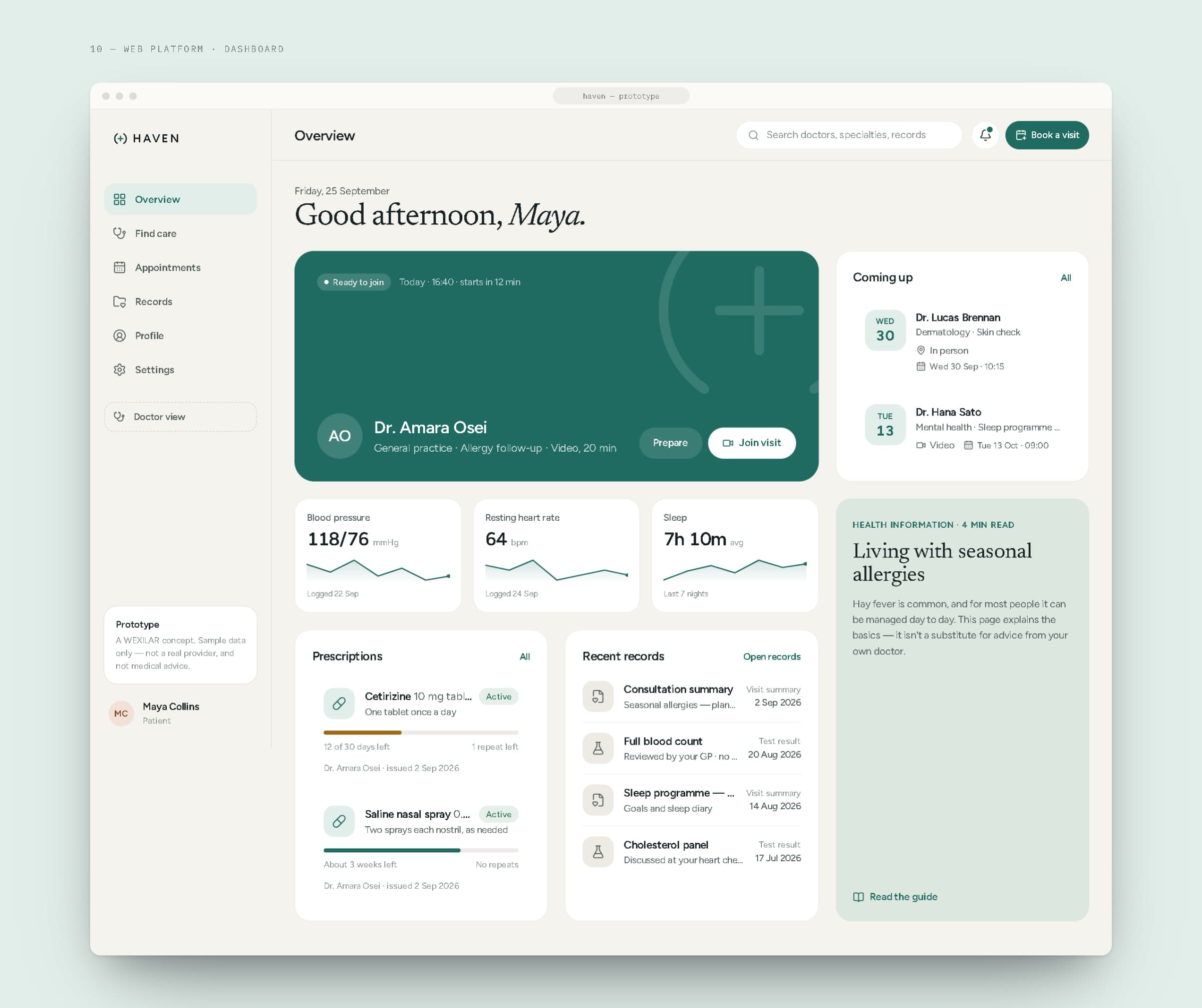
Patient dashboard.
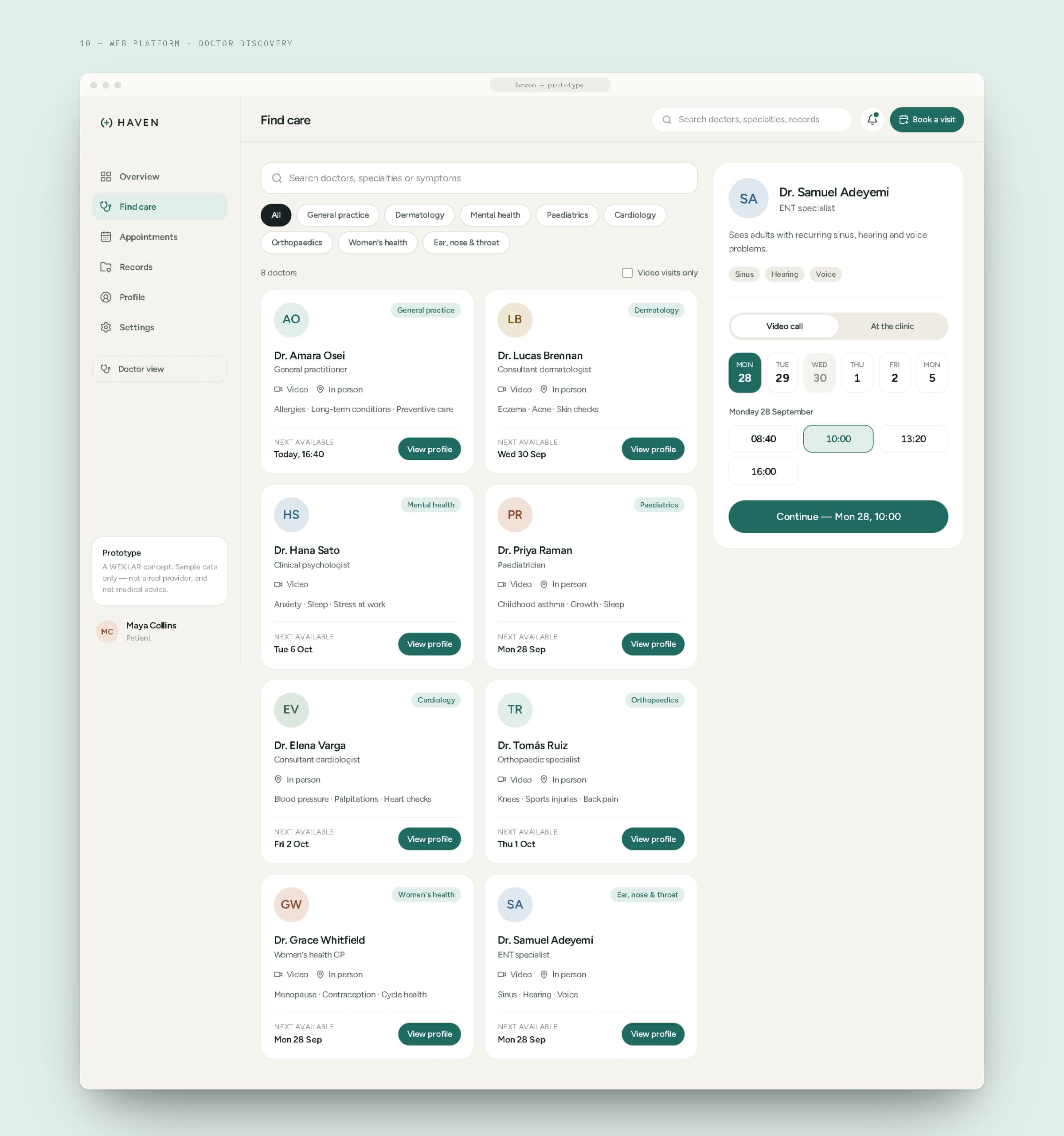
Doctor discovery, with the booking panel beside the results.
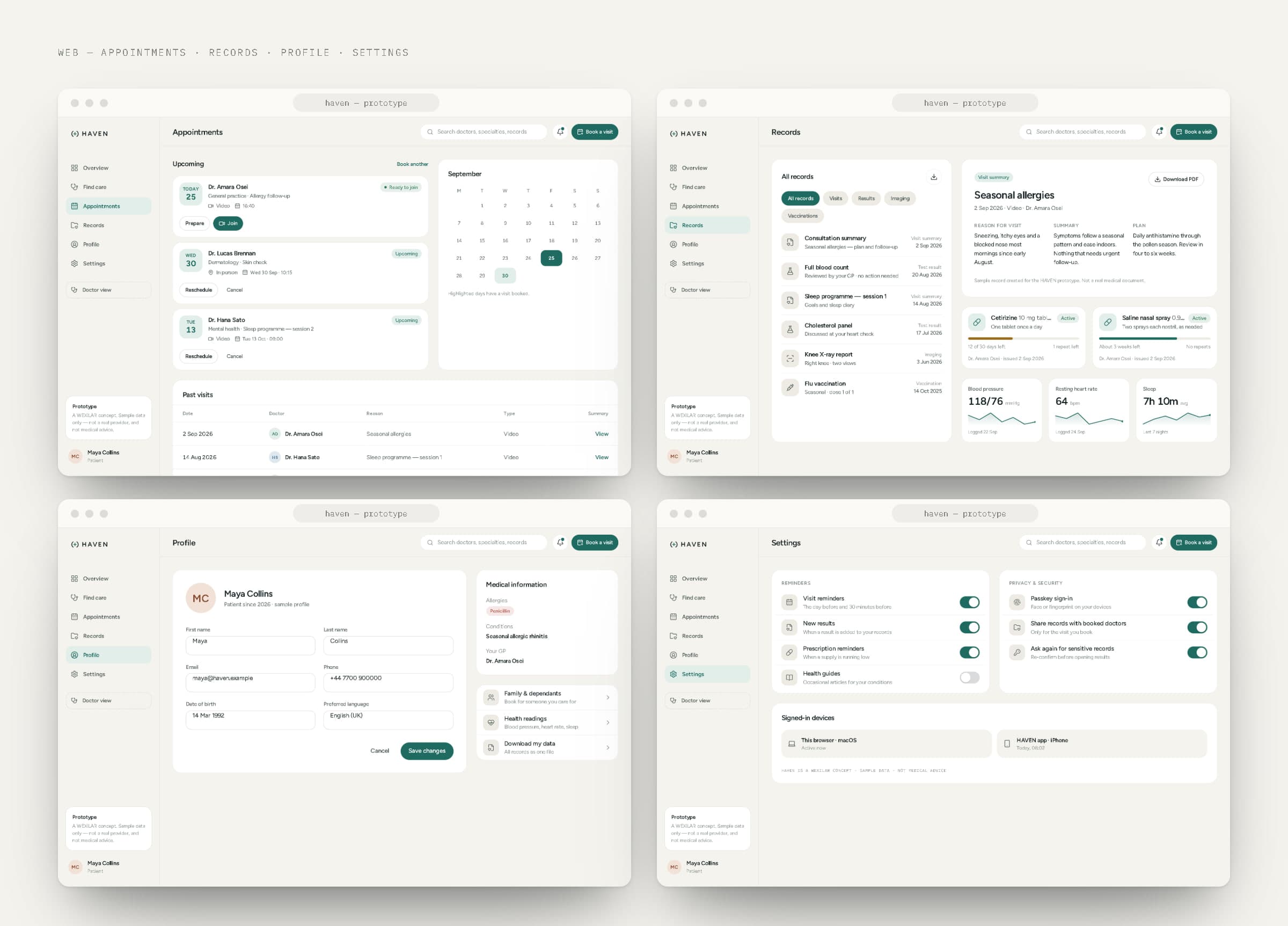
Appointments, records, profile and settings.
11Mobile experience
From “something's not right” to a doctor on screen.
The phone is where most care begins, so the mobile app gets the most attention: large, calm type; one filled button per screen; generous touch targets; and a consultation room that goes dark so the conversation is the only thing in view.
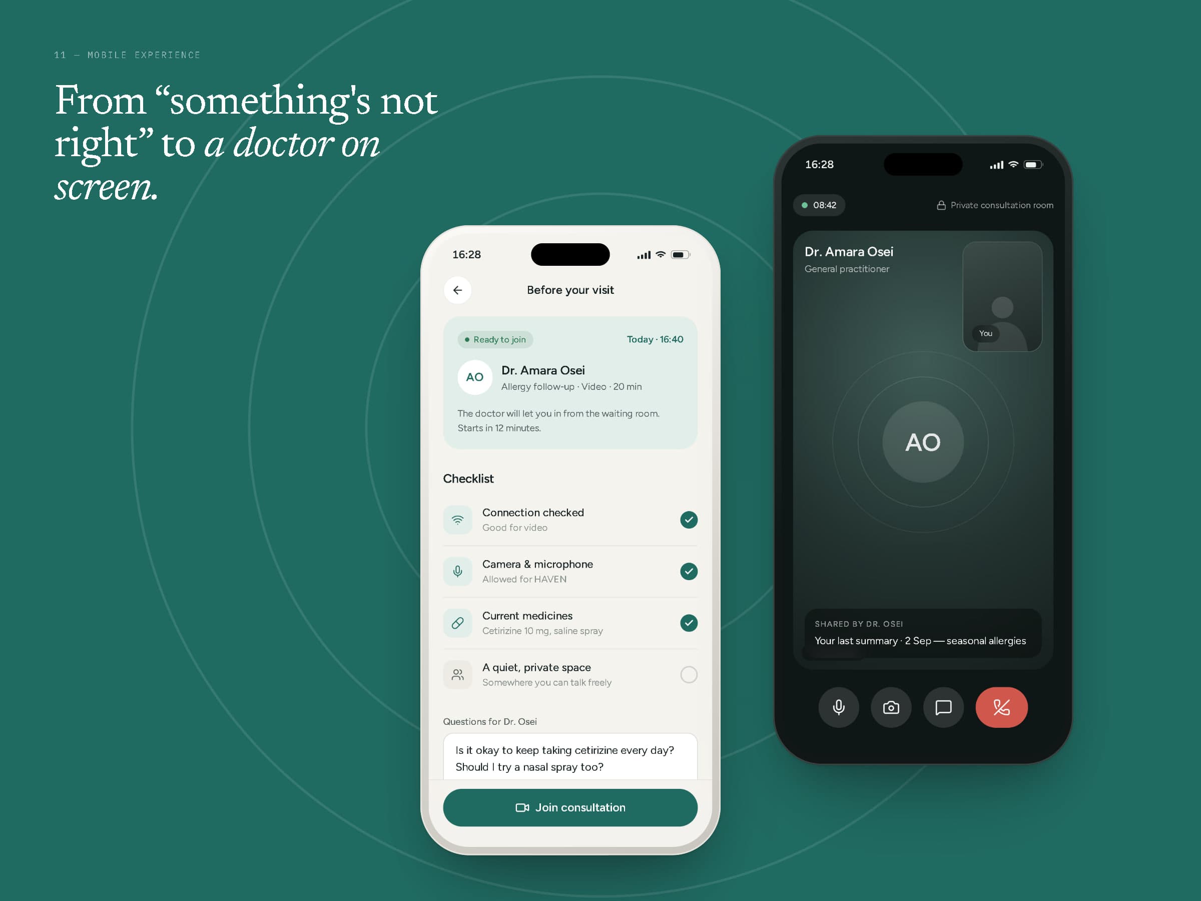
Preparing for a visit, and the consultation room.
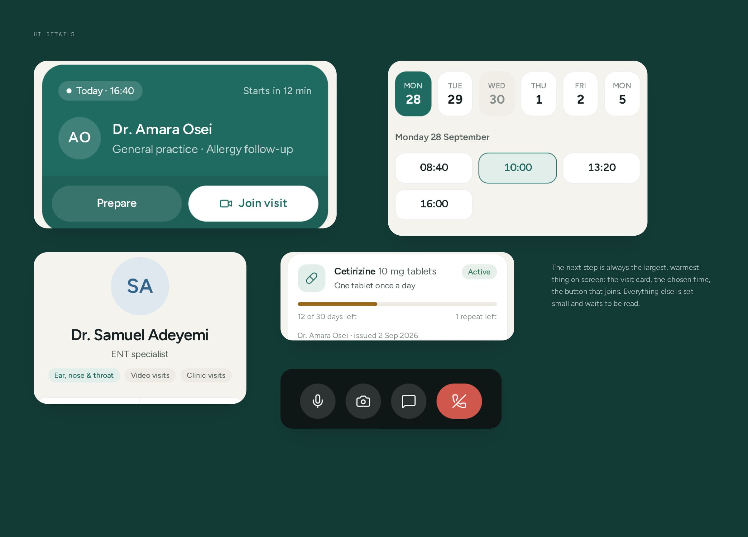
UI details — the next visit, the time picker, a doctor profile, a prescription and call controls.
12Responsive experience
One component library, three layouts.
At 1440 pixels the platform has a full sidebar; at tablet width it folds into an icon rail; on a phone it becomes a five-tab bar with stacked cards. The clinician dashboard follows the same rules. Tokens, data and components stay identical at every size — only the arrangement changes — and every layout was checked at 390, 768 and 1440 pixels.
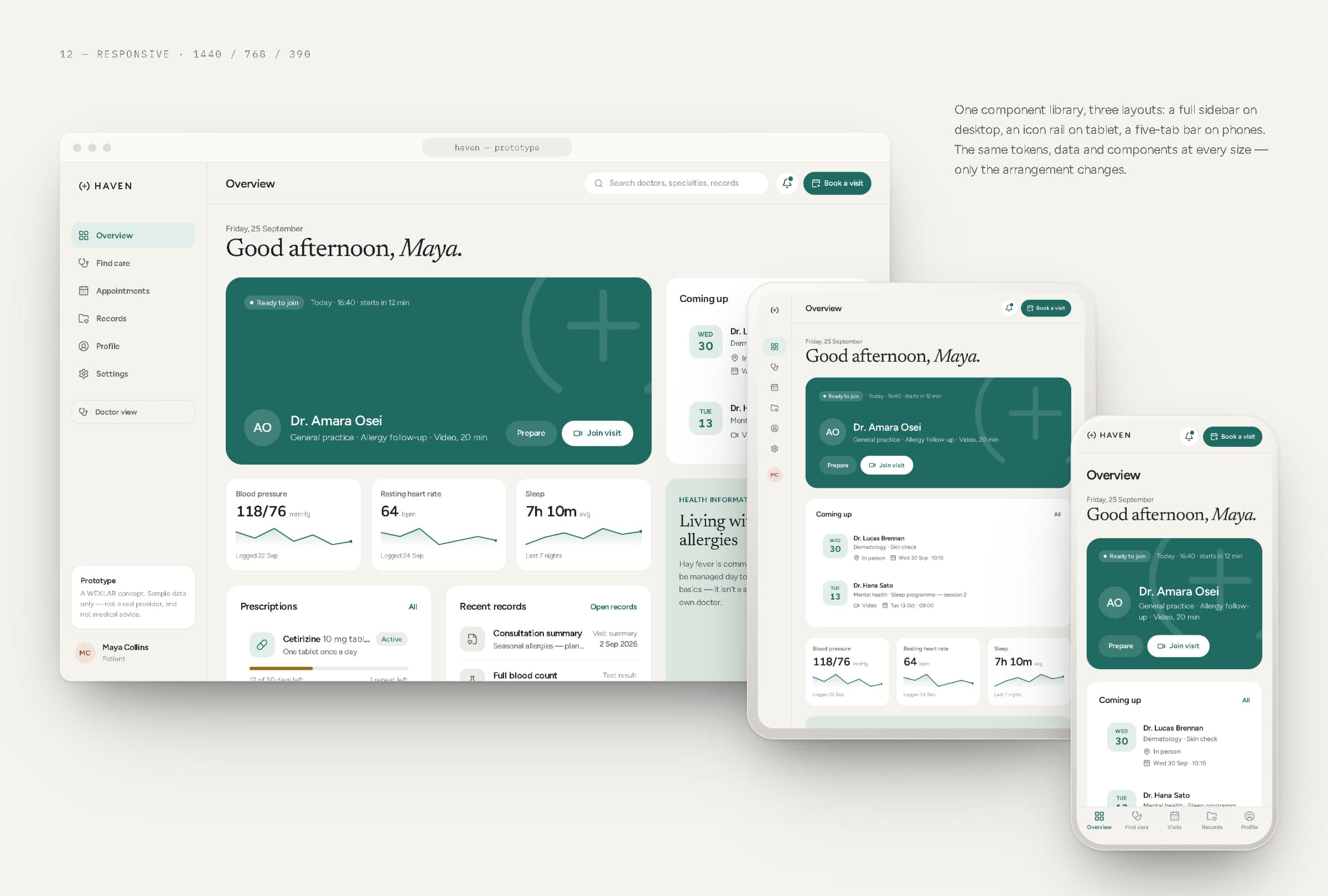
Patient web at desktop, tablet and phone widths.
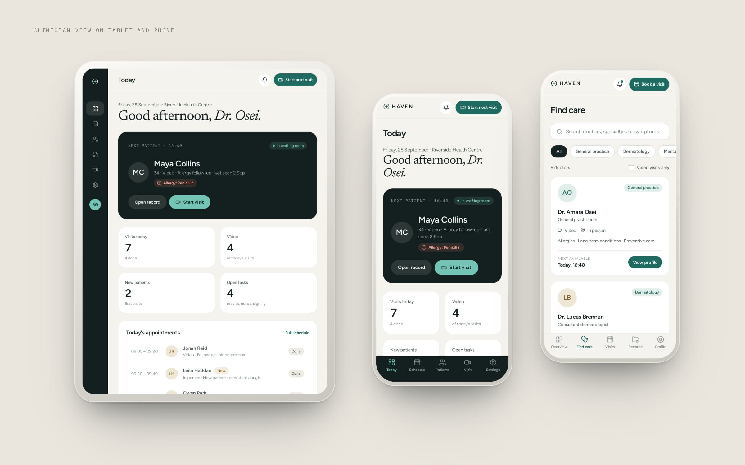
Clinician view on tablet and phone.
13Product architecture
How HAVEN would be built.
To design the product honestly we sketched how it would work: patient app, patient web and clinician dashboard behind one API and integration layer; identity for patient and clinician accounts with passkeys; domain services for the directory, appointments, consultations, records, prescriptions and notifications; and a consent and audit layer deciding who can see which record, and when.
This architecture is illustrative. The prototype is a Next.js app running on sample data, with one token file and one component library behind every screen in this case study. No hospitals, clinicians, clinical record systems, pharmacies, labs, payment providers or production healthcare infrastructure exist or are connected.
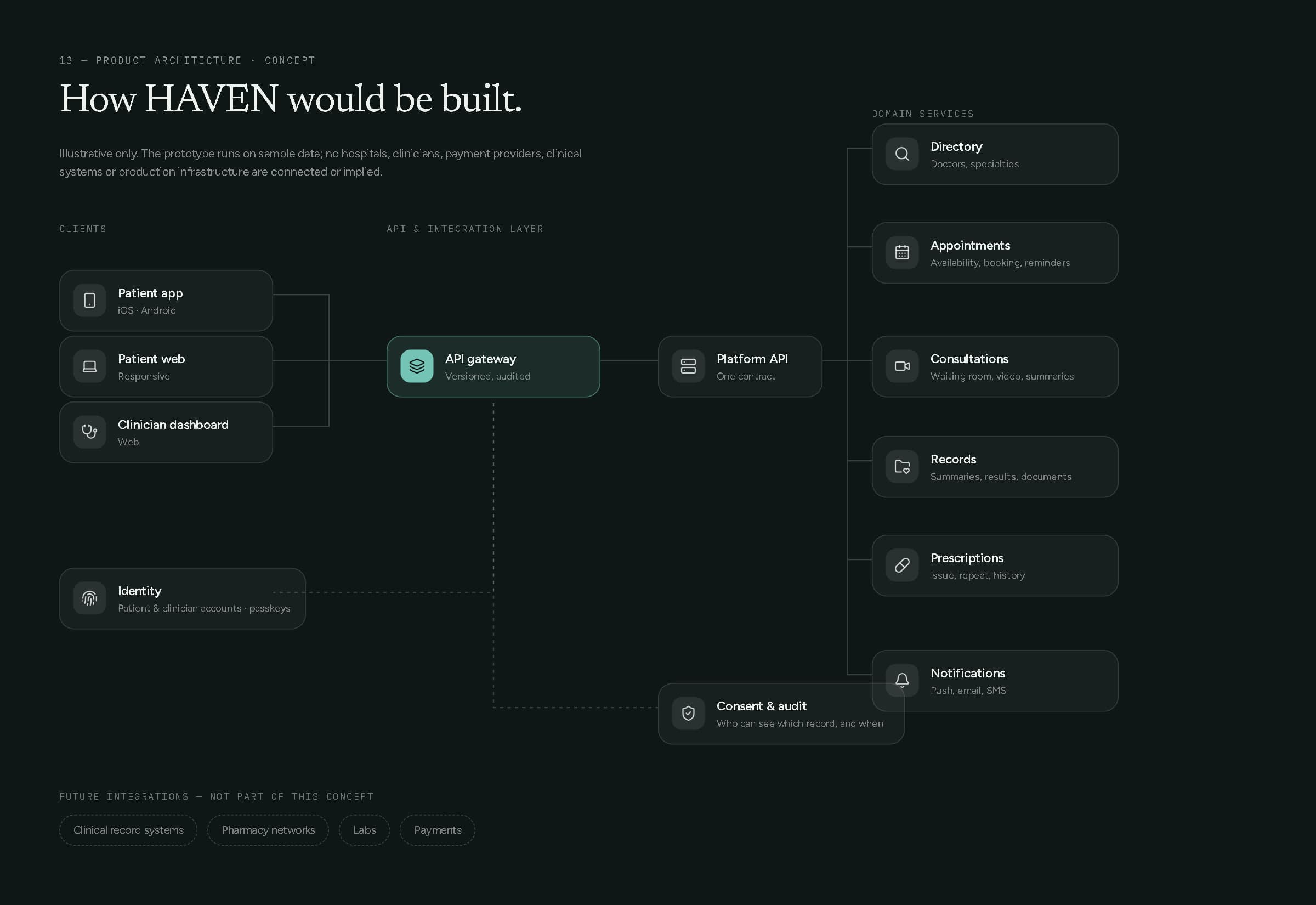
Concept architecture — illustrative only.
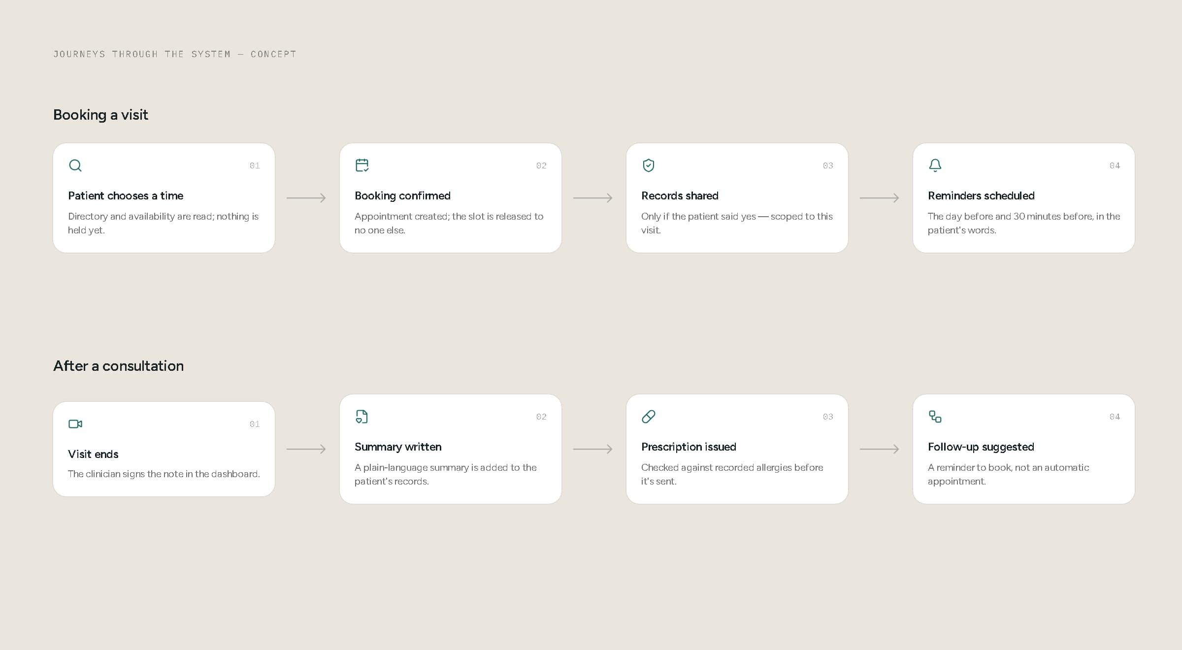
How a booking and a finished consultation move through the system (concept).
14Applications
One brand, from the home screen to the clinic.
HAVEN carries across the mobile app, the patient web platform and the clinician dashboard, down to the app icon — and into launch graphics built from the product itself: real screens and real components, never a promise the prototype can't keep.
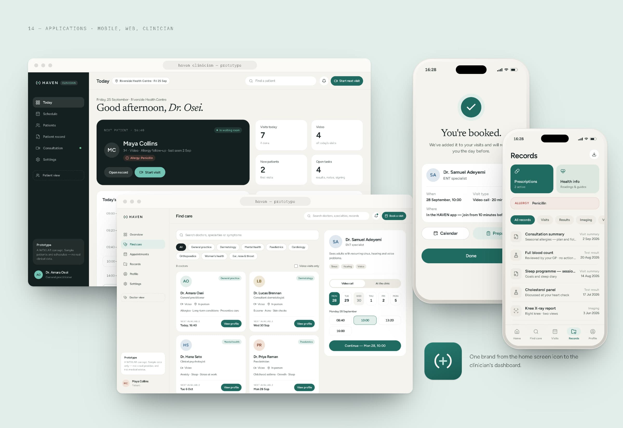
Mobile, web and clinician, together.
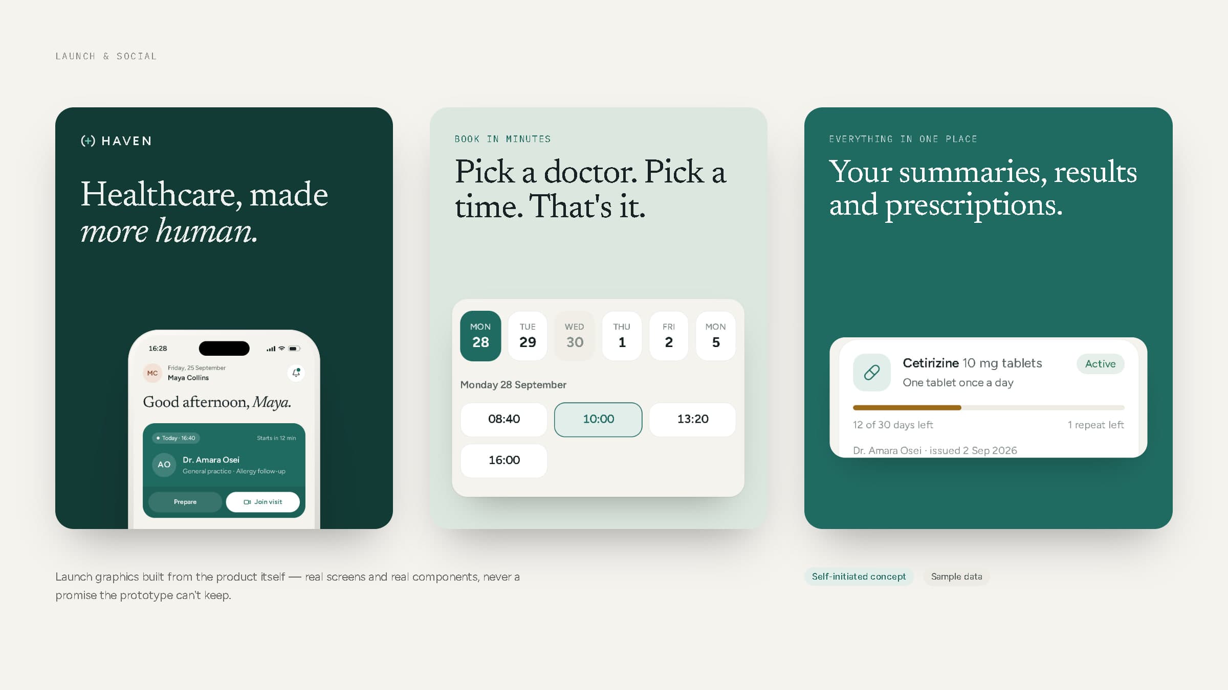
Launch and social graphics.
Care can't be simplified. Getting to it can.
15Final showcase
Brand, patient, clinician and system — together.
The HAVEN prototype is live at wexilar.com/concepts/haven (patient web), wexilar.com/concepts/haven/app (patient app, best viewed at phone width) and wexilar.com/concepts/haven/doctor (clinician dashboard). It runs entirely on sample data.
- Strategy & identity
- WEXILAR
- Product design & development
- WEXILAR
- Data
- Sample data only — no real patients, doctors, clinics, records, outcomes or metrics
- Status
- Self-initiated concept — not a real healthcare provider, doctor network or client project